Houses revisited: Mairangi Bay house
It can be a challenge to get the quintessential Kiwi male to make colour choices outside the monochromatic spectrum.
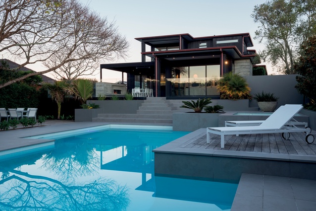
The owner of this home, a businessman, requested a modern, boxy design, and was keen on having a limited colour palette. This allowed the two Jasons — Jason Gibson of Gibson Architects and Jason Bonham of Bonham Interiors — to add texture and accents through material choices and lighting.
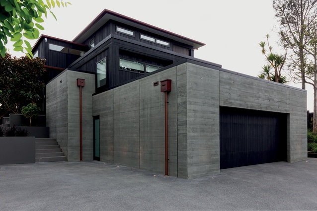
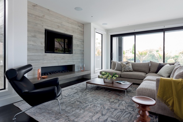
“The client had owned the property for some time and wanted a complete renovation, from the floor up. He wanted to get away from the weatherboard look of the existing 1960s bungalow and go for something more solid. In response to his design brief, we chose board-formed concrete as a textural motif throughout the house. Externally, the horizontal lines work to contrast with the verticality of the dark-stained cedar,” says Gibson.
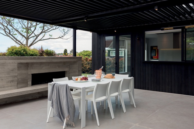
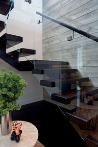
From the street, the house is grounded by the bold mass of the concrete-clad garage. Copper downpipes and guttering add an accent of shine to the exterior. Over time, this will develop a patina, providing the building with a sense of history. The board-formed concrete continues indoors, most prominently on the large feature wall in the entrance foyer, where it provides a backdrop for the floating staircase with its central steel stringer and glass balustrades, and also balances with a colourful artwork on the opposite wall. The material is used for the fireplace surrounds as well, both indoors and on the deck.

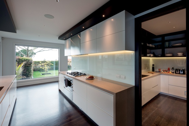
The site’s shape provided some challenges for the architect, as the house sits full-length across the main access. To enable separate but connected formal and casual living spaces, the kitchen is designed as a galley, linking the spaces and also allowing for interaction with family while cooking. The full scullery hides any mess during entertaining and is actually used more often than the kitchen, says Bonham.
“The client is home alone a fair bit so he wanted the scullery to be a bigger space that he could use as a personal kitchen. The open shelving provides easy access to his high-use items and attractively displays some of his pottery collection. To visually connect the galley kitchen with the adjoining rooms, we added bulkheads, which also contain subtle task lighting.”
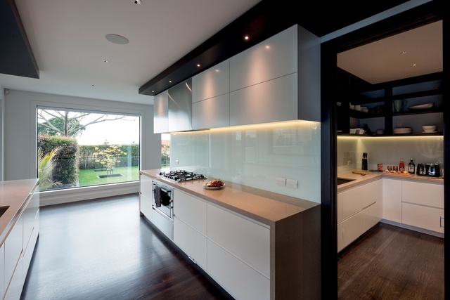
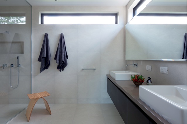
Both kitchen spaces have backlit cabinetry, which lends a sense of shine, accentuated by the glass backsplashes. In the bathrooms, mirrors are backlit as well, and tiles have been selected and carefully laid to add texture to the sleek, mainly white spaces. Tiles in the guest bathroom have been selected to match the concrete look, and have a three-dimensional aspect. Bonham chose different benchtops throughout the home also, to gain some colour and texture.
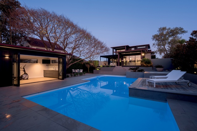
The kitchen windows overlook an outdoor dining area, with gas fireplace and a Louvretec roof. The existing pool and surrounds were retained, but Gibson added a poolhouse with sauna; this is currently being used as a gym.
Click here to see more Houses Revisited. And sign up to our email newsletters to receive Houses Revisited straight to your inbox.
Note: These are stories from our archives and, since the time of writing, some details may have changed including names, personnel of specific firms, registration status, etc.

