Houses Revisited: Lineout jumper
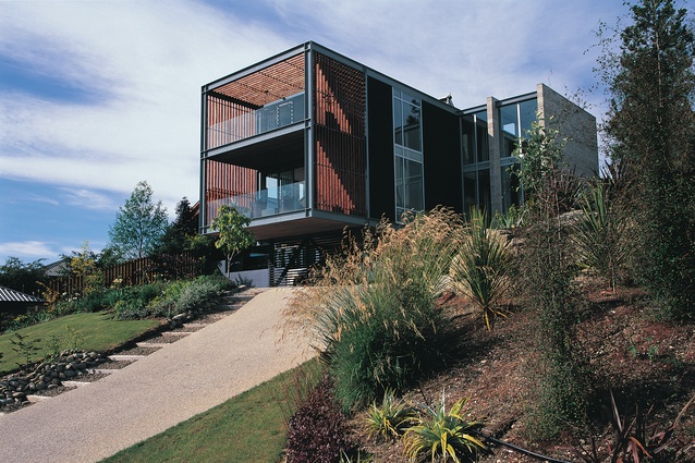
First published in 2007, this house thrusts itself from its site and above its conventional Wanaka neighbours, taking advantage of both lake and valley views.
Wanaka has long been a popular holiday spot for South Islanders. The resident population of 5,000 increases by about 50 per cent during winter and summer vacation periods. Despite this seasonal popularity a few years ago Wanaka was still playing poor cousin to bigger, sleeker Queenstown. But, if property prices are anything to go by, this status might be changing. Wanaka has access to the same outdoor pursuits as Queenstown and has the charm of a town that has not been developed to the hilt – yet. Most of the town’s suburbs are still largely made up of houses that would not have come off an architect’s drawing board.
This house, designed by architect Niko Young of Dunedin practice Parker Warburton Team Architecture, is a brave departure from the local bachy vernacular. Tall where others lie low, it is unashamedly modern. The clients are recently retired farmers who had built a house two doors down with the intention of living in it full-time. They had just completed the house when the current site – bigger and higher – came up for sale. So they bought it, sold their just-finished house, and made plans for a larger scale successor.
Their brief to their architect specified that the house had to take advantage of the views of Lake Wanaka, the township and the Cardrona Valley; it needed to be big enough to accommodate friends and family; and it was to be clean and simple in form. The clients also required that the design incorporate exposed steel work that they planned to fabricate themselves.
The site is a long rectangle facing south-west. Because the front drops away in a steep dive the bach that formerly occupied the site sat at the very rear, on level ground. Large Oregon trees obscured the view of the lake; along with the existing building they were removed. Niko Young located the new structure further forward on the site to maximise the views down the lake, but not so far as to necessitate difficult site excavations.
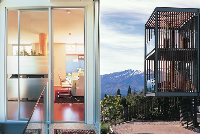
Seen from the road below the house, which leans out over the sharp incline of lawn, looms tall and distinct. This high impact roadside perspective is emphasised by the double storey cantilever out over the carport. The plan is a very simple timber box container with two smaller boxes protruding from one side, creating a sheltered spot for planting. One of these boxes accommodates the stair shaft and the entry to the house. Its three storey, floor-to-ceiling glazing is supported by two concrete block walls. Glass balustrades continue the frail glass pattern, and the solidity of the walls is repeated in the thick wooden stairs. The second protruded box sits behind the stairs. The stairwell was designed to form a view-capturing gallery and, Young says, to mirror the height and sense of open space in the surrounding mountains. Standing on the third floor landing, precipice is one word that springs to mind.
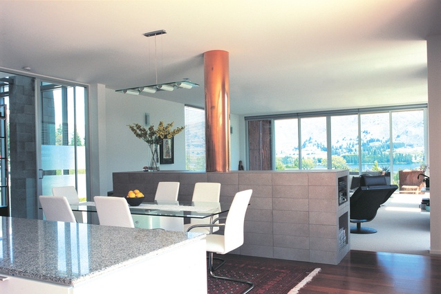
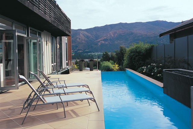
Small bridges run from the stairs to the doors into the main box on each floor. On the first floor, the length of the plan comprises two large areas. The front has a lounge, dining and kitchen area; a second lounge or large office lies at the back, looking out onto a small sheltered lawn. Louvered screens on tracks help protect this side of the house from the sun and provide privacy. Sliding doors open from the kitchen area out onto the side garden and lap pool. The pool might seem a bit extraneous when there is a vast expanse of water a stone’s throw away, but it does have the advantage of staying well above freezing temperature.
At the front of the house, the lounge opens onto a large deck. Timber slats protect the sides but let in light and the view. Glass runs along the front, as it does on the inside stairs, so as not to interrupt the scenery. The frame of the deck, and of the house itself is, as per the brief, made of exposed steel. There is something rugged and outdoorsy about exposed structural steel; it’s simply declarative, both of its nature and, in this case, of the clients’ ability to fabricate it. White is the colour used through the house as a neutral backdrop for the steel, polished concrete, glass, block work and timber that make up the material palette. The clients resisted bringing all the furnishings from their traditional country home. Instead, they have fully fitted out the house in a style better suited to a modern home.
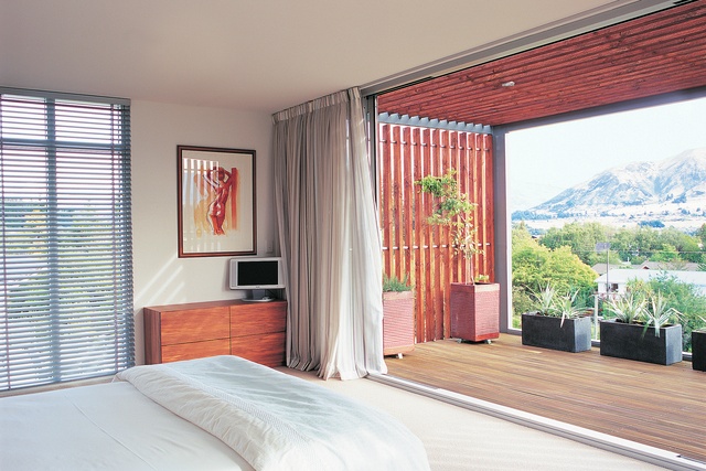
The clients’ three adult children live away from home, but the second floor has four bedrooms, enough for the whole family. (Is downsizing in retirement a thing of the past?) The master bedroom is at the front of the second storey with a repeat of the large deck below. The open timber wraps around to form the roof of this deck. From here the height of the house and the projection of the cantilever most forcefully expresses the emphasis on vertical space that Young aimed to achieve. The ensuite bathroom, too, has enviable lake views, above the modesty frosting, that is.
The materials and volumes of the house have imparted the appearance and experience of strength and solidity – they are a considered acknowledgement of the surrounding landscape. This strength has been achieved without sacrificing light or line of sight, both of which are maximised wherever possible. In a suburban line-up of neighbourhood homes, you wouldn’t call this bold house a team player; indeed, its singularity is rather challenging. Tall and confident, it seems to be on the point of launching itself into new territory.
Click here to see more Houses Revisited. And sign up to our email newsletters to receive Houses Revisited straight to your inbox.
Note: These are stories from our archives and, since the time of writing, some details may have changed including names, personnel of specific firms, registration status, etc.

