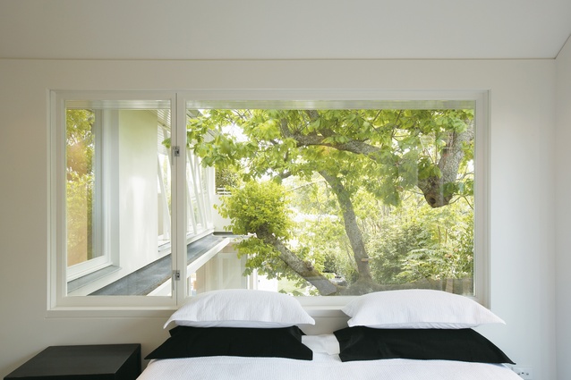
Houses Revisited: Light heavyweight
In Auckland’s most established suburb, Malcolm Walker demonstrates a deft touch with shape and space with this house from 2007.
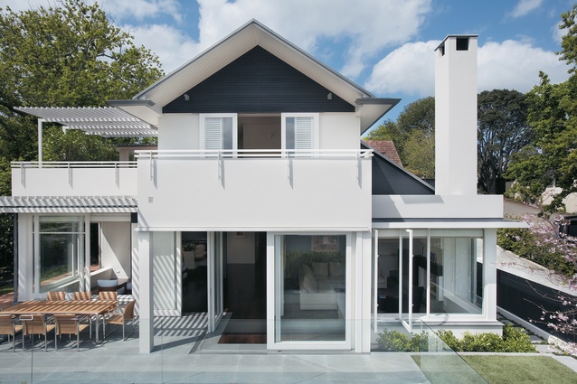
Newer houses in the Auckland suburb of Remuera often have a design aesthetic that seems to shout rather than smile. New projects here are well resourced, which sometimes creates the impression of excess and an absence of thoughtfulness. Two new houses that architect Malcolm Walker has designed for his client are as well resourced as their neighbours, but are also thoughtful, clever and comfortable homes.
The house on the front or west of the site (incomplete at the time of writing) was designed for the client and his family. This house, at the rear (east) of the site, is being developed for sale by the client. By far the majority of Walker’s projects are houses – usually not grandiose – designed for clients who will actually live in them; this client had to promise Walker he would try not to use the ‘development’ word in reference to the project.
The site was large enough to take five townhouses but the client opted for only two buildings, a choice that has allowed each house garden space. The houses were designed, Walker says, to be significant and strong spaces, but not to be impersonal or uncomfortable. “They’re made to live in, they’re not made to show off,” he says.
The long driveway leads to the section past another, street-side house. The site had a natural downward slope, allowing the rear house (that is, the one to be occupied by the client) to sit lower than front one. Each house is pushed to the edge of the boundary so that they can have some planting space and privacy from each other, and the neighbours. The area is quite densely populated, and the neighbours are quite close to the edge of the site.
The section of this house has a small front lawn with a modest-sized pool. Behind the pool, a boundary wall and trees and bushes serves to conceal the sibling house. A massive oak tree on one side of the house, which necessitated considerable planning work, dominates the landscaping of the garden.
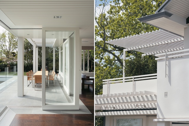
Stairs are cut out of the slope on this side of the house, and laid with heavy stone pavers. The stairs lead up the side of the house to a small deck on the top floor. The slight slope creates a sense of modest proportion and allows most rooms to have access to the outdoors. “You never feel detached from the site,” Walker says.

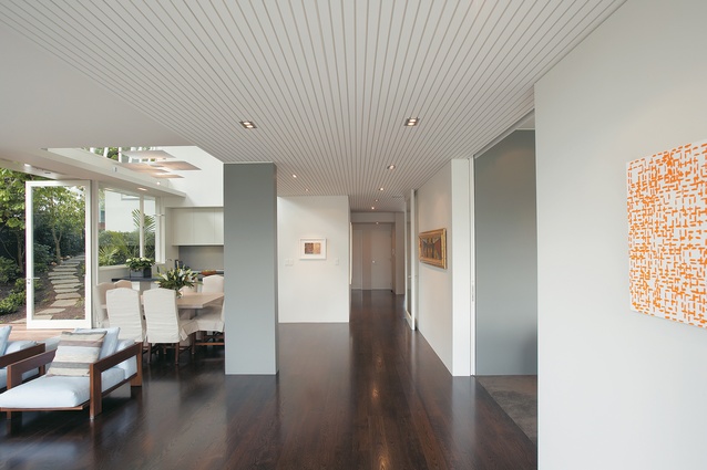
Well insulated with masonry, the house is a very stable environment. Double glazing and under-floor heating have been installed to provide comfort and warmth. The entry hall is a small room that leads into the much larger kitchen, dining and living room.
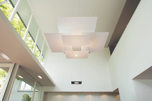
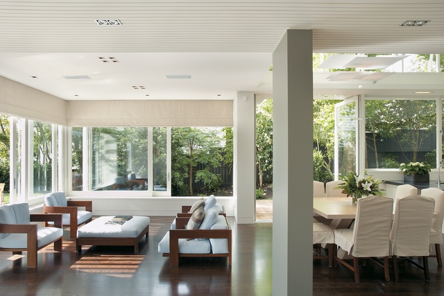
The kitchen is an open, double-height space with glazing and large glass doors on the north side framing a dappled green view of the oak. It is very light in this area, and surprisingly private. The kitchen, composed in an earthy, neutral palette, runs along the back wall and has a bench island.
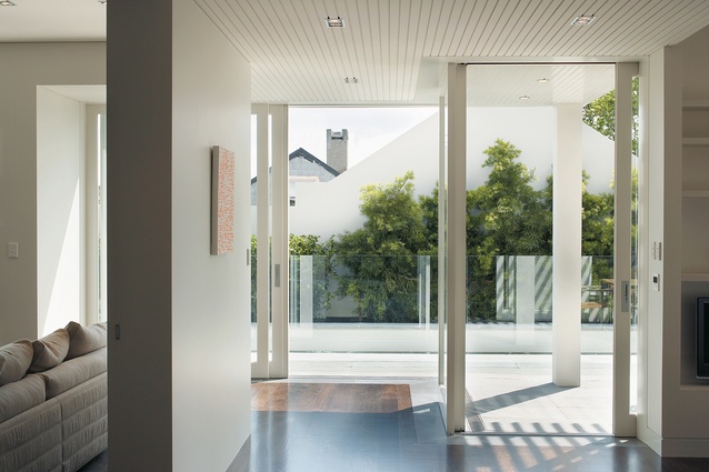
Another, second living room runs off this large space. The large, square glass door can be slid into the wall if needed. All of the house’s large, glass pivot doors are without door frames; there are no joints or hinges to obstruct the strong inter-spatial connections. The second lounge is home to the server for the home entertainment system. It also has a large gas fireplace and a mantel made of the same stone used in the kitchen.
The windows are pushed back to allow a small timber window seat (a trademark Walker element), a place to relax or just somewhere to put bits and pieces, the architect says. In the north-west corner this room is open to the larger, open-plan living area; if the door is open, you can walk a loop through the room. Near this opening is a set of doors leading to the patio. Again, the doors are frameless; when open they seem to vanish, preserving the connection between inside and out.
The stairs leading to the second level from the entry hall are wide and generous, consistent with the spatial arrangements through the house. A large landing has a display window dominated by the oak tree. The house feels big in a strong, comforting way; it has none of the coldness that often results from big volumes. The light and visual connection to the well protected garden in the stairway is also evident everywhere else in the house.
The upstairs has two areas. One has three rooms and a study area for children. Each of the two bedrooms that open on to the top deck have their own bathroom. Each of the bathrooms has a tall window, cut out above the door, letting afternoon sun into one and morning sun into the other.
On the western side of the top floor, the master bedroom has an en suite bathroom and walk-in wardrobe separated from the hallway by a large door and a slight level change. The bedroom has a private deck that looks back down into the kitchen and out over Parnell and the Orakei Basin. The small hallway between the two parts of the top floor is open to the double height living room below, bringing in light and offering views of the garden.
This house has the feeling of a family home – quite something, given that it wasn’t designed for a particular family. This effect was achieved, Walker says, by working closely to the client’s brief that his family needed to be able to live in either home. The house is spacious and light-filled, with green views from most rooms. The adherence to tall and strong spaces has given this house a sense of character that will, no doubt, be enhanced by habitation.
Click here to see more Houses Revisited. And sign up to our email newsletters to receive Houses Revisited straight to your inbox.

