Houses revisited: Lakeview house
This unapologetically bold house in Wanaka cantilevers over the outdoor living spaces without compromising the stunning scenery. First published in 2017.
It’s not unusual to separate private sleeping quarters and living spaces but, sometimes, with vision, this practical layout can inspire stand-out modern architectural form.
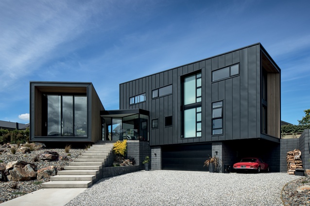
Conceived by Craig McAuliffe and Zachary Blue from McAuliffe Stevens, along with the clients, this 330m² home is defined by two distinct forms pulling away from each other, connected by a seemingly suspended glazed box atop a flight of floating stairs. McAuliffe calls this connection ‘a permeable threshold’; this idea of permeability and connectedness is important in understanding how this home has been assembled.
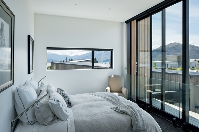
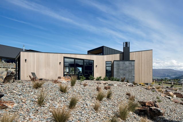
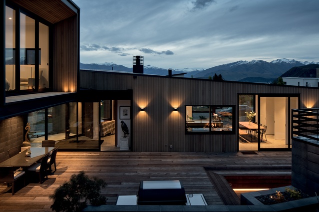
The timber-clad living wing extends out from the land, tilting towards Lake Wanaka and cantilevered over a rock garden. The steel-clad private quarters are in a single extension, projecting towards Wanaka township, while a third cantilevered box faces the rising sun and covers the outdoor dining and barbecue area behind the house. As these forms project towards the land, the living spaces within them are set back, providing a four-sided extension of the walls that becomes a shaded balcony.
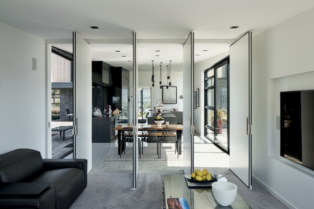
Fold-back doors in each room draw the outdoors into the living space. “Cantilevers deliberately play with the sense of area as they project and throw out over the landscape,” explains McAuliffe. “But to avoid them looking like a series of big portals, we found solutions – like scalloped soffits – that align with the internal programme and break down the scale of the mass.”
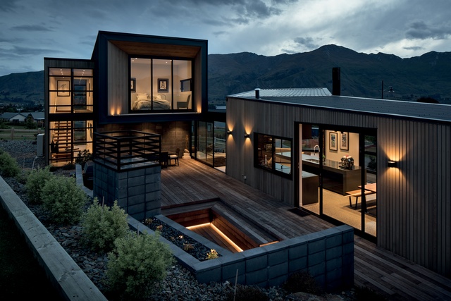
The glazed threshold facilitates the permeating of these opposing portals but also enables the views to be enjoyed from any of the three backyard entertaining areas, which simultaneously give shelter from the prevailing wind. This is demonstrative of the entire project: well-considered and purposeful.
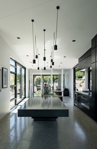
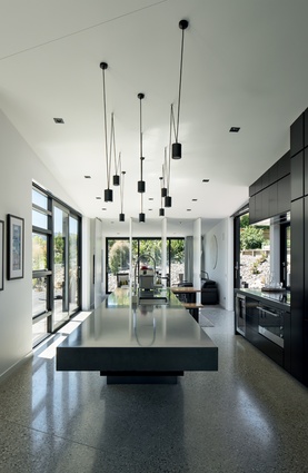
The theme of suspension is met at the micro level: bathroom cabinetry hangs away from the wall, the baths are freestanding, indoor and outdoor stairs seem to float, and a cantilevered kitchen bench, beautifully crafted in concrete, echoes the external form. “This is about allowing the aesthetic strength of each form to stand out, rather than colliding everything together,” says McAuliffe. “It is all part of the dichotomous language that defines the design.”
There is also a relationship between hard and soft. Private spaces are encased in a hard steel cladding, while the gently twisting living wing is covered in clear-finished cedar, which the architect says has a softer and more exposed feel. “It looks as though we dug into the side of the land to expose the earth’s crust. This excavation, along with the rock garden – an elegant solution with minimal maintenance – gives the home a feeling of being grounded despite all the floating elements.”
The house is dynamic, not only because of the movement the cantilevers produce but due to the dichotomy of hard and soft, east and west, public and private, floating and settled. This dynamism is enhanced by the clutter-free silhouette and subtle design strengths that protect the outdoor living space without compromising scenery.
So, while this home with its rocky landscape seems well-settled in its earthy place, it is neither restrained nor blended into the background. Rather, it is unapologetically bold and striking.

MATERIAL SELECTOR
Craig McAuliffe discusses his use of contrast, framing and shape in this Wanaka home.
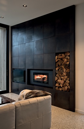
Black is a strong yet bold choice to use in large quantities in the house. How do you get the light–dark balance just right?
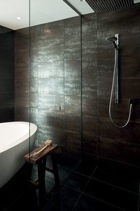
We tend to use a lot of contrasting colours or shades to test emotion. Dark materials for anchoring the senses, almost like nodes, whites to uplift or play with volume. We are always testing these ideas in a 3D environment, so have a good feel of the spaces we are developing.
The window framing is an irregular configuration on the front elevation in particular. Is this about framing the views?
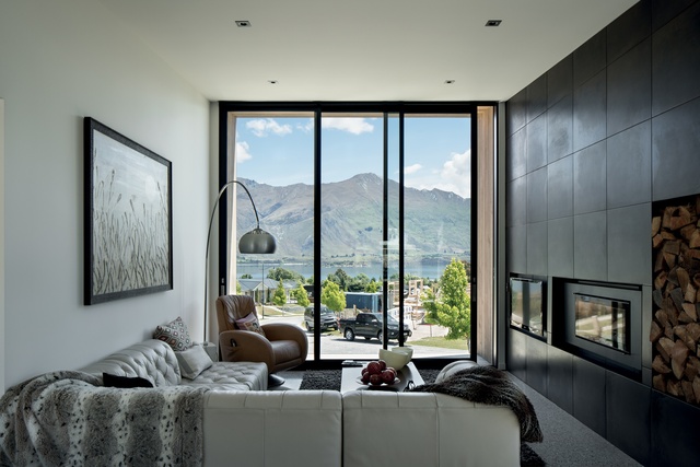
Somewhat, yes, because of the strong rhythm formed by the cladding ribs, and the interior programme. There are panoramic views from all rooms, so framing of views becomes a by-product anyway in Wanaka.
The cantilevered kitchen benchtop appears to float over the kitchen, how did you achieve this?
By a rather sizable steel frame, hidden in the detailing of the benchtop. The engineer had all sorts of equations for earthquake loading etc., but at the end of the day, you need to be able to use it effectively, and that may mean people standing on it!
Click here to see more Houses Revisited. And sign up to our email newsletters to receive Houses Revisited straight to your inbox.
Note: These are stories from our archives and, since the time of writing, some details may have changed including names, personnel of specific firms, registration status, etc.

