Houses revisited: Kiwi pav
Look back at this home on Auckland’s West Coast, where Simon Carnachan works up a modernist recipe for a casual beach house.
On one of West Auckland’s most exposed beaches, Simon Carnachan of Crosson Clarke Carnachan (CCC) has created a home that eloquently conveys the notion of shelter while remaining open to the surrounding landscape. The clients, described by the architects as “very private people”, presented CCC with a simple, straightforward brief, stating that they desired a three-bedroom home that took advantage of the section’s sweeping views of the Tasman.
Because the brief dictated little in terms of design priorities, the architects took their cues primarily from the restrictions (topography, wind, existing native bush) and opportunities (views, northern sun) presented by the site.
The house is situated on a long, narrow section that runs east to west with one end facing the road and the other facing the Tasman Sea. Although the clients also own the adjacent section to the north, they decided to build only on the southern section, leaving the northern one to buffer their home from the predominant wind. The house’s main axis, therefore, extends from east to west. The architects divided the house along this axis in terms of function, placing private spaces, the bedrooms and the home office, at the eastern end, and placing the more public spaces, the kitchen, dining room and living room, at the western end.
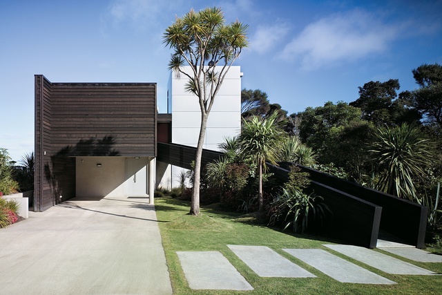
The house’s two extremes are distinguished not only functionally, but also in the different, almost oppositional, ways in which they enclose space and relate to their surroundings. One notices this distinction most strongly as one approaches and enters the house.
Upon arrival, the eastern façade presents visitors with two uninviting, windowless planes, the effect being that the house has turned its back to the road. The closer plane protrudes out over the carport and is clad in wood, while the further, taller one, is clad in wide horizontal bands of cool silver aluminium. Only a cabbage tree and a long black ramp enliven the blank façade, the cabbage tree emphasising the verticality of the silver tower, and the ramp breaking the otherwise strictly orthogonal composition by extending upwards diagonally.
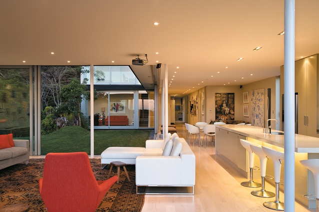
This initial feeling of impenetrability is only slightly alleviated as one moves up the ramp and slips between the two large masses into the small, tight gap that affords access to the house. Upon entering, however, the impression created by the protective eastern façade falls away, as stunning views of the sea draw one down the length of the house and into generous, light-filled spaces.

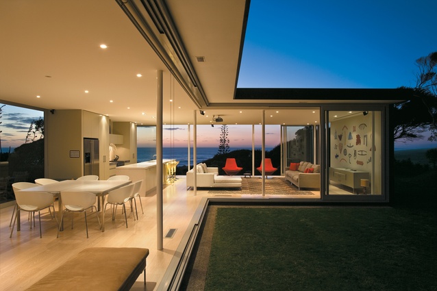
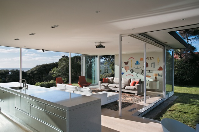
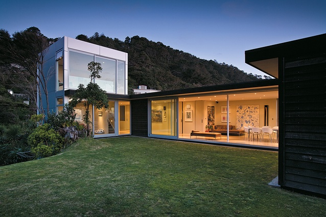
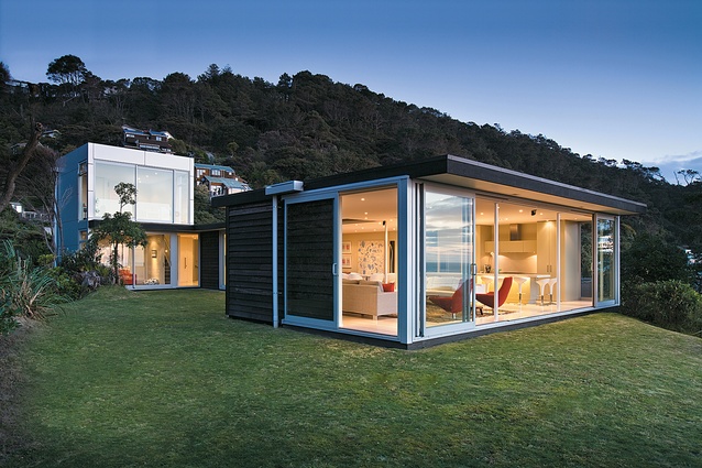
The western end of the house, with its wall-to-wall, floor-to-ceiling glazed panels, opens expansively onto the landscape and to the Tasman beyond. When, on a fine day, the panels are pushed to the side, the façade further dissolves, leaving only slender, white columns to delicately punctuate the view.
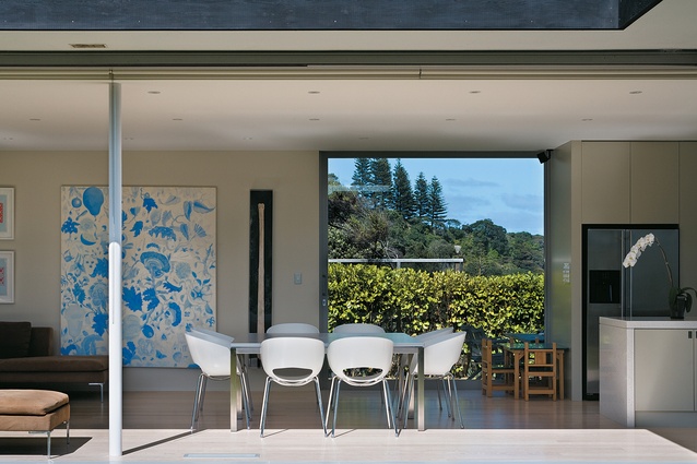
The openness of this end of the house is not limited to its western façade. The north-facing side of the house, which wraps around a rectangular courtyard, dematerialises in an equally dramatic way. All of the walls opening onto the courtyard consist of sliding glazed panels that, when fully opened, transform the courtyard in a grass-carpeted extension of the living and dining rooms. The feeling of openness at the western end of the house is so complete that the one solid wall, which stands behind the sofa, seems to have been provided solely and specifically as a surface on which to hang a piece of modern art.
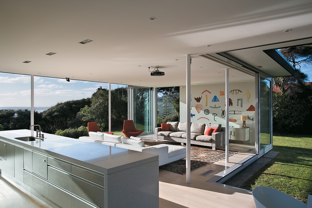
Another characteristic of the house is the lightness with which it relates to its surroundings, the softness with which it treads on the site. The house does not seek to dominate the landscape, nor does it seek to merge with it by hunkering down into the earth. Instead, the house rests lightly on the ground and interferes minimally with its environs.
For example, the architects have placed the courtyard on the only flat portion of the section to minimise excavation. They have designed the long, narrow entrance ramp, a defining element of the house, to avoid the removal of native bush. They have allowed only a slight increase in elevation from lawn to floor, and have provided little visual evidence of the concrete slab that the house rests upon. Both of these decisions strengthen the feeling that the landscape rolls right through the house, and that the house is placed lightly, even tentatively, on the ground.
From its minimal structure to the simplicity of its forms, Crosson Clarke Carnachan’s West Coast house is an exercise in architectural understatement. It is also a house that reveals the architects’ sensitivity to the exigencies of site. This does not mean that the house lacks beauty or drama, but rather that it creates both with a minimum of ingredients. The house itself makes no grand statements. Rather, it allows the landscape in to speak powerfully and expressively on its behalf.
Click here to see more Houses Revisited. And sign up to our email newsletters to receive Houses Revisited straight to your inbox.
[Note: Since the time of writing, the design practice featured may have changed name, personnel or both.]

