Houses Revisited: Housing acts
Paul Barry’s ‘Three-part house’ makes the most of a tight and tiny Wellington site in this project that was first published in 2009.
Wellington’s topography presents plenty of challenges to the Capital’s architects, but it offers opportunities, too. The city’s hillsides have always yielded little plots which design skill and imagination, and serious retaining walls, can turn into viable building sites. Reassuringly, the supply of these perilous spaces shows no sign of running dry: with some initiative, persistence and good fortune, you can still find a bit of left-over land that will support a house, perhaps even a driveway.
Architect Paul Barry found his own opportunity several years ago. It’s a small section – about 250m2 – that, for the developer of a townhouse scheme on a steep cul-de-sac off Glenmore Street, proved to be one site too far. “There was a bit of a fire-sale,” Barry says. You can understand why the developer decided to cut and run: this particular section is right at the top of a steep incline, and backs onto the sort of vertiginous, bush-clad, creeper-choked bank that would surely loom as ominously in the subconscious as in the view. God knows what goes on up that slope, in the impenetrable undergrowth. A constant stream of water pouring out of a pipe by the grunty retaining wall could be seen as a good sign: at least the creek running down the hill is draining, not pooling.
Looking further on the bright side, the verdant hillside is visited by the tui and keruru that have returned to this part of Wellington as recently-established nature reserves and the Karori Wildlife Sanctuary have augmented the eco-system of the adjacent Botanic Gardens.
If the natural environment in this part of the city is in recovery, the built environment has also proved resilient. Glenmore Street and its northwards continuation, Tinakori Road, constitute one of the finest urban strips in New Zealand. It’s an urban ravine, really, running between the Gardens on one side and Tinakori Hill on the other; close-packed cottages line the small side streets, and the shops in Thorndon Village are pleasant in scale (if rather twee in character). The sun sets early but you can walk to the waterfront in 20 minutes.
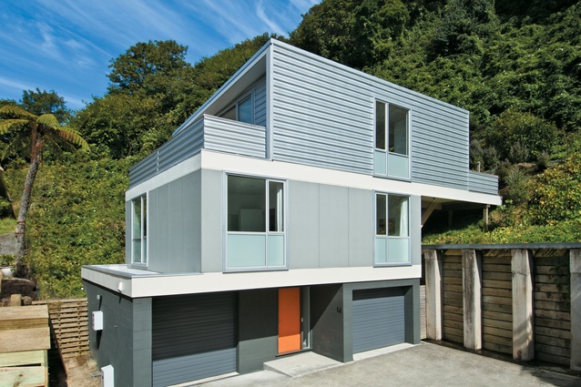
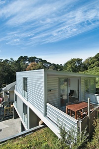
So: an affordable, if difficult site, in a diverting and evocative neighbourhood. The house Paul Barry designed was a residence for his own family and therefore – as is usually the case with an architect’s personal project – the subject of much investigation. There were some givens, of course: the shape of the house, Barry says, “was almost dictated by Wellington City Council”. Site coverage and set-back regulations, together with the programmatic decisions made by the architect, influenced the form, which is basically three stacked boxes sliding back towards the slope.
In determining an organising principle for the design, Barry considered the broad activities that might occur in each of the building’s levels. His method could be called gerund-based design – in fact, the architect makes explicit reference to this term – and, if you think about it, expressing the meaning of spaces in terms of verbs, not nouns, makes quite a bit of sense and offers quite a bit of freedom.
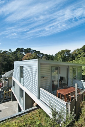
Accordingly, the ground floor is given over to the act of ‘arriving’. That decision was straightforward enough, but it was less obvious what ‘gerund’ should be accommodated on the first floor. In the end, Barry dedicated that level to ‘sleeping’, while ‘living’ was assigned to the second floor, which enjoys a prospect of the Botanic Gardens to the east and, from the terrace, a glimpse of the harbour to the north. Height also means more sunlight. “You don’t need a view or the sun to go to sleep,” Barry says, “although having the living up top means lugging the groceries up the stairs.”
Having chosen to organise the house according to the ‘acts’ undertaken on its various levels, Barry decided to signal the spatial differentiation in the construction materials and exterior colour palette. “The basic idea,” he says, “was to go from heavy to light.” The ground floor of the ‘three-part’ house is clad in concrete, the middle floor in fibre cement board, and the upper floor in extruded profile Zincalume. The exterior colour pales as it rises; Barry says he wanted the house, which is dug in at ground level, to feel lighter as it ascended – to reach for the sky.
This levity has not come at the cost of comfort. Barry acknowledges that the house did have a tight budget, but double-glazing was specified for the sleeping level – the architect intends to retro-fit the ‘living’ windows – and the garage has insulation under the floor and against its rear, dug-in wall. On that south-west wall, the architect has ganged up all the service pipes, out of sight from the street, but easily accessed for repair.
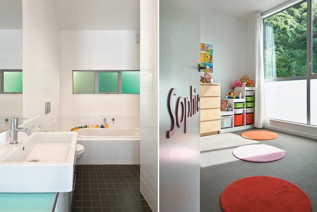
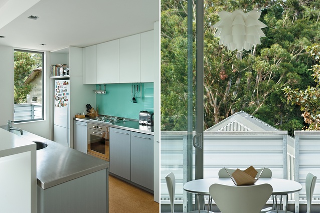
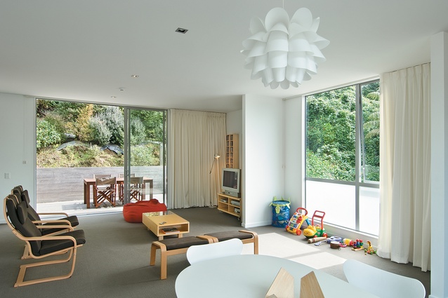
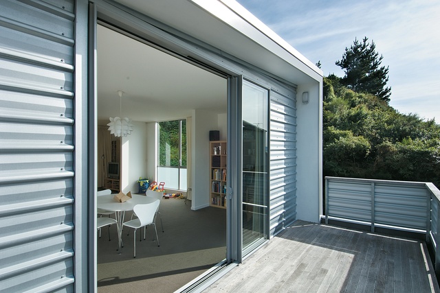
The second or ‘sleeping’ floor has been democratically arranged as three equal bedrooms, a configuration that broadens the possible constituency of the house beyond the nuclear family. (The house was tenanted when Barry accompanied his wife on her four-year work posting to Madrid). Up on its top floor, the house is a pavilion, with sliding doors at either end, one set giving onto a terrace that looks east towards an elevated section of the Botanic Garden, and the other to a sheltered balcony fitted in between house and rear bank. This long, simple room, with a modest but well-detailed kitchen at one end, gets about as much light as it’s possible to gain on this site while retaining privacy.
Throughout, the palette is neutral – white walls reflect the natural light and also suit the “different scenarios” of occupation. When more of the family’s art goes up on the wall – they have only recently returned to New Zealand – the house will quickly turn into a home.
This is an intrepid little house, which makes considered use of a demanding site, and meets the needs of a young family. Despite one or two “surprises” on this job – “the unknowns were in the earth” – the architect has not lost his appetite for building under the green mountain. In fact, he says, the spare, pocket-hanky parking area could support another house – one day.
Click here to see more Houses Revisited.
Note: Since the time of writing, the design practice featured may have changed name, personnel or both.

