Houses Revisited: Happy camping
Return to a Copeland Associates home that draws on the tropes of the Kiwi beach settlement for a Coromandel holiday house.
Camping in New Zealand is a pastime about which it is easy to get nostalgic. One remembers the sunshine, the relaxation and freedom offered by camping and readily forgets the times when rain caused the tent to leak, that constant feeling of being dirty, and the end-of-holiday packing up and cleaning of all the gear. New Zealand expatriates continue to buy coastal property here, seeking to reestablish their connections with their homeland and have their own slice of Kiwi paradise to satisfy that nostalgia, without the aforementioned hindrances, of course.
In this project, Barry Copeland of Auckland firm Copeland Associates Architects was put to such a memory-recovery task on a 14-hectare, native bush-clad site perched on the hills overlooking the Coromandel’s Hot Water Beach, a tourist hot-spot, but still largely undeveloped. Copeland’s client, who now spends the majority of his time in the U.S. and London, wanted to create a holiday base that typified the “New Zealand experience”, as well as providing the large spaces and mod cons typical of contemporary American homes.
Wholly aware of his “privilege in getting to work with such an un-spoilt piece of land,” Copeland was sensitive to the difficulties of integrating such a large inorganic object into the natural landscape. He says he “dedicated a fair amount of time in the early design stages to ensuring the building would fit in”.
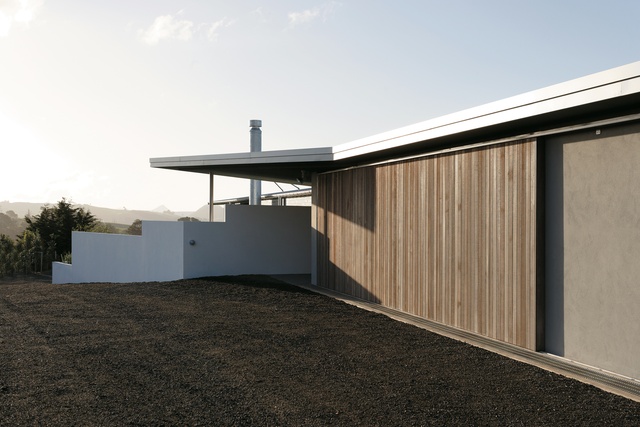
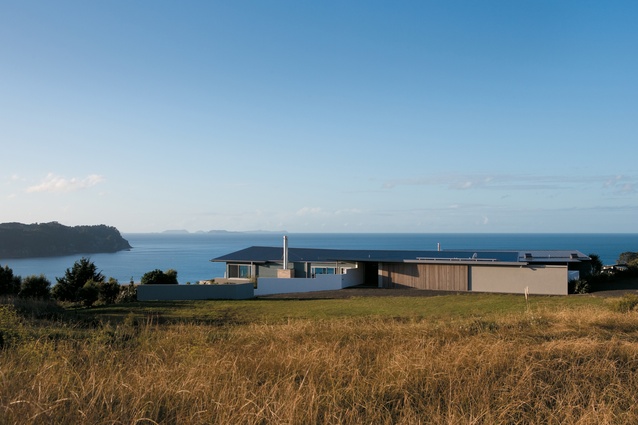
Copeland’s commitment went so far as to mocking up full-scale plans of the building with masking tape on the site as a way to explore, and be certain of, the best way to embed the property within the topography and fit the grain of the landscape. The result of such perseverance is that the building – from the beach, and also from the top of the site and from its interior – has an inherent feeling of alignment with and connection to its environment, a quality that adds a secondary layer of detail and thought to the design. Copeland describes the house as having the appearance of “exposed rocks projecting out from the earth”.
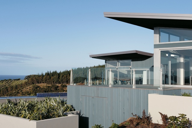
Although it is the most prominent house on the hill (not because of any unruly features, but simply because of its position), the building’s three low-slung pavilions that shape the plan of the house appear to lounge casually across the hillside. Copeland expects his choice of materials – earthy green stained timber and pale grey plastered walls – will, over time, weather into their surroundings, creating a house that matures in to landscape and begins to camouflage itself.
The house is reached by a steep and windy gravel driveway. The experience of being thrust from the magnificent grounds at the beach up the unsteady road serves to disintegrate the idyll of the local landscape. Once you make it to the top of the hill, the house – by forming a staunch barrier between the road and the sea – momentarily suspends the outlook that is anticipated from this altitude. This barrier, created by the expansion of a large garage, a windowless media room and the backside of the semi-enclosed barbeque courtyard, postpones the capture of a glimpse of the view until you make your way into the building.

Early on, Copeland conceived this house as an encampment. An appropriate concept, given the client’s use of the building as a New Zealand holiday base as well as the nature of the house as a refuge from the wild elements inevitably confronted on a New Zealand coastal cliff face. Upon entering the house, you become even more cognisant of the concept of encampment.
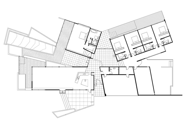
After a small foyer, which cuts through the centre of the house’s axial spine, you’re drawn into the house’s central space. Heavily glazed, and not of a typical shape, this space is defined by Copeland as “the crossroads”. This middle ground, traversed by the axial spine, is where two of the pavilions connect. The crossroads, then, is akin to the space between tents: the area with the bonfire (or, in this case, a wood burner) that everyone circles around.
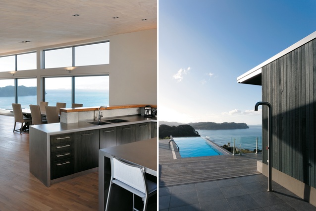
The axial spine, which begins by being dug into the rural landscape and housing the media room and garage, thrusts itself towards the sea as a container for the kitchen, dining and living spaces. Its northeast and northwest elevations open out towards the sea views.
The space is further opened by sprawling out onto courtyards on either side of its length, on the western side becoming the sheltered evening barbeque courtyard, while the eastern side reaches towards the infinity pool. The living spaces are large, but the retention of camping casualness has been achieved by keeping the material palette neutral and raw. White-washed timber ceilings, natural timber floors and walls painted in pale shades are used throughout.
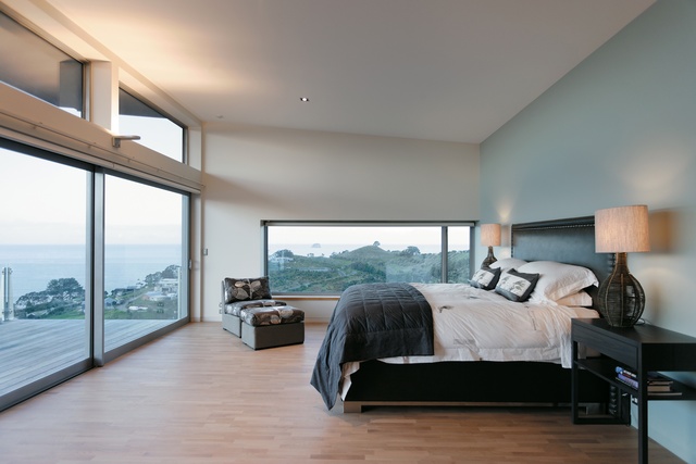
The master bedroom pavilion extends northwards: as with choosing a campsite, when you scout around assessing what will be the best spot to place your tent, the decision about where to locate the master bedroom was, Copeland says, taken after asking the client to point out his favourite spot on the site. The third pavilion, which accommodates the guest bedrooms, completes the encampment. This guest wing departs from the informal trope of the camping trip, and heads in the direction of the modern holiday house which allows for formal entertaining.
The pavilion’s plan is simple: all four bedrooms are identical; they are simply reflections of each other. Each bedroom contains an en-suite and a walk-in wardrobe, complete with suitcase holder. Although guests are provided all the conveniences of modern luxury, the effect is that of the impersonal hotel room.
This house requires no ‘roughing it’, but as its environment, and its occupation, often changes, the camping concept retains some credibility. For the most part, this house has achieved camping casualness. The house adopts many camping principles, but at the same time provides a spot for a luxurious holiday with magnificent views: a realisation, indeed, of the Kiwi coastal reverie.
This article first appeared in Houses magazine


