Houses Revisited: Happy camper
Faced with a spectacular but challenging East Coast site Nicoll Blackburne Architects took to the tent in this home, first published in 2007.
It’s hard to beat camping along New Zealand’s coastline, when the sun’s shining, that is, and the breeze is a gentle zephyr. But when the sun goes away, the wind gets up and the rain comes down it’s a different story. Then campers must hope their site is right, their tent is strong and their pegs secure. If so, they’ll have protection, privacy and a firm foundation for enjoying a littoral view.
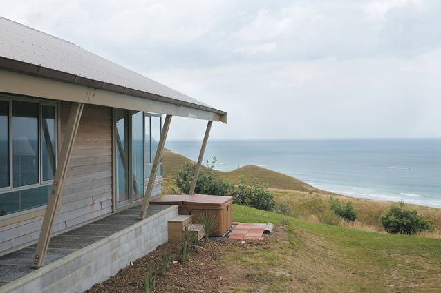
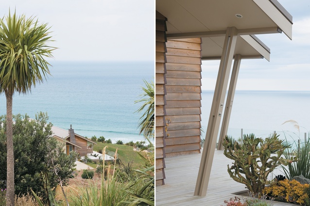
It’s no surprise, perhaps, to find these camping basics observed in a 260m2 home high above the white sands of Gisborne’s Okitu Beach, where the near-180 degree ocean view stretches from well south of Young Nicks Head north up the East Coast. The house, designed by Graeme Nicoll of Gisborne practice Nicoll Blackburne Architects, mimics summer camping. Its brave pitched roof, protective tent-fly eaves and metal tie-downs offer a refreshing counter to the orthodoxies of flat roofs and “computer-screen” glass.
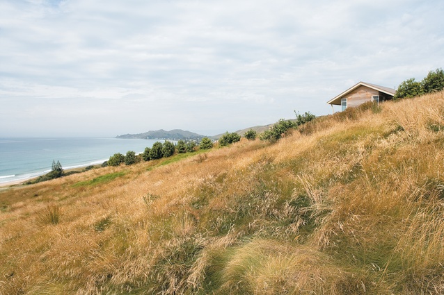
The house’s linear form affords year-round, all-weather enjoyment of an ever-changing panorama – the very reason the site was bought. Graeme Nicoll knew the ridge well, he had watched and assisted in its slow transformation from farmland to exclusive residential development. He designed a house further along the ridge in the mid-1990s; his business partner James Blackburne designed the house next door to this home in 2004. This site has many challenges: it faces south, is hit by strong winds from all directions, and supports a reduced building platform because of the instability of the terrain.

The clients, Sheila and Michael Kingston, wanted ample wall space to display their collection of exotic artwork and rugs gathered during extensive travels. “[The Kingstons] didn’t want a glass box, “ says Graeme Nicoll. “They had lived in old cold houses and more recently a cottage. They wanted rooms that could be opened up or closed off as required. They didn’t want an open-plan kitchen, or the smell of cabbage in the living room.” Like many people of retirement age, the clients wanted a home to complement a relaxed lifestyle, with spaces for entertaining and accommodating family and friends. They didn’t want the sight of cars and trucks on the highway below intruding on their tranquil landscape, and they didn’t want to be on public display.
The architect deliberately made his first site visit during a wet and windy southerly storm, complete with horizontal, almost uphill, driving rain. Instead of offering protection, the hill to the west accentuates wind speed with its aerofoil effect. “I had to overcome the contradiction of creating a rustic look in a modern house,” Nicoll says. “I had been reading A Singular Architectural Practice, Haig Beck and Jackie Cooper’s book on Glenn Murcutt. I was impressed by Murcutt’s lineal plan forms and the way he treated overhangs and roof forms as environmental controlling elements. A lineal plan form had gelled in my mind from the initial visit but the building platform – restricted to an 1160m2 rectangle at the top of an 8370m2 site facing south – didn’t enable it to be truly adhered to. As a result, the garage and visitor bedroom wing were offset. This conveniently helped create the north-facing sheltered courtyard.”
“You have to face the view,” Nicoll says, “but here’s the typical New Zealand coastal architecture contradiction. Most coastal bays have the best views facing south, and the sun is on the other side. I could see how Murcutt used the architectural elements to act in various ways. I brought in the tent fly concept and wedged it with tent poles into the ground. It accentuates the view and gives an intimacy and sense of security and protection. Even on hot days, you’re protected from the blaze of sun.”

The lineal theme is apparent in the open passage, from the front door opening to the uninterrupted walk to the master bedroom, and accentuated in the protective 1.5m overhangs. “The low horizontal form of the eaves plays on the horizon, provides an uncanny limited view of the outside by framing and even restricting, especially the sky. One is aware of being protected.” Nicoll says there is no need to provide a full view from every room: “I see it as framing a scene from inside. There’s a different picture as you move from room to room. From the courtyard on the north side, there are still glimpses of the sea through the windows.”
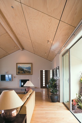
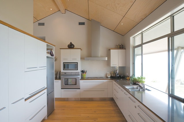
Views have been cleverly incorporated from all rooms, even from the north-facing sunny courtyard and the bath, sunken to maximise the vista, neatly tucked in where the room height drops. The frames of double-glazed sliding glass doors in the living, dining and master bedrooms are cannily kept to the outside, and are invisible from inside. This strategy is complemented by the use of internal cavity sliders that enable the lounge, study and main bedroom to be closed off when desired. Bleached pine and negative detailing in the pitched ceilings create space, echoing the expanse of the outdoors. The desired rustic look has been achieved through the juxtaposition of cedar (which has already weathered), copper and plaster.

Nicoll believes that architecture should endure, and he seeks to design interesting houses that marry form and function. (In the case of the Kingston house, Nicoll’s peers judged he had succeeded: the house won a 2006 NZIA Gisborne/Hawkes Bay Branch Award.) He says he is not fad-driven, nor concerned to produce an identifiable Nicoll Blackburne “look”. Listening to clients’ wants and needs, and responding to the demands and opportunities of the site are vital to the design process.
“It’s important to know how clients want to use particular spaces, how they live, how they would like to live. Then we use our expertise to incorporate that into the design.” Nicoll says. For example, Ms Kingston wanted her own study that she could retreat to; her husband wanted a deck at floor level off the dining room and a spa pool outside the bedroom to take in the night sky and the lights of the nearby Wainui-Okitu settlement.
The client’s brief was basic but they are pleased with the result: a comfortable home that takes advantage of a superb view, yet is intimate, private and protected. Just like camping by the sea, except that here every day is a good day.
Click here to see more Houses Revisited. And sign up to our email newsletters to receive Houses Revisited straight to your inbox.
Note: These are stories from our archives and, since the time of writing, some details may have changed including names, personnel of specific firms, registration status, etc.

