Houses revisited: Grey Lynn renovation
For many owners of period homes, particularly the ubiquitous villa-style properties found throughout the country’s cities and towns, renovating has a practical purpose as the profusion of small, pokey rooms favoured by our forebears tends to be at odds with the modern lifestyle.
A desire for additional living space, as well as off-street parking — another aspect often missing from early 20th century inner-city houses — was the catalyst for the owners of the featured property to call on friend and architect Jonathan Smith of matter to devise a scheme that realised their wishes.
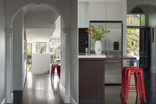
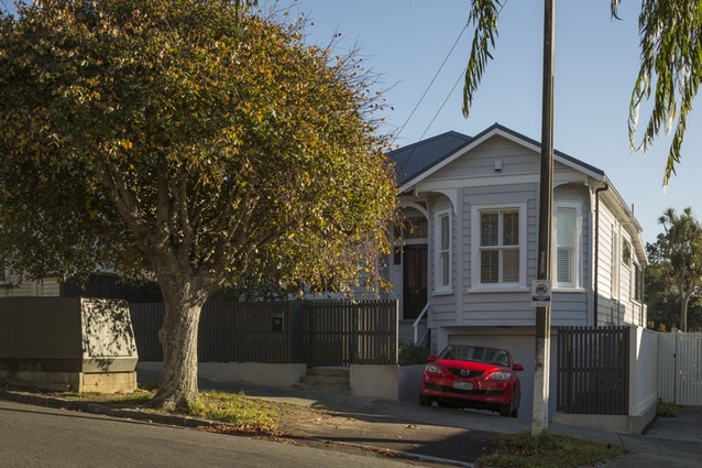
“Aside from a previous renovation 20 or more years ago that incorporated a modern kitchen, the house had pretty much kept its transitional villa detailing,” says Smith. “While not a heritage site itself, an important consideration was to maintain the existing character, which along with the street-facing façade included a plaster ceiling designed to look like pressed tin, an original fireplace and the arch in the hallway.”
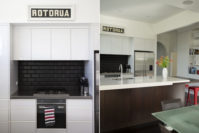
Maintaining these elements while giving the renovation its own distinction came down to creating a seamless flow from the front to the back, augmented by the choice of materials and the hierarchy given to the various spaces.
“Coming in the front door you’re at the heart of the original structure, the central hallway leading off to the rear of the property,” says Smith. “Experientially, as you make your way through the space there is a sense of the hallway falling away as the space opens up, firstly on the right into the new kitchen/dining area and then off to the left and the new lounge. To maintain a sense of that inital axial relationship, a small window has been inserted into the rear wall, which acts to reinforce the lineal progression.”
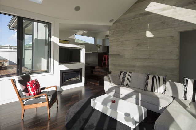
Features such as the timber flooring have been used throughout the upper level to impart a sense of cohesion, while varying ceiling planes and forms act both as a visual reminder of the original demarcation of spaces and as a distinction between the old and new.
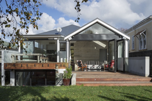
“Internally, this is almost subliminal in its effect,” says Smith. “Externally, we’ve played with the roof forms to define the different spaces - traditional villa roof, flat-roofed kitchen extension and a simple gable roof for the new living area.”
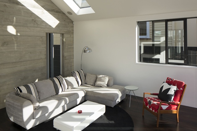
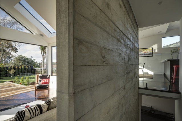
Less subtle, but no less effective, is the off-shutter concrete wall in the new extension. Evocative of weatherboards, the wall also marks the position of the former external wall — another nod to the relationship between old and new — and has the additional benefit of providing passive solar gain.
Downstairs, a completely new level has been excavated. With no precedent for the spaces, these are sleekly modern with built-in joinery and carpeted floors. This level includes a family room, laundry, second bathroom and the all-important garage. From this space, a paved courtyard, partially covered by the deck above, leads to a series of terraced garden beds and the now level rear yard.
Click here to see more Houses Revisited. And sign up to our email newsletters to receive Houses Revisited straight to your inbox.
Note: These are stories from our archives and, since the time of writing, some details may have changed including names, personnel of specific firms, registration status, etc.

