Houses Revisited: Full nelson
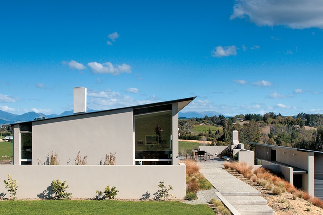
Sited on a grassy spur above Waimea Inlet this house, first published in 2006, by Jeremy Smith looks east to Tasman Bay and west to the Kahurangi mountains.
The brief was clear, for all its apparent contradictions. Having found and bought (in a day) the 1.8ha paddock on a grassy slope running down to the Waimea Inlet, the owners, a sociable, semi-retired couple, asked Jeremy Smith of Nelson’s Irving Smith Jack Architects to design a home that opened itself to the views and the sun, yet had ample wall space for art; was a comfortable space for two people, but was ready to welcome a crowd; had a separate building for guests, which still felt connected to the main house; and had a clean, contemporary style that would also be at ease with a collection of antique furnishings.
An obvious building site bestrode a small spur looking straight out over the tidal estuary that washes in and out from Tasman Bay. Smith’s approach was to split the living spaces into two rectilinear forms either side of the north-south spur, connected along the spine by an external courtyard. Virtually no earth was moved, and nearly all outside areas have been kept to ground level. Rather than just sitting on its section, the house is designed to be of its site. “The idea is that it engages the site and uses it internally and externally to make what is quite a small house seem larger,” Smith says.
Located in a district of lifestyle blocks, and reached by a rural driveway, the main house (166m2) is set to the east on the highest point of the spur, with the garage and guesthouse (94m2) directly in front, below the central courtyard. The fine, horizontal planar roof forms, which reflect the ridges of the spur, aim to create a displaced roof landscape linking the two buildings and the external spaces.
Square, shallow steps, encroached upon by grasses spilling from dense clay soil, skirt up to the main house, past a small lap pool wedged between a low wall and the northern end of the house. The reflections off the water, and a row of tall reeds, soften the solid north aspect. There’s a promise of big views through a side window but little is given away until you turn to face the entry where, rather than being met by a front door, you’re greeted by a long set of bi-folds and a horizontal slatted screen above. The screen continues through to the inside and in one sweep takes you right into the central space and leads you out over the eastern courtyard.
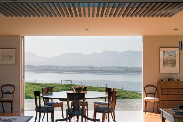
By carefully building up the bank below, the architect has contrived to make it seem that the hillside has dropped away completely. Wishing, of course, to take advantage of the yawn of the estuary to the east and the Kahurangi mountains to the west, Jeremy Smith worked for a sense of transparency and visual connection throughout the house. There are continuous views and openings from one side to the other in every room. “It’s about getting people to the edges of the buildings, which is where you want to be in this climate,” Smith says. The wide bi-folds and external-mounted sliding doors and windows allow the owners to choose between sun and shade, to close off one side to the wind or open it all up on a calm day. When the sun is at its zenith, the solid north end blocks it out, keeping the house and furnishings cool.
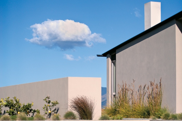
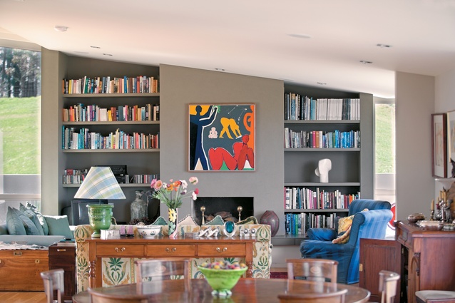
Adding some movement and relief to the essentially rectangular structure, the lightweight concrete walls and plywood cladding of the exterior step out to give width for living areas and tighten at entry points. Inside, a rich collection of antique furniture and oriental rugs, and a side area with exposed rafters and an inset window seat, serve to delineate and break up the open space. An 1880s circular walnut table dominates the centre, sofas and enclosing walls define the fireplace (the only form of heating apart from the sun) and built-in shelves are placed at the northern end. Large colonial-era pieces are accommodated within the living space, which increased in size at the owners’ request more than once during planning.
Picking up on the warmth of the furnishings, the diverting quality of the artwork, and the affable nature of the owners, the breezy blue kitchen to the right of the entry facilitates all-round socializing, keeping the cooks at the centre. The side bench opens directly onto the central courtyard and open-air fireplace – the owners eat outside most days, winter or summer.
The continuous American oak flooring, and the muddy colour palette chosen to reflect the estuary, tie the kitchen/living and compact bedroom areas together. Past a small breakfast deck and study, the master bedroom at the front of the house runs right off the spur and is cantilevered out over the point to provide a spatial ending that defines the bedroom as a more private space than the open living area. The gap beneath also allows the guesthouse a view through to the inlet (and it’s perfect for the wood pile).
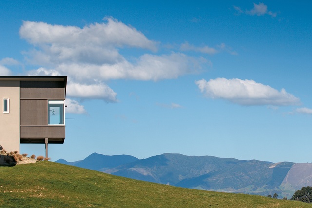
Still true to its outside-inside living ethos, doors open at the end to a slightly dizzying balcony with an invisible glass balustrade, outdoor shower and transparent door through to the ensuite. Windows on all sides frame either a snowy Mt Arthur or wriggly tidal streams – the plain wooden-plank-and-rubber-strip flooring suggests a ship’s deck. The guesthouse below is hidden by a large retaining wall, built up to act as a fence between the two house structures and provide the central, connecting courtyard with some enclosure and shelter. Separating and lowering the guest building fulfilled the owners’ desire that the views from the main house not be interrupted by the extra bedrooms or the garage. Steps lead down behind the wall to the simple two-bedroom, bathroom and kitchenette quarters, frequently occupied by friends or family.
The house, which came in at $650,000, is connected to the landscape, and provides a clean backdrop for the lives of the owners, and for furnishings and artwork accumulated over the years. The owners are completely at home with the design (the recipient of a 2006 NZIA Nelson/Marlborough Local Architecture Award), which moves easily between quietly comfortable and openly social.
Click here to see more Houses Revisited. And sign up to our email newsletters to receive Houses Revisited straight to your inbox.
Note: These are stories from our archives and, since the time of writing, some details may have changed including names, personnel of specific firms, registration status, etc.

