Houses Revisited: Fresh start
Fulton Ross Team Architecture’s Rangiora retreat relates to its site and local types, in this home that was featured in Houses magazine in 2008.
The rural landscape around the country town of Rangiora, twenty minutes north of Christchurch, stretches out like a lush, green tablecloth, encompassing fat hawthorn hedges, stands of huge oak trees and paddocks filled with grazing animals. In a twist in the usual holiday house tale, a Christchurch couple has chosen to build a rural retreat in this sleepy locale – a simple, elegant hideaway that is the complete antithesis of their large, beachside, city home.
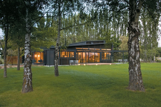
Christchurch architect William Fulton, of Fulton Ross Team Architecture, took his design leads from the unhurried environs of the site, the client’s brief for “a quiet house”, and the vernacular language of surrounding farm buildings. The end result is a collection of uncluttered forms at peace with their setting. Hemmed in by paddocks, the house sits well in a green lawn surrounded by large established trees, well away from the road. Harmony, tranquility and, usually, silence prevail.
This simplicity is deceptive. Arrived at via a close collaboration with a client with an astute understanding of architecture and the mutable design processes required to bring a building project to completion, the house was born out of a protracted attempt to ‘rescue’ the original Seventies home that previously occupied the site.
“In the end the original home wasn’t fixable to the client’s satisfaction, so it was demolished and we started afresh,” says Fulton. No doubt the architect contemplated this decision with some relief, and also welcomed the freedom from the usual planning constraints of inner city design. “And,” he adds, “with no near neighbours or recession planes to consider we had an open page.”
With the original overgrown garden cleared of 22 tonnes of waste, Fulton and his client settled into design discussions that centred on the concept of an elegant, comfortable country house sitting quietly in the paddocks. For Fulton there was obvious inspiration in the local rural buildings, and his design for a “small cluster of farm buildings around a requested raised central courtyard” was readily accepted by the client.
The design may have become more sophisticated in terms of colour but the three forms have remained true to the architect’s original model. The simple plan follows a classic U-shape, with the entrance forming one side of the raised courtyard. A guest suite sits to the right of the entry facing east; a long, open-plan kitchen-dining-living area is oriented to the north and views of Mt Gray; and a two-storey form encloses the west side of the courtyard, featuring a garage and the upstairs main bedroom. A long slim gallery runs between the central building and the other two forms; it can be closed off to conserve heat in winter.
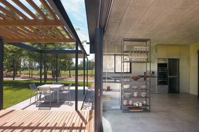
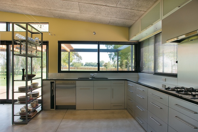
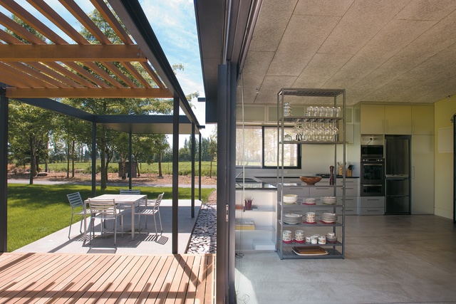
The interior is finished simply. Almost industrial in its economy, it features a sleek silver Melamine kitchen with granite and aluminium surfaces, open shelving and sanded concrete floors that sweep throughout the main living areas. The furniture is comfortable and elegant.
Attention has been paid to thermal efficiency and sustainability. All skirting boards are removable to accommodate extended and upgraded wiring; hot water cylinders can also be easily removed; living areas are oriented to the sun with concrete flooring acting as a heat sink; windows are double-glazed; and an impressive Swiss stove burns wood from the client’s large and growing woodlot with very little particulate matter. Woodtex ceiling panels have been used to ensure the reflective large volume space is a comfortable, non-echoing acoustic environment. A gas heater provides fast heat when the owners first arrive at the property.
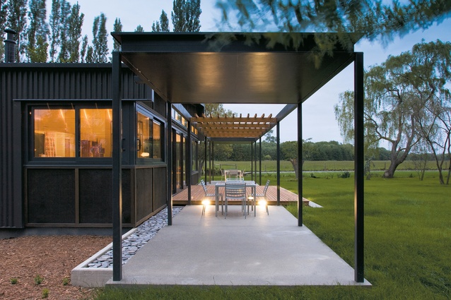
Externally, the home’s most distinctive feature is a Colorsteel roof that runs over the top and down to wrap the east and west sides of the house. North and south ends are recessed plywood; cedar sunshade and Victorian ash deck stretch along the north face. The colour of the building – charcoal grey – was chosen specifically so that the cluster of trapezoidal forms recedes into the landscape.
Particular attention was also paid to window punctuations – their placement within the form and the views they set up. The building is far from being an enclosed form. It connects to its environment in all directions with transparent views that run east-west and north-south. This transparency is key to the creation of the sense of calm with which the house is imbued and is crucial, too, to the clients’ enjoyment of their rural surrounds.

From the outset, the clients expressed their desire for a rural retreat that would settle comfortably into its immediate five acres of grounds. Their intention is to plant large numbers of trees and the initial landscape design has already been mapped out. The large grass lawn that runs to the edge of a small stream is a central feature of that design: “Without that the house wouldn’t be complete,” the client says. “We wanted a very natural outlook and [landscaper] Glenn Scott has given us that.”
William Fulton’s approach to this project was characteristic of much of his practice. Long sweeping lines, an avoidance of fussy detail, the use of straightforward materials and a respect for the New Zealand vernacular and client brief are what he considers to be the defining elements of his architecture. “It’s important to me to be true to the materials – solid, good quality materials treated with a lightness of touch – and to avoid too much embellishment,” Fulton says.
The design and construction of the house, which received an NZIA Canterbury Branch award in 2007, has been very satisfying for Fulton, who says he enjoyed working for a client who embraced the project from start to finish. “It has been very much a team effort, and we’ve all put a lot of careful thought into creating the sense of serenity that prevails here,” Fulton says. “It’s as if the house has always been here, and the client feels very much at home. That’s how it should be.”
Click here to see more Houses Revisited. And sign up to our email newsletters to receive Houses Revisited straight to your inbox.

