Houses revisited: Freemans Bay house
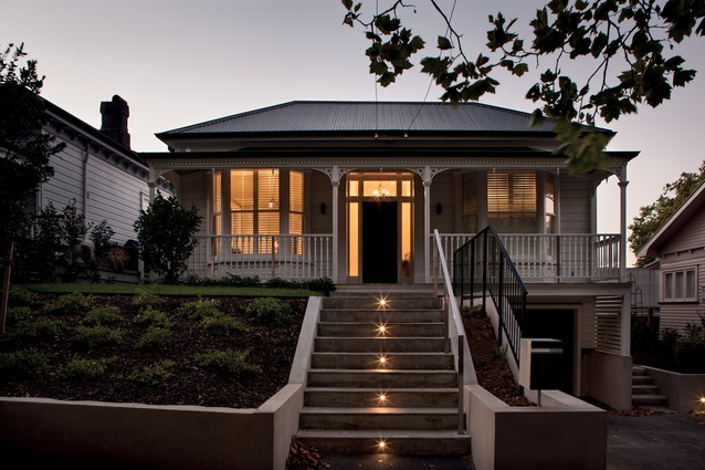
Perched atop a barbeque in her high heels appeciating the view out over the Auckland suburb of Freemans Bay, architect Jane Aimer knew that the renovation of this villa was not going to have a predictable solution.
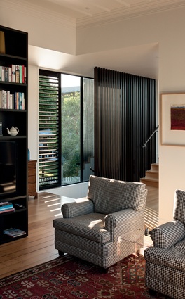
‘Do you see the view? That’s what we want to capitalise on’, Aimer’s clients told her. They also told her that they wanted to maintain the connection to the garden but didn’t want access to be off a deck, as was the present case. Like many early-1900s villas, this one featured the expected lean-to addition, added sometime around the ‘30s to house a basic kitchen. This in turn led onto a raised deck, itself added at some point, most probably in the ‘80s.

“The obvious and most straight-forward solution would have been to remove the lean-to addition and deck and replace it with a similar yet much more considered form,” says Aimer, a director of Scarlet Architects. “However, that was something that the clients most definitely did not want. The challenge then became to fulfill their requirements for a light, bright sun-filled home that challenged people’s pre-conceived notions of a villa makeover.”
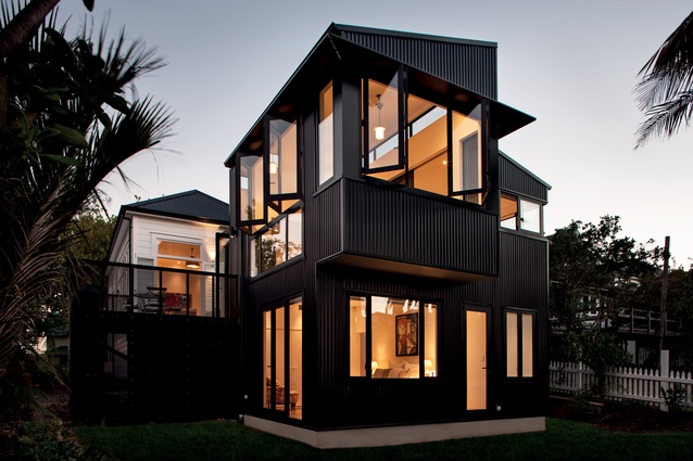
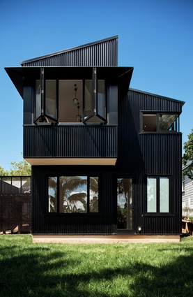
Aimer’s solution was to remove the lean-to and deck and then create a separate two-storey structure linked to the villa but with its own vernacular. “The villa is in a Residential 1 zone, which meant having council’s heritage architects assess the plans for the addition. They were very keen for us to express the addition in a way that truly made it distinct from the villa, which of course, was our intent right from the start. We wanted to reference certain heritage forms, such as the lean-to shape, so we kept the sloping roof plane but rather than simply attach it to the villa we rotated the structure ninety degrees and pushed out into the garden.
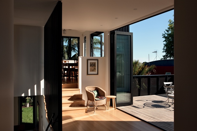
“The resulting monopitch roof forms are a nod to the past but with the contemporary twist. Similarly, choosing to clad the new structure in corrugate takes a traditional material and utilises it in a modern way.” Rotating the axis also meant that the addition could be oriented towards the sun and view, a main stipulation of the clients.

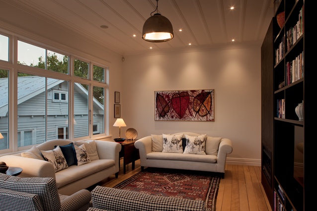
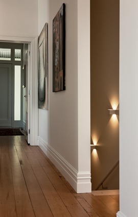
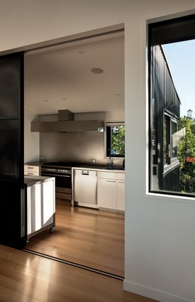
Internally, the addition houses a separate kitchen — another stipulation — and the dining room, which are half a level above the villa, while downstairs is a bedroom suite with access to the garden. “We did some excavation to replace the existing off-street parking with a new garage. Internal stairs lead from the garage to the villa, while a glazed gallery is the linking element between old and new. In this space we expressed the original ceiling and flooring to show where the delineation between existing structure and new build merged in what is now an open-plan space,” says Aimer.
“For me, the real success of this project began with clients who were ready to try new things and who challenged us to be adventurous. This solution has been specifically tailored to the clients’ needs, rather than as a quick do-up-and-sell measure, which is what makes it work. There is a real sense of surprise with this house, which is magical. You enter what is a very nice, measured response to the traditional villa and then you have your perception completely rocked when you come through into the new extension. The transition is very unexpected and very dynamic.”
Click here to see more Houses Revisited. And sign up to our email newsletters to receive Houses Revisited straight to your inbox.
Note: These are stories from our archives and, since the time of writing, some details may have changed including names, personnel of specific firms, registration status, etc.

