Houses Revisited: Family court
A look back at a 2007 design by Eva Nash (neé Segedin): A beachfront house in a lifestyle capital gives the opportunity to demonstrate filial devotion.
Mount Maunganui is one of the self-proclaimed lifestyle capitals of New Zealand. It is a reasonable claim. The weather is warm, there is a sprawling beach and the settlement is small enough to ride your bike without fear of cars. R&R has long reigned supreme, that is until it was reduced to a secondary concern by real estate. A drive down the Mount’s main drag is enough to see that the pace of life here might not be fast, but the real estate transactions are. Most of the beach sections have been subdivided twice over, with three or even four houses one behind the other. Architect Eva Nash’s (neé Segedin) client was fortunate to have bought a beachfront section a few years ago.
Nash was able to use those years to familiarise herself with the site, as she’s the client’s daughter. Working with family was an easy collaboration, Segedin says. Her insider knowledge was an advantage during the design and building process – the only down side being the available-at-all-hours policy. The brief called for a home where family and friends could stay and be entertained comfortably. The architect had to make the most of the knock-out view, and ensure the house had some protection from sea winds.
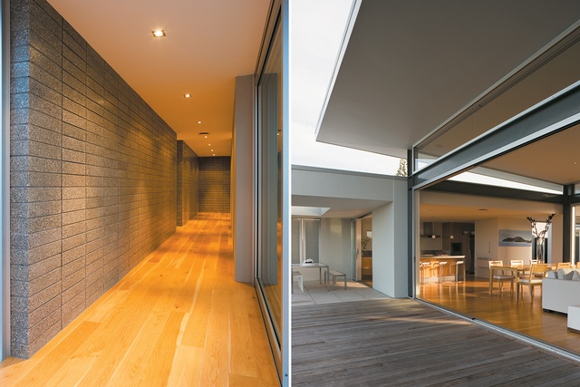
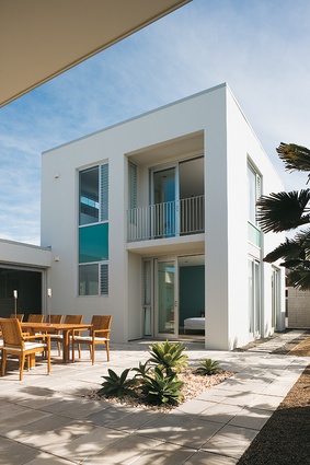
The new house sits on a sub-divided site, with the neighbour on the street side. A gate marks the division of the section and beyond it lies a parking area the size of a small car lot. This, too, was part of the brief: the provision of parking means guests don’t have to leave their cars on the road. The entryway is discreetly located behind a double garage. This, the backside of the house, is very neutral – a two-storey white block with narrow slot windows gives nothing away. To the left a path leads around the outside of the house to the courtyard and beach. To the right is the front door and beyond it a small entry hall, dark and solid with walls of honed grey brick in the manner of a bunker or vault.

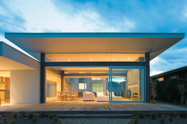
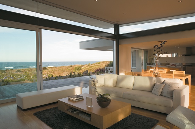
Further down the hall the solid walls give way to glazing on both sides and a spectacular view of the sea is revealed. Nash has used the entry hall to create a clever theatre of suspense and reward. To one side there is a large courtyard, and to the other a smaller one. The entry becomes a long hall that forms a bridge between the house’s two wings, one solid and private, the other light and transparent. The glass pavilion – in effect, one large room – houses the living, kitchen and dining areas. Doors open onto the deck and beach at the front and onto the courtyard at the back. The ceiling is raised towards the beach, with a large overhang above the deck.
The transition between heavy and light has been managed with a consistent use of materials to prevent a sense of abrupt change. The timber floor runs from front door to deck and the brick of the entry wall is repeated in the wall that anchors the lounge and protects the room from the gaze of the neighbours. The kitchen on the opposite wall also acts as a counterweight and provides a space for necessary utilities.
On a warm day, the architect says, the courtyard, deck and living areas function as a series of outdoor rooms. When the wind is up, the courtyards are sheltered alternatives to the front deck. Significant in its dimensions, the larger courtyard is about a third of the footprint of the house; as it is easily accessible from all sides it feels like an integral part of the home. It was Nash’s intention to lessen, as much as was possible, any disconnection between indoors and out, and the courtyards are central to this ambition. If proportion is the key to the success of a courtyard, as Nash suggests, then these two are spot on. They fulfil the role of sun lounges in summer and in winter allow both wings of the house to get plenty of sun and light.

From the main courtyard much more of the private wing of the house is visible. The path of the hall directs guests straight through this block without pause to the living area. Bedrooms, bathrooms, a laundry and even an office are hidden away behind the block walls. The stairs lead to the master suite with its bathroom and walk-in wardrobe. From this height the view is interrupted only slightly by the incline of the pavilion roof. In deference to the view, the master bedroom has neutral colours. In two of the three downstairs rooms the architect has taken a different approach, employing a wild blue in a vivid reflection of the watery surrounds. (The clients’ children might be grown-ups, but these are still the kids’ rooms.) Two of these rooms look out onto courtyard space and through the pavilion.
Despite three of the four bedrooms being on the edge of the courtyard and being visible from the entertaining area, the rear portion of the house is a very private space. When the courtyards are in use they lead the occupants’ eyes to the pavilion and beyond to the passing ships. There is no sense of exposure in these bedrooms, or in the master suite; none can be seen from the beach. The approach to the house ensures that absolute privacy is maintained – no small accomplishment when neighbours are metres away on three sides.
The house suggests a lifestyle far removed from the usual higher-octane activities billed in the Mount. Who would go rock climbing or jogging when the alternative is front row seats to the best show in town? When asked what local fare is on offer, the client admits no knowledge of local entertainments, preferring to eat at home on the deck or in one of the courtyards. Nash’s design is sensitive to its site and to the requirements of the brief. It is a comfortable, versatile and good-looking house – an ideal place to get away from it all.
Click here to see more Houses Revisited. And sign up to our email newsletters to receive Houses Revisited straight to your inbox.
Note: These are stories from our archives and, since the time of writing, some details may have changed including names, personnel of specific firms, registration status, etc.


