Houses Revisited: Brynderwyn House
In our new Revisited series, we look back at houses from years past, which still have a thing or two to say about designing for life. This week, take a look at this modern house in Northland designed by architect David Wingate. Suggestive of a refined barn, it serves as a place to watch over one’s land.
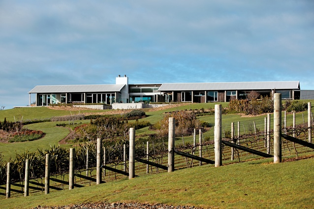
Even the architect, David Wingate, would forgive you for thinking that, from a distance, the Brynderwyn House was a couple of barns. The house sits at the foot of the Brynderwyn mountain ranges on a rural block five kilometres west of the Mangawhai estuary.
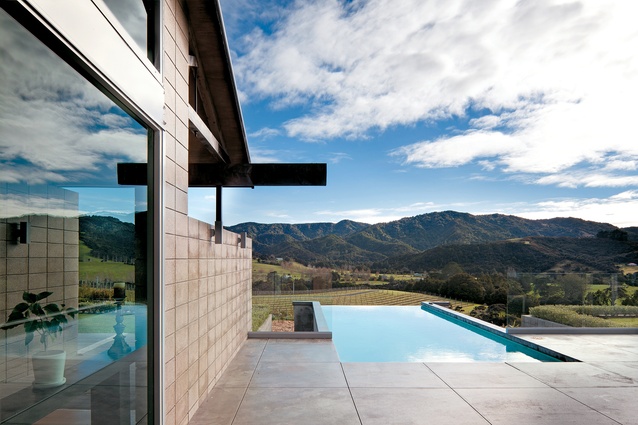
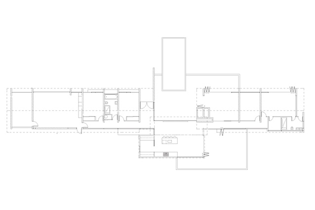
Its proximity to ‘real’ barns, while they’re mostly dilapidated, draws attention to their similarities in form and materials. The house has a long and thin plan, its walls constructed from timber and concrete block, with a corrugated metal gabled roof.
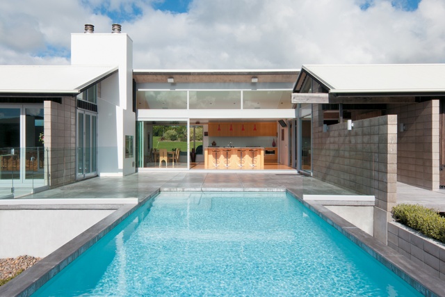
On closer inspection, you will note the reflection of the Brynderwyns on the glazing, the recognisable rhythm of bi-folding door joinery and a level of refinement in the construction that would never be bothered with in the building of a working barn. It becomes clear – and this is when your forgiveness is accepted – that this building is, in fact, a modern house.
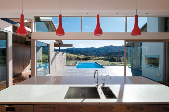
While the house’s planning comprises a strong physical axis, a secondary axis is formed by the suggestion to always look outside. Despite the fact that the sea can be seen from the site, the house encourages one to look towards the mountain ranges; the decision more appropriately referencing the house’s context and the occupants gaining an “engaging and ever-changing backdrop due to the extraordinary play of light and shadow on the hills,” says Wingate.
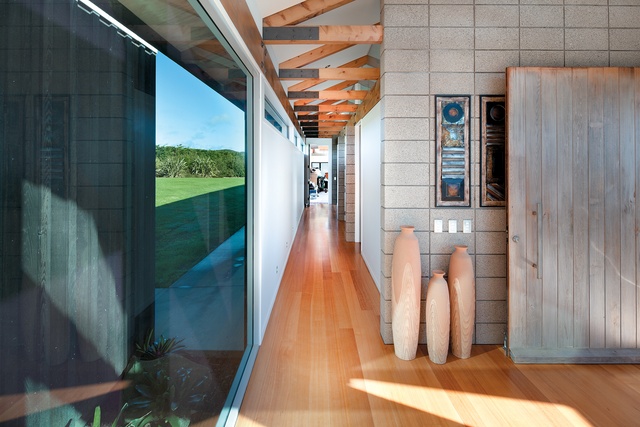
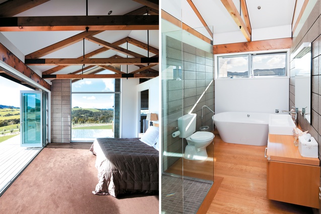
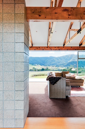
The activity of looking out is continually interspersed by the need to traverse the physical axis that runs perpendicular to the view. This axis, largely indicated by the corridor that runs the length of the house, is accentuated through the repetition of exposed concrete block walls and macrocarpa trusses.
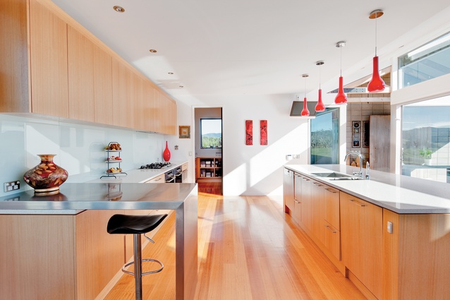
However, it’s clear the view is the priority, as the clarity of the physical axis is weakened at several moments: The central entranceway splits the axis in half; the set back kitchen and dining space momentarily open up the axis, also enabling the creation of sheltered courtyards; and finally a large window in the master bedroom feathers the house’s edge, which perhaps is also another subtle reference to those dilapidated sheds.
This article first appeared in Houses magazine.


