Houses revisited: Arnold Street house
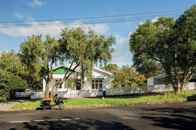
This unassuming bungalow by McCoy + Heine Architects was extensively renovated to suit an extended family. First published in 2016.
Much has been made in the popular press of the need for our larger cities to embrace higher-density living. While building high-rise apartments is one solution, another option can be found closer to home. The design brief given to architect Miles Heine and his partner Natasha McCoy was to provide accommodation for an extended family comprising four adults and two children — living together within a large family home — and a separate, two-bedroomed tenancy to provide additional income.
Situated on a double site, bordered by a reserve, this 1920s bungalow was ripe for development. “The project required a sensitive response to a complex set of considerations,” explains Heine, “including heritage zoning controls, connection to a public park, the sloping terrain, an extended family owner-occupier dynamic and considered sustainability.”

“One of the primary driving concepts for the design was the integration of the existing bungalow and the new wing with the landscape; to make the most of the site’s newly created, large north-facing garden, as well as its shared boundaries.”
Initially located to the north of the site, the bungalow was moved to the southern boundary, which borders the reserve. This was designed to maximise the east-west orientation of the house, providing for all-day sun. The first stage of the renovation included upgrading the bungalow, says Heine.

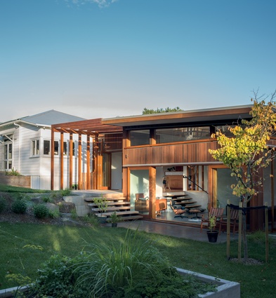
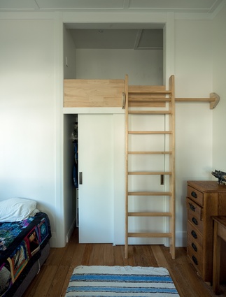
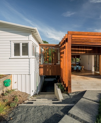
“The bungalow was quite extensively remodelled, although much of the works consisted of aspects such as installing double glazing, upgrading the insulation, electrics and the like. While the interior was stripped back to the bare bones, the layout has pretty much remained as it was, with the exception of the new breezeway bridge linking the bungalow with the new wing addition.”
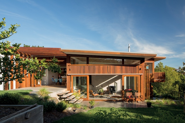
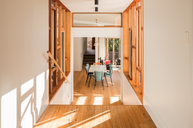
Heine says the scheme for the addition was to create a very distinct style from that of the bungalow but something in the language of a lean-to, which is a familiar vernacular to bungalow owners. “The bungalow, as usual for its type, is very internally focused, whereas the brief called for a home where the lines between the built and natural environments were blurred, at the very least.”
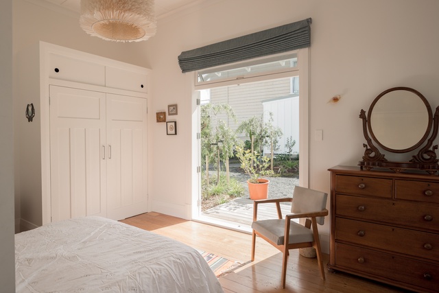
“The site slopes away to the south-west corner, which meant we were able to follow the natural contour and step the addition down the site, all the while maintaining that desired connection to the yard and gardens.”
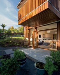
While the two wings may appear as polar opposites, Heine has integrated a number of elements that serve to link the pair in subtle but significant ways. The first is through the use of timber, namely tōtara. Commonly used as a flooring material in the ’20s and ’30s, totara is more likely to be used in landscaping today.
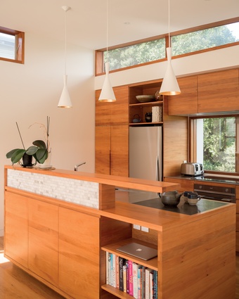
Heine has used tōtara extensively throughout the addition, from the cladding to the window joinery and the kitchen cabinets as well as the pergola, decking and stairs.“Tōtara was selected for its stability, natural resistance to decay, rich colouring and its cultural heritage.”
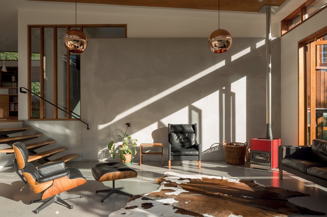
The architects also exploited the fall of the land to maintain the stud height from the bungalow through to the addition, creating a series of light-filled rooms that revel in the space, and, in the interests of familial harmony, this retains a unified hierarchy.
“This result steps away from the typical single-family residence. However, in terms of looking at different sustainable economic models, it is a definite alternative to addressing the issue of density and communal living within the city environs.”
Click here to see more Houses Revisited. And sign up to our email newsletters to receive Houses Revisited straight to your inbox.
Note: These are stories from our archives and, since the time of writing, some details may have changed including names, personnel of specific firms, registration status, etc.

