Houses Revisited: Above the shop
The Architecture Office have brought a little bit of suburbia to a city edge apartment, first published in 2006.
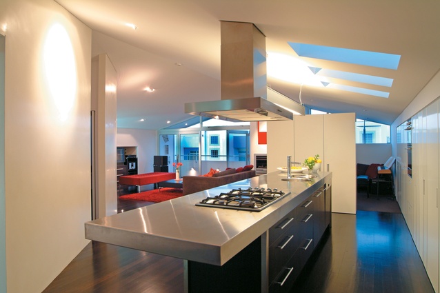
After camping in the space above their Newton studio for a couple of years, Paul Mason and Brenda Lawrence-Mason of Auckland graphic design company D1 Creative had some idea how they wanted to organize their upstairs apartment. For starters, it would have the bedroom ensconced at the back, away from noisy 5am deliveries to the café across the road, and it would have a 4m island bench positioning the cook toward the views, including a scrap of land out the back. The couple had every confidence they could blend their ideas with those of architect John Ingham, because he had just completed the funky fitout of their downstairs studio.
“The clients have to take a lot of credit for the design outcome,” says Ingham, a director of Auckland practice The Architecture Office. “They were always adding more to the concepts presented.” For their part the clients, as designers in their own right, also respected the architect’s role and were fully prepared to let Ingham do his job.
The clients had bought their premises, located in a commercial design precinct off Upper Queen Street, with the intention of converting the upper level into inconspicuous living quarters. It was to be a literal reversal of their previous working/living arrangement in which they had operated a design studio above a suburban villa. Now, in the new premises, the first thing business or personal visitors encounter is a colourful, bubbly-etched glass frontage, and then seventies-style, futuristic curved white joinery sweeping down from the studio ceiling to hover as UFO-inspired floating desks.
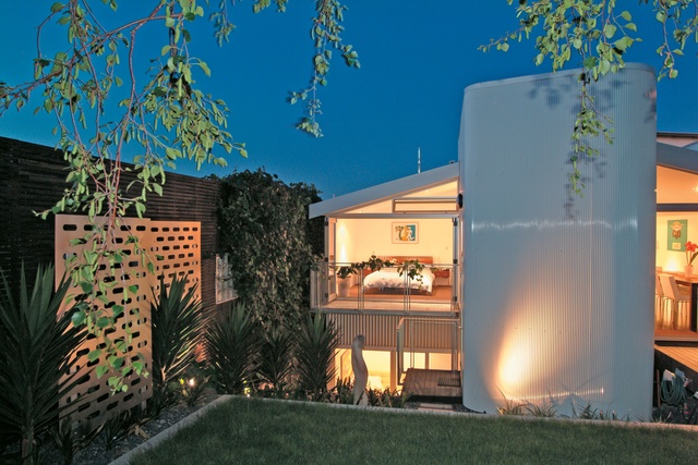
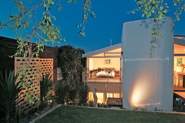
This strong visual statement has since been carried through, with more subtlety, in the second stage of the project, the residential space upstairs. There, a curved white wall screens private areas from the remainder of the open-plan living space, and extends outside the building to wrap around the stairwell. “Downstairs, we effectively cleaned out the shell and then we put the objects into it,” Ingham says. “The idea was that the objects could be multi-functional. They could operate as a desk surface and then wrap seamlessly into a ceiling or a wall element. Upstairs, it’s a similar idea but rather than operating in a section or a vertical, it tends to operate more in the plan.”
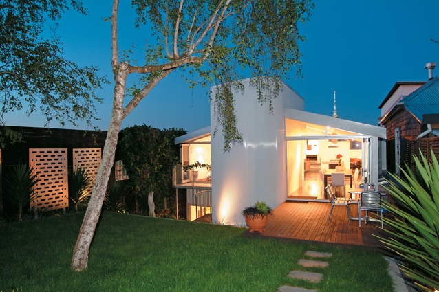
An apparently simple idea, but only arrived at after half a dozen schemes – including some that added another floor – were investigated during the 15 months it took to obtain consents. The result is a light and spacious haven, with a generous flow from the upper level out to a private, landscaped backyard. Ingham treated the building envelope as an extrusion with the front and back almost completely open, and then punctured the roof for extra light above the kitchen and bathroom. As there was only 800mm clearance from neighbouring buildings, the existing sidewalls were retained, but punched through to create a pantry and storage outside the building shell. Generous under-floor space has allowed the addition of central heating ducting from a furnace behind the fireplace.
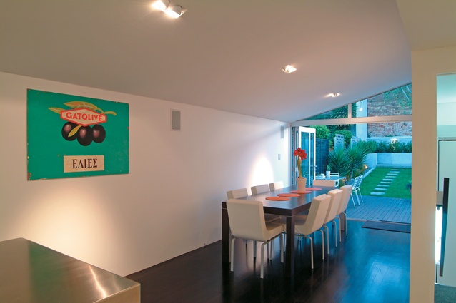
An old external landing at the back was demolished and replaced with an extension for the new dining space and stairwell. A discreet laundry was placed in cupboards on the landing of the new curved stairwell, with a folding ladder trapdoor to access attic storage. The clients have since added a wine cellar in the cool subterranean space under the landing – an entirely appropriate gesture: clients and architect originally got to know each other at meetings of a local wine-tasting group. Entertaining is facilitated by the new open-plan layout with its outward-facing kitchen bench. The clients decided against a second bedroom in the apartment (there is a guest bedroom downstairs next to the studio) – “it always fills up with junk” – and instead the architect devised a versatile solution whereby a corner of the living area can be used as a study or, when screened off, as a guest room. When the screen is lowered from a slot in the ceiling, a tall free-standing kitchen cupboard unit becomes a fixed wall.

“We attempted to have elements work on more than one level,” says Ingham, “and the boundaries between elements are tested: when does a floor become a wall, a wall become a ceiling, or furniture become a wall or structural element?” In this boundary-breaching spirit, black rubber flooring with a studded tread extends right up the walls in the bathroom and across the ceiling, creating a dark cocoon. “Originally we were going to go white, but we couldn’t get white tiles anymore because they fade with the UV, so it turned out black”, Ingham says.
Out in the living areas, elements have a freeform, loose fit. Even the curved wall has a recessed light at the end – it doesn’t actually finish, but just sort of floats in an open space where posts have been either hidden away or replaced by beams. As a feature wall, the curved surface is unadorned and finished in a highly polished plaster with an eggshell effect. It all lends a contemporary feel to the home, achieved without sacrificing character of the building. “I like that position it has, that it is open plan and yet you do feel that you are in different spaces,” Ingham says.
The result of the architect’s work and the client’s brief is a city-edge apartment that not only shuts away the downstairs working environment, but also offers a spacious, one-bedroom house and garden (complete with sculpture by artist Quentin Welland). On a more personal level, the result is contented clients who say they can’t see themselves moving for at least a decade.
Click here to see more Houses Revisited. And sign up to our email newsletters to receive Houses Revisited straight to your inbox.
Note: These are stories from our archives and, since the time of writing, some details may have changed including names, personnel of specific firms, registration status, etc.

