Architects in Profile: Rogan Nash Architects
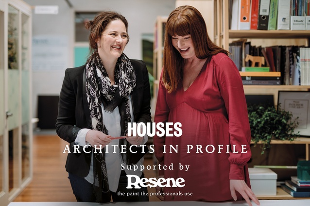
In the third exclusive Houses Architects in Profile series, supported by Resene, Justine Harvey talks with Eva Nash and Kate Rogan, who have built their practice designing exceptional and sustainable homes.
Kate and Eva of Rogan Nash Architects are like an old married couple – in the habit of finishing each other’s sentences and eagerly debating differences in points of view. They met at Auckland University through a mutual friend and have created a practice, based in Morningside in Auckland, that reflects their shared worldview; a love of light and contrast, and respect for the environment through exceptionally-designed homes that respond directly to their clients’ needs.
Justine Harvey: What got you interested in architecture?

Eva Nash: I always wanted to be an architect. I grew up in a beautiful old Gummer and Ford-designed house in Epsom, which my mother restored; it was a real inspiration. My parents say that when I was seven years old, I said I wanted to be an architect. And when I was ten years old, I used to draw up plans for my friends and family and my own house. For me, there was no question.
Kate Rogan: I’m the same – I was always going to be an architect. My grandfather was a draughtsperson, but he died before I was born, so I didn’t get to talk to him about it. He had this wooden box he kept his draughting things in, like his old Rotring pens, and I was allowed to hold it because I was the grandchild who could draw. Like Eva, I constantly rearranged rooms and designed pieces of furniture. I have always liked to know how things work and how we can make them better and beautiful.
JH: Did you both study at the University of Auckland?
KR: We did. And after university, I went to San Francisco, then to London and worked for Alexi Marmot Associates, predominantly on public and commercial jobs. It was a small office, so you had a lot of responsibility and we were immediately in quite extreme situations. I remember one day I turned up to a site meeting, maybe ten minutes late, and the engineer and builder were about to move the lift shaft. I was like, “Woah!” It was quite rogue.
JH: Do you think it was because you are a woman? There is a bit of an old boys’ club attitude in London architecture.
KR: They used to call me “the lady architect”. In London, the ratio of women to men was about one in ten, whereas here it is one in four. And when you’re young and from what they call ‘the provinces’, it pushes it to the next level. If we’re talking about women and architecture as a wider issue, I think of it as a truism. I just need to be the best person I can be because otherwise it gets you down.
JH: During that period, Eva, were you working here?
EN: I was at Architecture Smith+Scully for four years. They had two female directors, which was and still is quite rare and inspiring. They also had young families, so it was great to have those role models to show you that you could have a career and a family because, in other firms, the norm is to dedicate yourself to architecture. But when you’re a woman and you want to have a family, it can be a difficult pull, which is why a lot of women fall out of architecture.
JH: Quite a few of the very successful women architects in the UK don’t have children.
EN: No, because it’s such a demanding job and the mentality around how you should be working is demanding. After Smith+Scully, I worked at Pete Bossley Architects for six years. Then, for about six months, I went to New York and worked for [Kiwi architect] David Howe’s firm on projects in Dubai, but the global financial crisis hit and any projects that didn’t yet have foundations was pulled, including mine. I saw that as a positive because it was time for me to come home.

Pete Bossley took me back and I ended up as an associate there. But I wanted to have a family, and that office was one where you had to be there all hours to gain the most out of it. So, when I got pregnant, I left Pete’s. Kate and I started the business six months after my eldest son was born, and it ramped up from there. I couldn’t be without architecture; it’s part of me.
KR: When I got back from London, I worked at Stevens Lawson Architects and was there for four years. In the process of getting registered [as an architect], it became apparent to me that I actually wanted to be a director. I decided to do my own thing and had my own company for four years. I enjoyed working for myself, but I knew I wanted to work with someone else. Eva and I had talked about working together and we’re similar people with similar backgrounds and life choices.
JH: Isn’t this kind of work partnership a bit like a marriage?
KR: Yes. People think it’s just about aesthetic but it comes down to what you imagine the practice is going to be. We don’t separate the projects. We present the projects together and meet the clients together. That is because we work off each other well and design together. As a sole trader, you can get through a design but its fun to be challenged on certain points.

EN: We are very honest with each other. We listen intently to what the client has to say and we often hear different things. One might be listening to the husband and one to the wife. We meld that with what we think and come up with a strong design because, not only is it our client’s point of view that we’ve tried to interpret, but also, our own – and we are very strong-minded women. We like to push our designs really hard and push each other as well.
JH: How do you approach your designs in terms of vision?
EN: We have always thought that people’s houses have such an effect on their lives. If you wake up and you’re in a lovely space and the sun has streamed in beautifully across your bench top, it just sets you up for a great day. Architecture literally changes people’s lives.
KR: We like houses to be simple, light and airy with a connection between inside and out. When you’ve been fighting the good fight and you come home to relax, your house has to be the place where you feel comfortable and you don’t have to make a massive effort. And if people come to see you, the house is there, ready to accept.
GREY LYNN HOUSE, AUCKLAND
2016
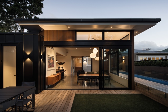
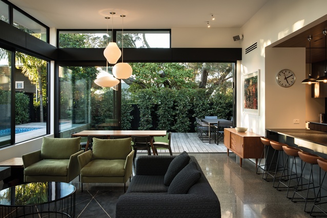
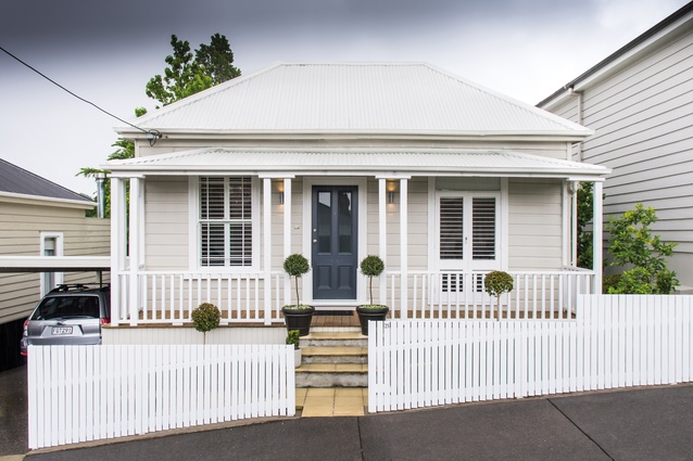
Completed in 2016, this project involved renovating an existing Grey Lynn villa and creating a new modern pavilion to its rear. A previous renovation – a lean-to – was removed, and a new cedar-clad pavilion was created, which houses an open-plan kitchen, dining and living room. This is a better fit with the homeowners, who are eager entertainers.

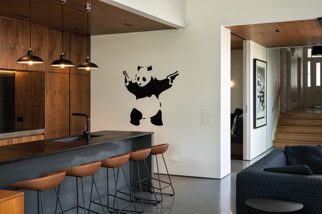
“The clients had a clean mid-century modern aesthetic and they were interested in Californian architecture, so that gave us a good starting point,” says Kate Rogan. “We created walnut cabinetry and ceilings in the new area. From the street, it remains as a villa, but inside, there is this delineation between the old and new, a change in ceiling and also a step down.”
The pavilion connects to two courtyards, one with outdoor dining and a barbecue and the second with an outdoor fire and access to the pool. A service scullery, tucked behind the kitchen, connects to the barbecue courtyard and provides a secondary pathway through the living space, which is important when the couple are entertaining large groups of people.
Inside, the water level of the pool is in line with the window at the dining table, creating an interesting connection between the inside and out. The pavilion is designed to have great energy efficiency, with a concrete slab floor that is heated and edge insulation and double-glazed low-E glass windows to ensure the heat remains inside in the winter. The villa was restored, with new sash windows in the bedrooms to match the old.
HERNE BAY HOUSE, AUCKLAND
2012
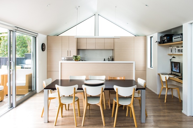
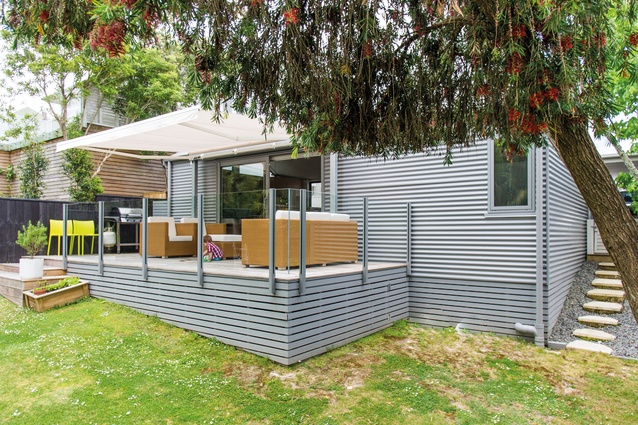
Again, from the street you would not guess that this villa hides a modern living pavilion. The pavilion contains an open-plan living, dining and kitchen space that opens onto a deck and a lawn area for the homeowners’ two young sons.
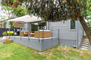
As the site is oriented south-west, the designers created clerestory windows at both ends of the pavilion to flood it with sunlight all through the day. The gable ends are frosted to maintain privacy in this built-up inner-city suburb.
“We put the bedrooms in the villa as the spaces in a villa lend themselves to bedrooms, otherwise you have to remove walls to achieve an open-plan space. In this house, the living pavilion is accessed through a corridor and has stairs leading into it for separation,” says Eva Nash.
To marry the new section with the old, the architects used a light-grey corrugate for the cladding. To accentuate the light, the palette is soft, with pale woods and a Scandinavian aesthetic, which contrasts with the darker timbers used in the original villa.
ST HELIERS HOUSE, AUCKLAND
2015
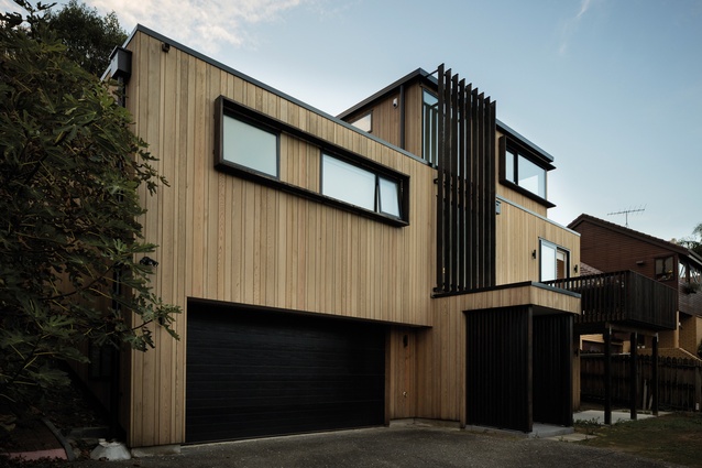
A steep site provided some challenges for building this new home in the seaside suburb of St Heliers. An existing two-storey house backed onto a reserve and had a garage that retained the entire site. The architects left the garage well alone and kept the lower basement footprint of the existing house but rebuilt everything above it.
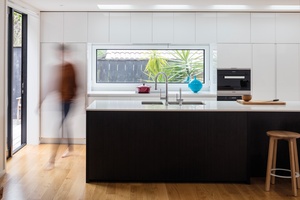
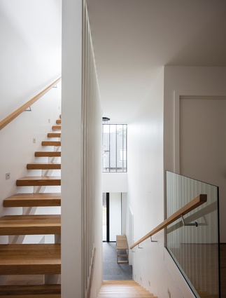
“The house is three storeys with a stair that reaches all the way through to the top level, with a beautiful vertical screen consistent along the stairway. The lower part of the house feels more solid, and as you get higher, it starts to get more open and light,” says Eva Nash.
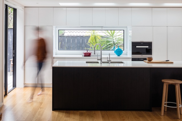
The kitchen on the first floor is extensive and built to be able to cater for extended family who often come to visit or for birthdays and other occasions. The island bench is 4.5m long and is illuminated by a series of skylights.
“The clients wanted a house with a lot of white, but we softened that with the oak floor and staircase, as well as dark wood panelling in the kitchen. This panelling references the dark cedar we have in box frames around the windows on the exterior,” says Kate Rogan.
The house is clad in cedar and features a dark timber vertical screen that extends down from the master bedroom window on the upper level. “There is provision in the house to have a lift – we think it is important to future-proof a house,” says Rogan.
WESTMERE STUDIO, AUCKLAND
2016

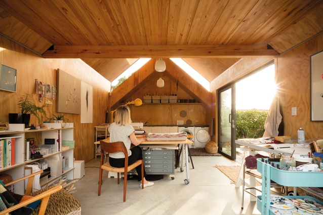
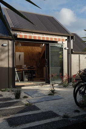
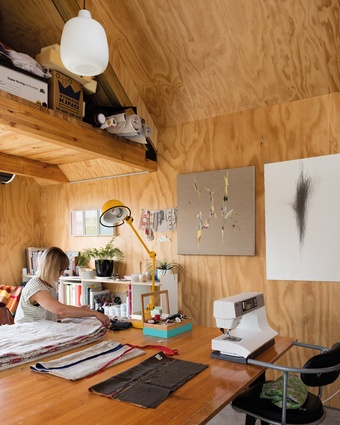
A textile artist, living in the city-fringe suburb of Westmere, wanted her garage to be converted into a studio, so that she could work from home. She also asked Rogan Nash to make it possible for the space to convert back into a garage for on-sale value. The garage door enabled this box to be ticked while, inside, the material palette is kept to a studio vernacular, with plywood lining and a concrete floor offering both warm and practicality.
The south-facing wall of the space is glazed to let in the sun and the studio is fully insulated. “The studio has three roof forms, which are quite lyrical,” says Kate Rogan. “It feels like a chord – three notes. The exterior is board and batten, which references the existing house and the residential language of the area.”
The architects also created a storage shed outside, lined with plywood to match. Inside the studio, storage is provided overhead. “On the one hand, it’s simple but, to get it to that point and make it work, it needed a lot of iterations,” says Eva Nash. “It’s about creating a nice work environment and a flexible space.”

