Hot House: The Acute House
Architect Fooi-Ling Khoo’s recent clients were living in a modestly sized apartment and looking to upsize when they stumbled across a rather unusual offering. The two-storey Victorian cottage they eventually purchased in Melbourne’s Albert Park was so spectacularly rundown, it was almost a ruin, and nothing short of an extremely ambitious renovation could restore it.
Fortunately, the couple (who work in the construction and design industries) relished the challenge, confidently taking on the heritage-listed weatherboard structure occupying a triangular site measuring only 48m2.
Khoo, who along with David Brand, is co-founder of Melbourne-based practice OOF! Architecture explains, “The renovation was actually about formulating the right design question to get to some sort of reasonable response, and in this case, the question was quite loud. The site itself was just so demanding in terms of what it is.”
In every respect, these constraints and the heritage restrictions informed the project’s outcome and Khoo’s decision to forego conventionality in both form and function is what allowed such a highly resolved concept to be so clearly expressed.
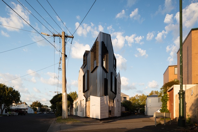
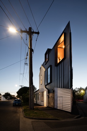
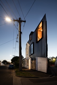
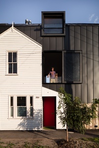
While the original structure couldn’t be saved due to its poor condition, the cladding was carefully removed prior to demolition. The reclaimed weatherboards are ‘stitched’ onto the new blackened metal skin, creating a patchwork of textural materials.
It’s an innovative amalgamation of old and new that satisfies the project’s heritage requirements and guarantees that the new three-level home – with its southern façade facing the street and northern façade looking out onto a laneway – is sympathetic to the local vernacular. A polite, subtle response would never have worked on a wedge-shaped site that’s as prominently positioned as this one.
Each of the external walls abuts the boundary in a determined attempt by Khoo to mine as much space from the site as possible. Of course there are no set-backs, backyard or outdoor area, since she had to fill the entire property in order to meet the clients’ living needs.
Consequently, the couple and their young son have had to shift their expectations regarding privacy and adapt to living in a home that’s clearly exposed. Yet the building’s compactness has its advantages too. “It means a whole lot of things can be made to function very efficiently,” says Khoo. “Lots of natural light, good ventilation and a substantial outlook are easily achieved because you’re never far from a wall.”

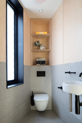
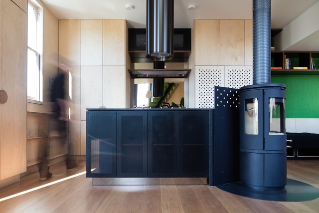
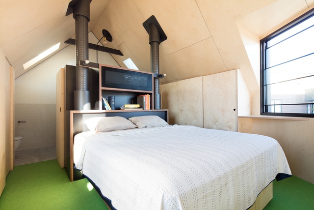
The ensuing 145m2 interior’s spatial arrangement is made all the more dynamic by a series of six split-levels stacked around a central stair. It’s a logical configuration that positions the son’s bedroom and a study at ground level, with these two rooms divided by the home’s only internal walls. A half-level down is the basement, while a half-level up from ground level is the powder room. The open plan living, dining and kitchen occupy the middle of the rear elevation; a half-level up is the balcony and the top level accommodates the main bedroom and en-suite.
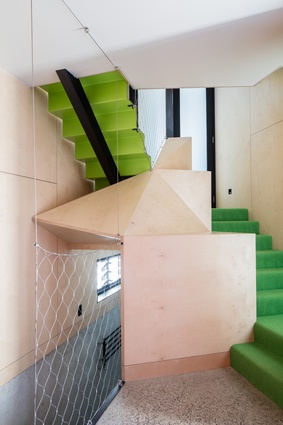
Each floor is essentially a different room that’s not defined by walls or doors but by the open stairwell, which offers a sense of division without boxing anything in. This central ‘spine’ connects the stacked spaces and creates vertical circulation and a strong spatial flow. The result, an overall scheme appearing a lot more generous than it actually is because there are simply no dead ends.
It’s a nod to contemporary Japanese interiors, where so many new homes successfully exploit the compact nature of their site through necessarily inventive design. Further evoking this sentiment is the stair’s bright green carpet, which injects the interior with a sense of the outdoors. Khoo’s clever interpretation of an internal courtyard means the clients have a ‘garden outlook’ regardless of where they stand. The balcony brings the outside in too, with the first level’s external walls doubling as seating and netting bring used as hammock-like seat backs.
This sturdy material is installed as the stair’s balustrade and together, these features are key visual accents in an internal arrangement that’s otherwise deliberately pared back.
“We tried to minimise the palette and remove any extraneous details to keep the interior clean and simple,” reflects Khoo. “And we chose birch [as the predominant material] because of its versatility.” The timber is applied throughout and is also used for the joinery and in-built furniture, all of which, not surprisingly, had to be custom designed and manufactured to fit the home’s particular geometries.
A sense of cohesion prevails and the neutral background is conducive to comfortable, relaxed, small-footprint living. The clients’ willingness to live differently is testament to Khoo’s planning and the strongly collaborative nature of the design process.
“You can’t underestimate the importance of their role in this because they’re the ones who have to enjoy the final outcome,” she says. Ultimately, the design succeeds because of a highly functional spatial strategy that provides the welcome conventions of family life in the most unconventional of settings.

