Hot House: Madrid minimalism
Home to an emergency doctor, Albóndiga (Meatball, his pet bulldog) and a large collection of pot plants, this tiny Madrid apartment is full of solutions for small-space usage.
Browse any popular design blog and it’s immediately clear that more than a few of the most exciting new apartment designs are coming out of Spain. Of course, there’s no shortage of small abodes in the southern European country, where hot spots like Madrid are high-density metropolises in which apartment living has long been the norm.
The capital’s metropolitan area alone is home to more than six million people, making it the third-largest city in the European Union. Residential renovations and refurbishments are popular and, even though architects and designers can often have quite the task on their hands, they’re also allowed plenty of scope for invention and innovation.

Husos Architects is one practice making a name for itself with small residential projects that disrupt traditional ideas about how big our homes need to be. Led by co-directors Camilo García and Diego Barajas, the Madrid-based studio champions small-footprint living by re-imagining domestic interiors as multifunctional spaces that are accommodating, flexible and totally unexpected. The beauty of their small-footprint designs is the degree to which they customise them; this is a necessary requirement for the most diminutive of spaces if each part is going to work as hard as possible.
One of the studio’s most recent projects features a ‘greenhouse’ seamlessly incorporated into the home’s wet area for a client with a large collection of pot plants. Meanwhile, its latest and most compelling is the renovation of a 46m2 apartment in the Arganzuela district of central-southern Madrid for Jaime, a young emergency doctor, and his pet bulldog, the aptly named Albóndiga (Meatball).
The home occupies a modern variation on the traditional Spanish corrala – a block of flats with access corridors that look out onto a shared interior courtyard – built in the 1960s. Like so many apartments of that era, its layout was problematic, disallowing a sense of logic and spatial fluidity.
As Barajas explains, “It had a double east-west orientation but excessive compartmentalisation obstructed cross-ventilation in the bedrooms, which meant these west-facing spaces were very hot in summer. So, we redistributed the footprint to create a one-bedroomed apartment, which incorporates a generously-sized living area with openings on both east and west elevations.”
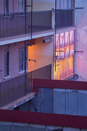
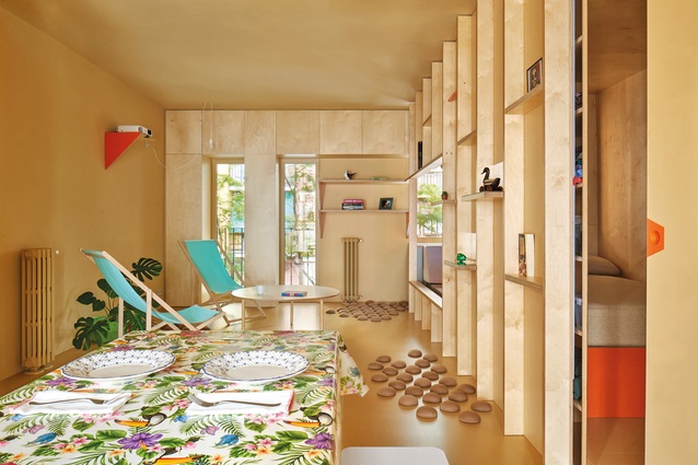
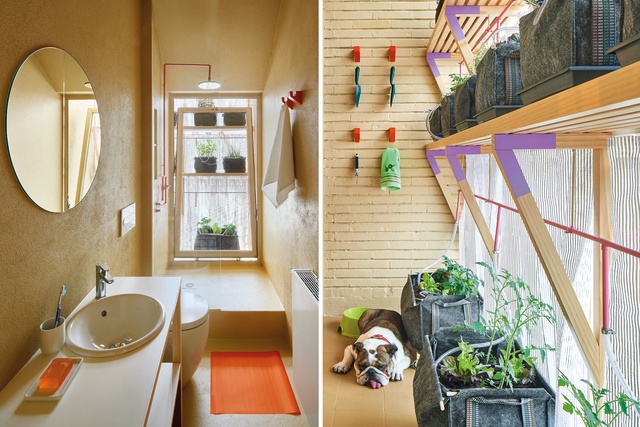
The resulting plan positions the lounge and dining spaces as the heart of the home, which now receives plenty of natural ventilation. García and Barajas also seized the opportunity to integrate a vertical vegetable garden on the western courtyard façade, in keeping with Jaime’s commitment to sustainability. And the renovation’s new watering system makes use of grey water from the shower while it also works to keep the interior cool so there’s no need for air conditioning.
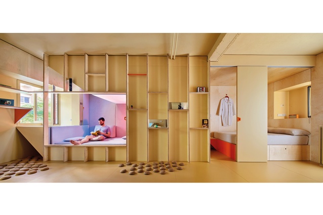
By prioritising a large, open-plan living area, the apartment is made to appear bigger than what it actually is. It’s clever planning on the part of the architects, who arranged the bedroom, a dressing room, a storage area and a multi-purpose capsule space within a 1.5-metre-wide strip along the southern edge of the home.
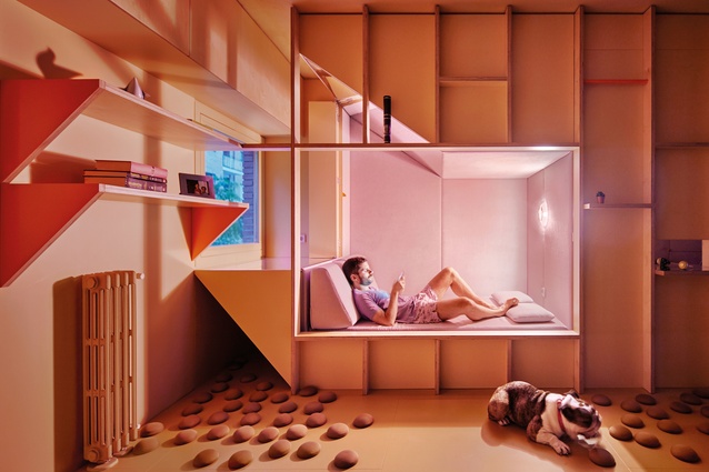
This neat resolution is made all the more efficient because of the bedroom’s sliding doors and ample shelving integrated within the partition wall. However, it’s the capsule that not only genuinely enlivens the space, but also takes the home’s overall functionality to the next level.
No mere folly, this space serves Jaime well as a place to take a siesta to recover from an especially tough night shift or as somewhere quiet to read a book. It doubles as a guest ‘room’ too, complete with a sliding privacy screen, making it a much more streamlined alternative to a sofa or fold-down bed. And the adjacent ‘window periscope’ brings the outside in, allowing immersive views of the tree-lined street via a series of strategically placed mirrors. There’s even a small nook for Albóndiga, who has the option of lying on soft cotton mounds that are attached to the floor with suction pads.

In considering the materiality, García and Barajas decided on the lo-fi combination of plywood and pine. “We avoided plastering the walls, opting instead for an outcome with breathable mortars,” García notes. “And we wanted the home to be cosy and comfortable so it’s in deliberate contrast to the mostly sterile white walls of a hospital’s wards.”
The minimalist palette creates a sense of cohesion and the pared-back aesthetic maximises the interior’s spatial constraints. Lighting is subdued and the capsule glows soft pink or purple, while colour accents also pepper the rest of the home: orange for the bed base, recessed door handles and shelf supports; pink on the water pipes; and purple in the vertical garden. These add visual flourish without clutter.
It’s a simple scheme that gives Jaime everything he needs for a comfortable lifestyle – nothing more, nothing less. And therein lies the design’s greatest success. Small-footprint living is about being mindful of consumption and understanding that more doesn’t necessarily make for a better home. By stripping back the apartment to its most necessary components, García and Barajas have created a stylish haven, free of superfluous detail, which offers a nimble framework for urban living.
This article first appeared in Urbis magazine.


