Honey coated
Architect Ester Bruzkus readily admits designing her own home was more difficult than designing one for anybody else. Without the inevitable limitations of a client’s brief, the co-founder of architecture, interior and furniture design studio Bruzkus Batek simply had too many ideas to choose from and narrowing it down to just one wasn’t going to be easy. But this lack of restriction and complete creative freedom proved advantageous in the renovation of her second-floor apartment in central Berlin – a tiny, compact abode, measuring only 107m2.
Bruzkus’ resulting design is a thoroughly contemporary scheme that’s equal parts cosy retreat and light, bright, highly functional hub. The apartment’s previous layout included two bedrooms and Bruzkus created a new open plan with only one bedroom, greatly improving the interior’s spatiality. If the home’s modest size wasn’t enough of a challenge, the stepped floor including two estrades (platforms) also needed careful consideration. “They definitely did pose an obstacle when trying to come up with a layout that offers a strong element of privacy,” Bruzkus reflects.
Each 40cm-high by 1.8m-wide dais runs the full length of the apartment, one at the front facing the street and the other at the rear towards the courtyard. These structural features are part of the apartment’s original interior architecture, conceptualised by the building’s architect Wolfram Popp, to extend each elevation’s balcony through to the interior. They create a sense of openness by blurring the line between inside and outside, an effective device that hasn’t diminished since the seven-floor development’s construction in the late 1990s.
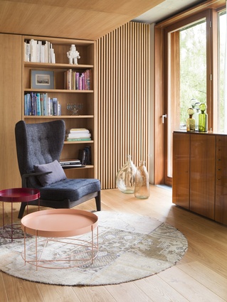
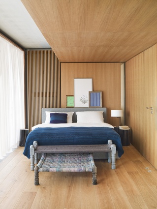
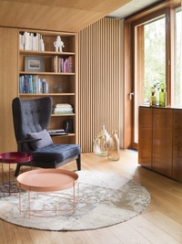
Surprisingly, the shift in floor height is ultimately what allowed Bruzkus to successfully zone the open plan and the overall configuration elegantly evokes a Japanese spatial sensibility. As she explains, “In a traditional Japanese house, different floor heights are used to distinguish public from private space, so I was inspired to craft a wooden ‘sleeping box’.” As the interior’s most compelling design expression, the bedroom is positioned atop the rear platform and is clad in oak. The honey-coloured timber doesn’t so much as wrap the walls, ceiling and floor as it does caress them, achieving the quiet sanctuary Bruzkus so desired.

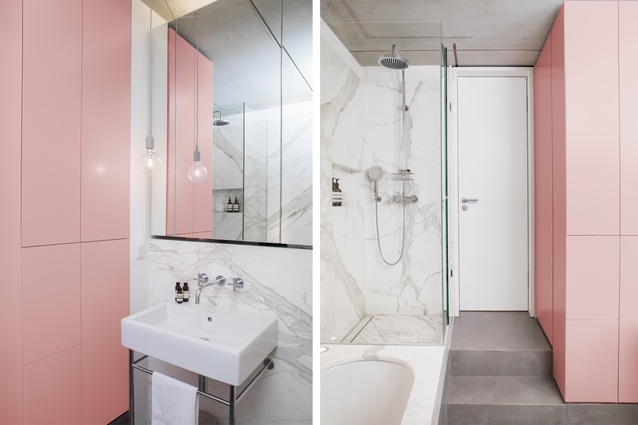
This zone includes a reading area with in-built shelving and the whole bedroom can be partitioned by means of a folding wall. The warmth of its materiality is in stark contrast to the rest of the apartment, comprising polished concrete flooring, concrete ceiling and a centrally positioned black box. This custom structure (accessible from both the bedroom and living areas) houses the bathroom – a delightfully unexpected arrangement of statuario marble finishes and soft pink joinery.
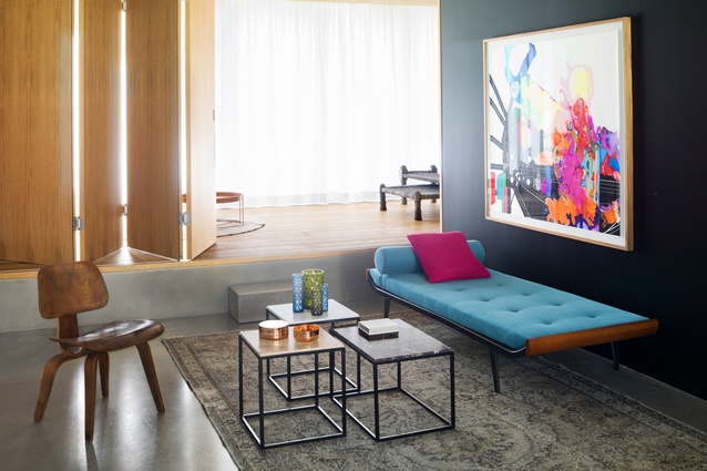
Bruzkus’ choice of black for the bathroom’s exterior walls may seem a dramatic one, but her design rationale is as simple as it is straightforward. “It’s the perfect background for artwork,” she says. Paintings by Berlin-based artist Niki Elbe were chosen for their abstract composition and a vivid colour palette, which is reflected in some of the living areas’ furniture pieces. In particular, the chaise longue and throw cushion are striking for their exact colour matches.
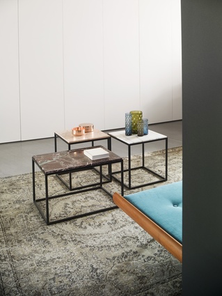
Decorating was a relaxed process that evolved over time, but Bruzkus displayed a restrained approach in not filling the space with unnecessary clutter. Her furniture selection is a tasteful mix of classic pieces alongside items from the Bruzkus Batek collection, all of which offer bold accents against the grey of the living areas’ ceiling and floor. Soft furnishings figure prominently too and the Kim Layani-designed rugs not only deliver practical comfort, but they assist in further differentiating the zones as well. Bruzkus’ emphasis is on quality, complementing the interior’s material palette and ensuring cohesion throughout.

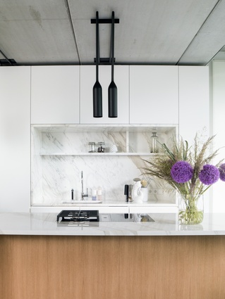
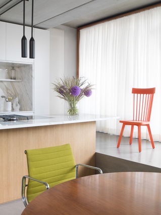
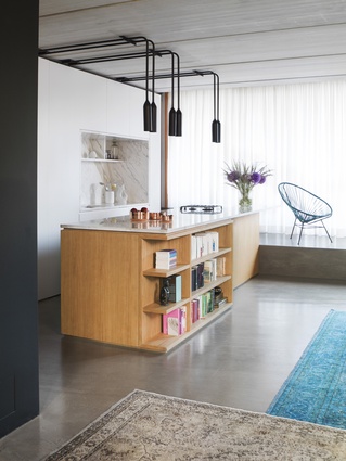
This pared-back, no-fuss theme is continued in the kitchen with the oak-clad island bench its distinguishing feature. It’s topped with polished statuario marble, also installed as a recessed splashback within the custom joinery. For Bruzkus, the most appealing aspect of the interior’s design is the kitchen’s clean, minimalist aesthetic. As she explains, “Everything can be hidden and this gives me peace of mind.” The black, industrial-style pendant lights by PSLAB are the area’s only design flourish, providing visual connection with the bathroom’s black box. Bruzkus’ keen attention to detail is matched only by her discernible use of colour and robust materiality to achieve a space that is as stylish as it is comfortable.

