Home with Hoppen
As British interior design’s star Kelly Hoppen celebrates 40 years in the industry, we step into the place she calls home.
This year, Kelly Hoppen MBE is celebrating 40 years as a designer. Astoundingly, she had her first interior design client at the age of 16, renovating a kitchen for a family friend. This was a learning curve that led to her next project a year later for a Grand Prix driver, who contracted her to redesign his huge house in the renowned prime location of The Boltons in London.
This project marked her beginning as a coveted interior designer and led to several other contracts, which over the course of her career have seen her become one of the world’s leading names in interior design.

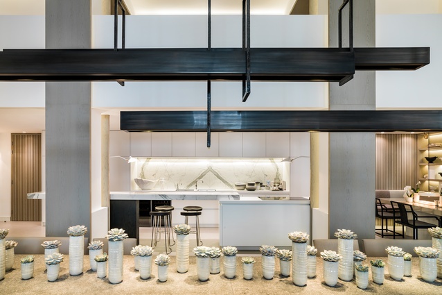
Hoppen has worked with many of the world’s leading brands, developers and clientele on projects that span from hotels to private jets, restaurants to tower blocks. Her own 800m2 home, pictured here, can be seen as the culmination of all this experience, a space where she can unwind and entertain, and one that must constantly live up to the scrutiny of an astute eye. The palette is neutral, and the home has a clean sense of linearity, which is part of Hoppen’s trademark design style.

“I have been known for my neutral palette and signature style of clean lines and layering different finishes, textures and fabrics for over 40 years now, so it’s only natural that my own home is designed this way,” she told Urbis.
“Taupe is calm, quiet, and very easy to live with. It is not overbearing, and it does not shout out and demand attention. It is the perfect colour to provide a remedy to the stressful pace of frenetic modern life and to layer on top colours, fabrics and textures of all different varieties.”
Interestingly, Hoppen is dyslexic, but as a sort of counterbalance, her faculty for visual acuity is extremely high. The linear and symmetrical nature of her designs is due in part to her ability to see spaces in a grid formation, which she describes as akin to a sixth sense of sorts.

“My brain has always worked on a grid scheme, with shapes and clean lines, since I was small,” she says. “As I walk into a new space, my mind automatically builds a grid system and I can see a potential design almost instantaneously – a system that has always worked for me personally.”
Her six-bedroom home was previously Bonham’s Auction House, and owning it was a long-held dream of Hoppen’s. When she first acquired it, the space was a dilapidated empty shell with no interior walls and a single floor. However, it had impressive columns throughout that provided a starting point for the design. “As soon as I saw it, I knew it would be my dream home and to this date I love every room, piece of furniture, gadget, artwork…” she says.
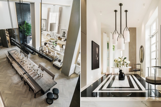
The entrance hall exemplifies Hoppen’s famous grid, with the bespoke Herve Langlais light fixtures drawing vertical lines from the ceiling, vertical shutters running along one wall, and a striking black and white marble floor.
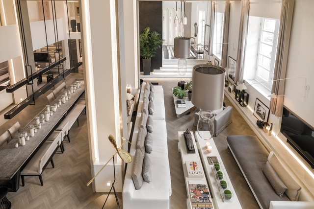
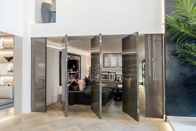
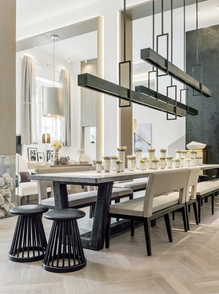
Despite its size and open-plan nature, the living and dining area has a sense of cosiness and warmth. Large wooden panels were added to the existing columns to define the spaces within it. The dining area was designed to allow Hoppen to entertain up to 30 guests, with a custom-made, Hoppen-designed, six-metre-long stone dining table. Hanging above this table is another Hoppen design, a pendant light made up of three long bars suspended in a parallel manner that again reinforces the linearity of the space.
“In my opinion, lighting makes or breaks an interior,” says Hoppen. “Without the correct lighting, even the most expensive and well-considered decorating scheme can appear flat and uncomfortable. For that reason, devising the perfect lighting scheme was very important for me. I would say to completely ban down lighters. They are the most unflattering bulbs. You want wall washers, up-lighters, pendant lights and lighting in shadow gaps to complement the room and space.”
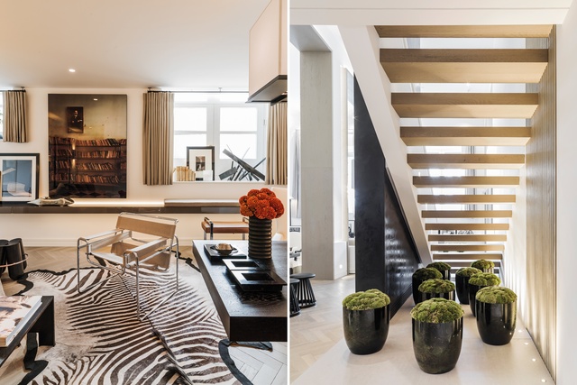
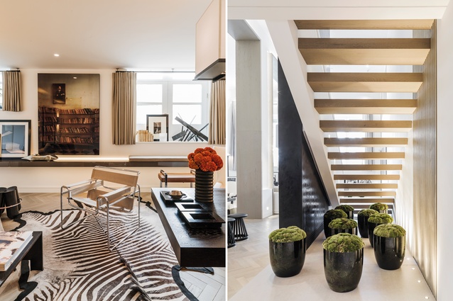
Deviating slightly from a neutral palette, Hoppen has introduced some darker autumnal shades to the study, which houses a zebra skin rug and a library of the old auction house books, which reference the history of the house. Every room has plant life of some sort, whether it be flowers or potted shrubs.
“Bringing nature into the home is absolutely key,” says the designer. “I love organic trees that grow indoors to bring a little oxygen into the home and also some life. Retro plants, palm trees and rubber plants are huge, very ‘60s. My new favourites at the moment are bonsai trees – I can’t get enough of them.”
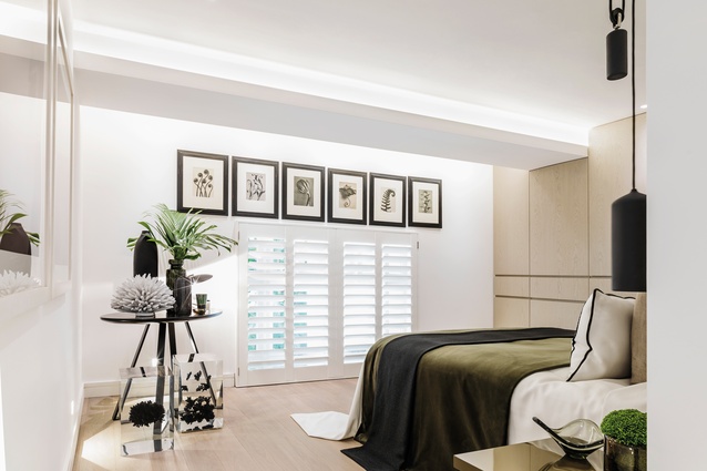
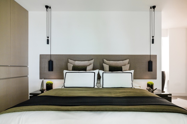
The private areas of the house are designed to be a sanctuary from the designer’s busy life. Hoppen says that a bedroom should be all about the person who sleeps there and their needs, with every detail thought out.

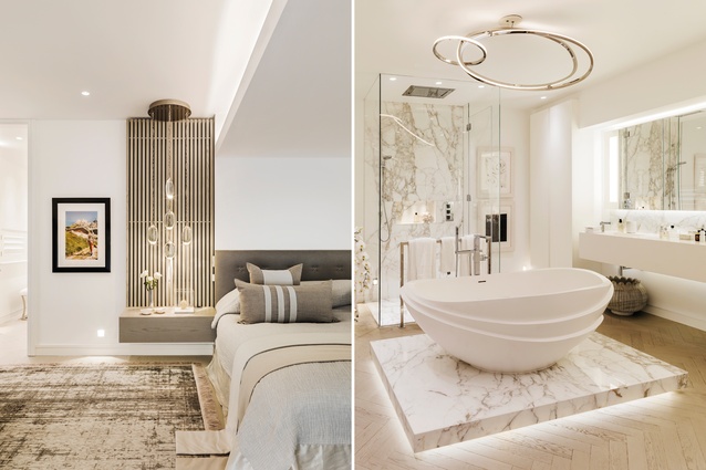
“My bedroom is completed in a neutral colour palette but has a lot of different fabrics and finishes to create that real luxury feel. Everything from the bed linen to the lighting is thought about so that it becomes an immersive experience in the evening; one that cannot be rivalled by even the best hotel rooms in the world.”
Hoppen’s master bathroom is clad in marble and features her own apaiser bath-tub, which is designed to resemble lotus flowers. This sits on an elevated marble platform, lit from underneath. Above, a Niamh Barry loop chandelier reinforces the sense of lightness and ceremony in the space.
It may have taken 40 years of hard work to reach, but a home of this level of comfort and quality would appear to have been worth waiting for.

