A welcome departure: Hellmann Worldwide Logistics
At Auckland Airport, RTA Studio and Eclipse Architecture have joined forces to design a warehouse-and-office complex that sets a benchmark for logistics buildings in New Zealand.
Big-box-style retail and warehouse buildings are endemic in New Zealand. So it comes as a welcome surprise to see an architecturally designed warehouse on the approach to Auckland Airport, where big, bold and blank boxes still reign supreme.
Auckland’s airport precinct is essentially a 1,600ha industrial park, which, to the airport’s credit, is undergoing a process of creative renewal – spearheaded by projects like Te Kaitaka marketing suite, designed by Fearon Hay Architects, and the Runway Mountain Bike Park, designed by Auckland Mountain Bike Club.
But the hulky logistics warehouses in this neighbourhood still typify the aforementioned triple-B box design. Until now, these bulky buildings – hubs for the exporting and importing of goods and produce – have been purely function over form.

However, the two clients – Auckland Airport, who owns the building, and Hellmann Worldwide Logistics, who leases it – have taken a bold step in employing RTA Studio and Eclipse Architecture to design this elegant state-of-the-art building to support the fusion of Hellmann’s two operations – an office/headquarters and a warehouse – under one roof.
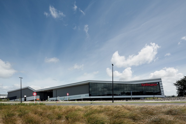
RTA Studio director Richard Naish describes it as “a family-run German company which really appreciates the value of good design. The CEO has been a champion of the building right from the start, and the airport has invested extra because it sees this as a gateway building to the airport, and into New Zealand.” The two main façades are prominently sited on George Bolt Memorial Drive and Landing Drive, while the back entrance of the warehouse is on Airport Drive, across from the spazioCasa showroom.
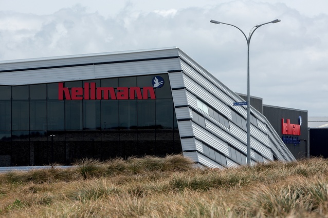
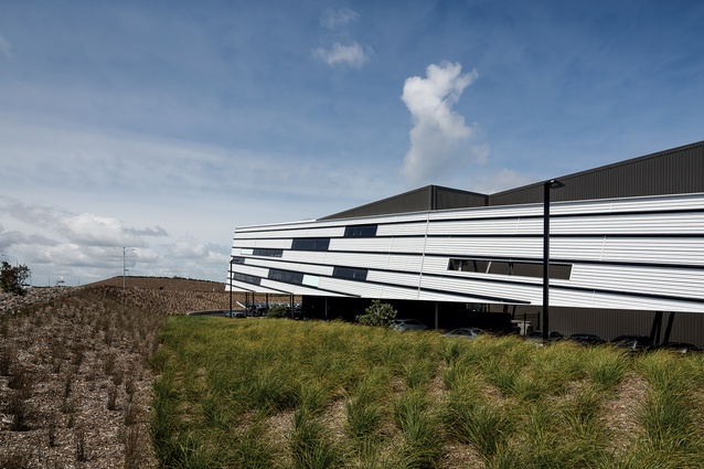
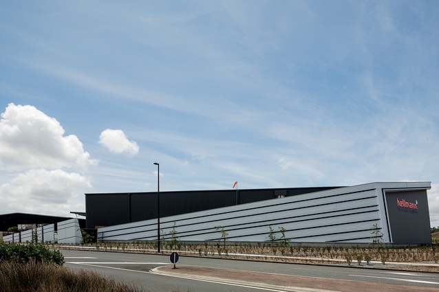
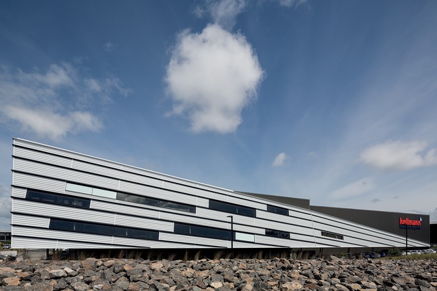
The building is split into two main operations: the office/headquarters, including tenanted showrooms, are within a 1,756m2 L-shaped plan along the perimeter of the two main façades; and a warehouse sits in behind, linked to the cool store by means of a breezeway. The architects have responded to the folded form of the surrounding landscaping, with an equally dramatic building form that resembles a floating wing form hovering above the ground in flight. The building reveals itself out of the landscaped gravel-and-grass mounds, as oblique views from the nearby roundabouts, and while you walk around it.
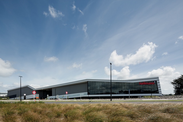
The entrance is a departure from the atypical ‘big box/small box plus canopy’ type of building that we’ve come to expect from this typology in New Zealand as well. Maurice Langdon, director at Eclipse Architecture, humorously describes the big-box form as being like “a turtle with a small head”, while the intention of this design is more akin to a cheetah, with its streamlined anatomy.
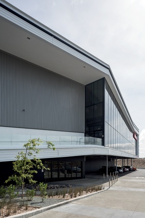
Horizontal shadow grooves and elongated, angled windows accentuate this dynamic, as does the sloping typography of the site. Walls are angled too, and caused the architects a few headaches during documentation. Langdon jokes they attempted “to stretch the physics of water penetration” and that “while the windows appear simple, they are complicated in detail”.

Another departure from the standard is the grand entrance, a sloping ramp that invites you up and into a lobby/reception area which features a double-height void that is really equivalent to three levels in height. “It was important to keep the sense of scale inside the entrance lobby,” explains Naish. “We didn’t want people to walk up the sloping entrance and to be disappointed when they arrived.”
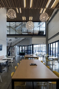
From here, you can view all three levels, gaze down through glazing into a large café-style lunchroom, or take a journey along the inside of the façade and enjoy the wraparound views from the office spaces. I expected the views out of the angled windows to be a bit disconcerting but they are thoughtfully placed and surprisingly interesting.
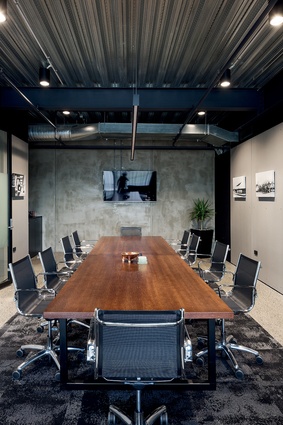
Various tenants occupy some of the separate office spaces on the second floor, while Hellmann holds court on the fairly open-plan first floor. During the fit-out, a long and narrow corridor has been strangely forced between some of the tenancies on the second level, presumably to create additional access.
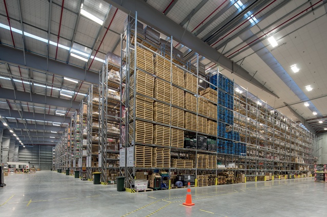
The geeks among you would really enjoy a tour around the warehouse and cool store, which I found fascinating. The 7,534m2 warehouse contains seemingly endless stacks of goods that fill this huge space. The yellow electric-run fork-lifts appear midget-like as they dart in and out of the aisles moving goods around. This area includes caged storage, including in-rack sprinklers for Class 2.1 aerosols, as well as spaces for high-value goods and controlled drugs.
Walk across the breezeway, where trucks line up to offload and load up goods, and it is the 3,234m2 cool store that gives Hellmann a significant competitive advantage, apparently. Customers require multiple types of infrastructure across the supply chain; so, to find that from one company on a single site is a compelling proposition. This facility has: advanced humidity control, forced-air cooling, eight temperature zones, including freezers capable of achieving -30oC, which Hellmann believes is a market niche that will expand in the future; infrastructure to house inspections by the Ministry of Primary Industries, and 2–8oC healthcare product chambers with base-isolation racking.
I’m told that humidity is quickly lost in many cold stores, causing the goods to lose moisture rapidly and then wilt, whereas Hellmann can control and significantly increase humidity to optimise the lives of perishable goods, such as seafood, meat, horticultural products and top-of-the-line pharmaceuticals – all with differing storage requirements. During my visit, $100,000 worth of chilled high-grade lamb had been packed within a ‘box-within-a-box’ dry-ice-lined cube and laid on pallets, ready to be flown to London. In here, everything is monitored and cameras track every movement to ensure traceability of goods.
Clearly, refrigeration isn’t the most environmentally-friendly activity on the planet, so Hellmann was eager to minimise ozone depletion and global warming impacts. The plant utilises ammonia, which has a low carbon footprint, and a large air-cooled condenser was installed to ensure that the plant doesn’t need water or other chemicals to operate. Safety is obviously paramount and scenario modelling was performed to ensure the facility will react appropriately in the event of an ammonia leak, for example. LED lighting and daylight harvesting minimise power usage.
The design of this building may not appeal to everybody but, functionally, it has the flexibility and scale to adapt and grow through the long term as well as being a very pleasant enviroment in which to work. Aesthetically, it is a really pleasurable experience to sense the shifts in perspective and form as you walk around the perimeter of the site. It makes you question what you’re looking at, which can only be a good thing for New Zealand architecture.

