Bare bones: Hallensteins
Designer Mark Gascoigne has fond memories of the historic Lewis Eady building on Auckland’s Queen Street. As teenagers on school holidays, he and his bandmates would go there to study sheet music in the manuscript section, then move on to the guitar section to put their memories to the test.
“The guy that ran the department would tell us off if he saw us holding a book open at one page for too long! We also tried to play real Fender Stratocasters but it was obvious we couldn’t afford them so that didn’t often happen. It was a beautiful building full of staggeringly unaffordable grand pianos, guitars, other musical instruments and music books: my favourite retail experience in Auckland back then,” says Gascoigne.
Built in 1927, the building featured a sweeping staircase up to the manuscript department and beautiful detailing, such as plaster casts with the names of the great composers. However, when the grown Mark Gascoigne (who now owns six Fender Stratocasters) and his team at Studio Gascoigne were called up to take a look at the site for a potential fit-out for Hallensteins, little, if anything, remained of this grandeur.
Over the years, the building had gone through so many refits, it was difficult to tell even where the walls and ceilings began. Earthquake strengthening had gutted the building and destroyed its original plasterwork through the placement of large steel beams. Studio Gascoigne was given a half-hour window to measure up the existing fit-out, which contained a Supré clothing store. When given the go-ahead on the project, there were just five weeks from green light to opening day.
“Hallensteins was started in the 1850s, originally as a miner’s brand. We’re not talking boutique and lots of money here. We’re talking mass market, young market and not a lot of money to spend. We needed to take something mass market, and typically seen in shopping malls, and transpose it into a very urban context – straight across the road from the new Top Shop, effectively. And we had just five weeks in which to do it,” says Gascoigne.
Studio Gascoigne began by peeling back the layers to see what exactly it was working with. Once the site was gutted, the team discovered an extra metre of space in the ceiling and 900mm of extra width behind false walls. In places, the ceilings were three layers thick and even the wall façades had façades.
“We couldn’t determine what was inside the ceiling and wall cavities until the job had actually started, so we were constantly updating drawings. Seth Gleeson from Datum Projects, the shop-fitter, was fantastic and took all the changes in his stride. We discovered that some of the existing brickwork was actually falling to bits so we had to add concrete and steel to this in places to achieve the required seismic bracing,” says Gascoigne.
An entire week of the five-week lead-in was taken up by replacing the faux-wood floor, underneath which was discovered crumbling filler that wouldn’t stand up to foot traffic. The new floor was sloped to the entrance doors to allow for fire rating issues and, also, for disability access.

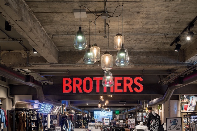
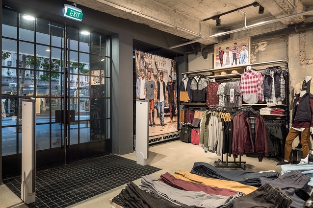
Hallensteins requires a high stock density, which necessitated covering nearly all the walls in product and the use of a standard fixturing system. With such a low budget and lack of time, Studio Gascoigne decided to embrace the raw element of the stripped-back interior. In this way, the designers were able to display elements of the building’s history, such as the aged concrete. “We tried to do more of a non-fit-out – something like a pop-up. We just stripped it back to bare bones, gutted it, put in the standard fixturing system and treated it like a skeleton. So it was a fun project,” says Gascoigne.
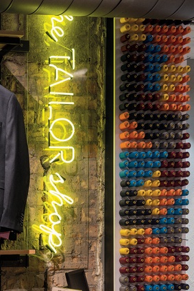
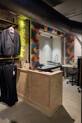
Painted walls were sandblasted and left as is. The air conditioning needed replacing, so the studio went with exposed spiral-welded ducting, painted black. In the counter area, hurricane mesh, bought from a hardware store, and painted steel shelving creates a gritty, industrial look. Neon lighting adds to this, while also providing visual storytelling for customers.
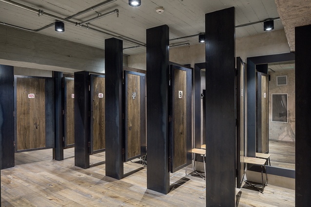
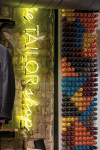
Detailing is low-budget but effective: the wall above the tailor shop in the rear adorned with a colourful pattern made from cotton reels, and a plywood counter. The existing fitting rooms were plain and uninspiring, and in this area most of the walls – and even the ceiling – were plasterboard, with none of the original concrete to expose. To fit with the rest of the design, the studio put in a lightweight pre-cast concrete ceiling.
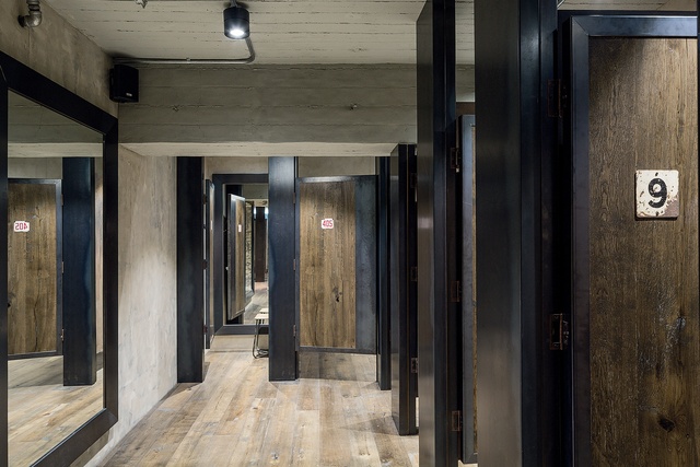
The wood flooring was left over from a previous job for Glassons and Hallensteins in Lambton Quay. The boards were sanded back and stained to appear aged. More of these boards were used to create the doors of the fitting rooms, which have steel framing and have been adorned with old metal numbers.
In terms of meeting historic regulations, Studio Gascoigne was required to reinstate the external column line. “One of the concerns for Heritage New Zealand was to do with the non-original shop front, which, when we took over the building, had three separate doorways created by two false columns. These columns did not line up with the column grid on the upper floors, so we rectified this by creating two new false columns, which lined up with those above,” says Gascoigne.
The studio also designed a new front door, to match with the steel joinery above, and reinstated the shop windows, one either side of the central doorway.

