Glam camping
In 2006, after Chris Tate sold a family house on Waiheke – a Richard Priest-designed pad with such humble accoutrements as seven bedrooms and a helipad – he found himself living in a tent in a nearby friend’s backyard.
Rather than self-pity, this architectural riches-to-rags story prompted an epiphany of sorts about the need for simplification:
“It was raining, and the local kids knocked my tent down while I slept inside; and I found myself saying: ‘This is what I want!’ Just a basic, day shelter with no running water, no services – somewhere I could come in after a day at the beach.”
Tate recalls the feeling of freedom, and the release from the shackles of home maintenance as the main instigators for this simple space-to-be. “We tend to place so much emphasis on the building rather than the experiences it can offer,” he says.
Tate bought a slightly sloping, waterlogged site and arrived with machete-wielding friends to tend to the weeds. He spent the next five years slowly devising an architectural language that translated the feeling of freedom he got while in the tent.
According to him, it was a true luxury to spend that much time designing his own place. “I would do something and think about it and go there by myself and think. I would have a glass of wine and go, ‘shit… how is this going to work?’ No deadline and no one breathing down my neck was a real treat.”
During the design process Tate met his now-wife and began planning a family; and by necessity the simple beach shelter concept became something larger and more comfort-driven. Nonetheless, the process remained faithful to his initial quest for freedom and experimentation. “It was like doing a university model, but it was actually on-site. I did the foundations and floors with a couple of students and grads, so it was a learning experience for all of us,” says Tate. He acted as the main builder for the house and, jokingly, calls himself a “black-market architect” due to the fact that he never studied architecture and is therefore unregistered.
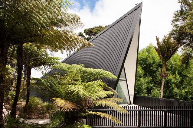
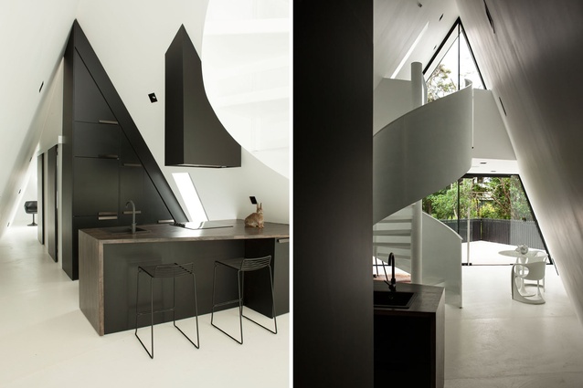
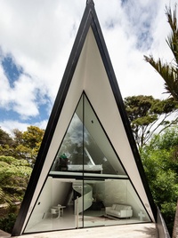
The resulting 1.5 bedroom, 70m² house is a strongly gestural – nearly theatrical – abode; part glamping, part bling-bling, with an unexpected accent of Victorian Gothic.
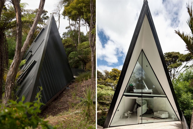
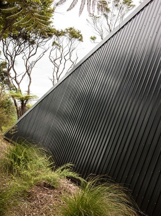
From the main road, the building burrows into the site like a corrugated-iron armadillo. The tapered form requires a strong foundation because the planes that make up two sides of the triangular envelope behave like “a great sail” when buffeted by high winds.
The structure is supported by huge steel portals that were cut and welded on site, and moved into place with ropes and shoulder power. Tate explains: “We couldn’t get any big machinery or cranes down here so it was done with six guys… it was kind of fun!” Given the shape of the building and its seven-metre height, scaffolding would have been a costly and logistical nightmare so Tate designed the wall purlins as a ladder; bringing the spacing right down so one could climb up the home’s exterior skeleton.
According to Tate, each angle of the triangular interior is different, which made construction an intricate, trial-and-error exercise. “What was rather simple to draw was actually really difficult to build. I worked closely with [engineer] Kevin Burrows and I worried that I was going to give him a heart attack. I think he likes me as a person, but I thought some of the things I came up with might cause his undoing!”
A brief walk on a thin wooden path leads from the carport, past a fire pit and spa pool, onto a bush-clad triangular wooden deck. Its unusual shape acts as the A-frame’s shadow, and the deck is lined with a black fence: “I like the Gothic references of this building and my wife always wanted a white picket fence, so I thought… hey, here you go, here’s a black picket fence,” jokes Tate.
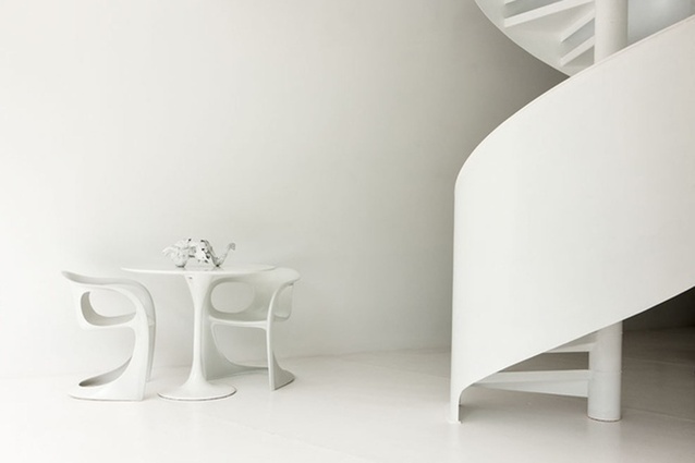
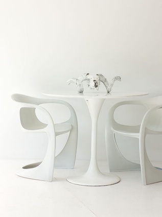
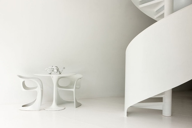
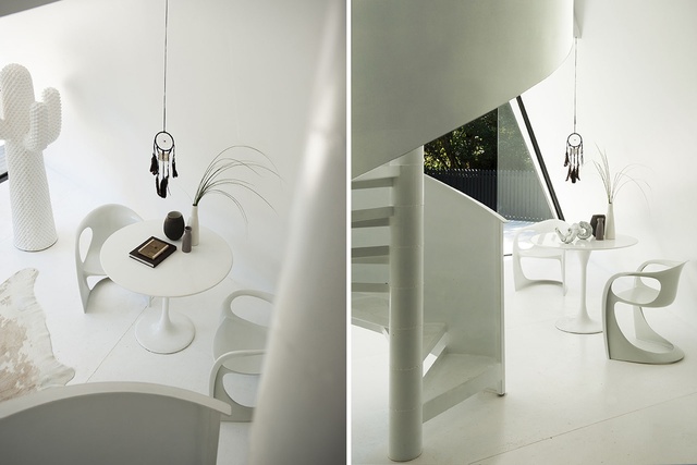
The front façade reveals itself with a bang: a glass-clad gable opens up like tent flaps, giving a direct view to the compact, black and white interior. The centrepiece is a ribbon-like staircase. A Knoll table and two Casalino chairs give the impression of slender, polar felines lounging in the Waiheke shade.
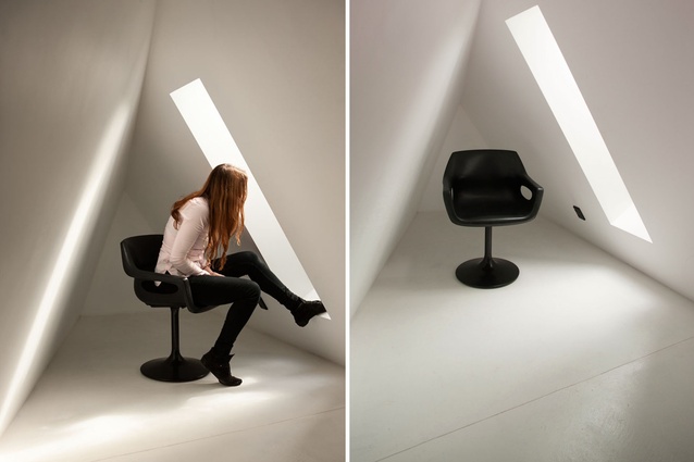
As with any A-frame, there is plenty of technically unusable space: the bathroom and the room at the rear end are tiny. Nonetheless, this home is an imaginative, vibrant structure. The lack of vertical wall surface, the limited axes (both for seating and walking) means every piece of furniture and artwork has been highly considered. This is minimalism predicated on spatial restriction, not aesthetic whim.
For an interview with the designer click here.

