‘Future retroism’: Bobhubski
This “1970s Japanese spaceship” home in Falls Creek, Australia by March Studio, designed with both playfulness and pragmatism, transports inhabitants to another space and time.
When the call came through to transform a rundown studio apartment in Falls Creek into “a 1970s Japanese spaceship,” Rodney Eggleston, director of March Studio, grinned and immediately started conjuring an all-white capsule hotel. Having collaborated with the caller – painter Robert Morgan – on a number of commissions, Rodney knew that this project could be conceptual and playful in equal measure.

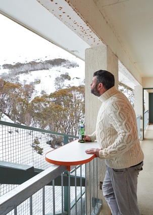
A summer site visit to the Victorian alpine village confirmed that the existing space had no redeeming features. What was formerly a staff crash pad in the Hub resembled a public toilet more than anything habitable. Furthermore, its southern orientation and meagre window denied any real daylight penetration.
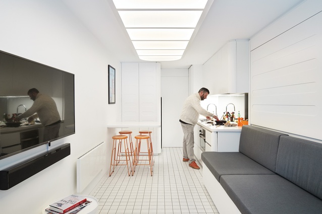
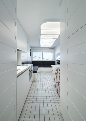
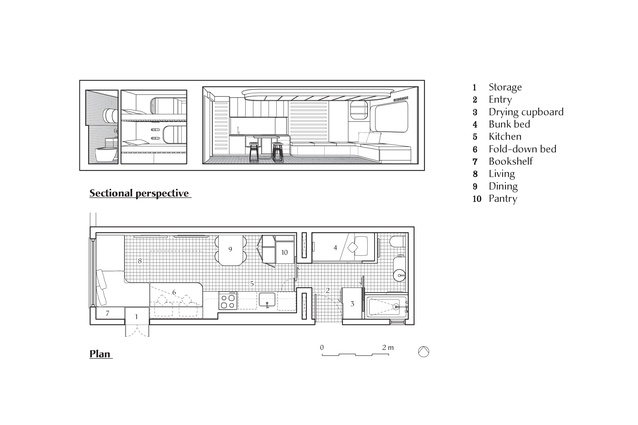
With graduate architect Jenny Kan, Rodney’s first priority was to reprogram the entrance in order to make the most of the 3.5 × 10.2-metre floor space. Moving the front door from the ring balcony to an access thoroughfare unlocked the potential of the project by creating two distinct zones: an open-plan living and dining area with a fully functional kitchen at the front, and the bunks and bathing zone at the rear.
Spatial constraints demanded the utmost in pragmatism. “When you get into such small spaces, you think less about how you’re going to finish them and more about making them feel bigger,” Rodney explains. “It almost moves away from architecture and lends itself to caravan design or boat design, because every piece of joinery in the space has to appear to be at one with the rest of the building, exactly as though it’s a kind of capsule.”
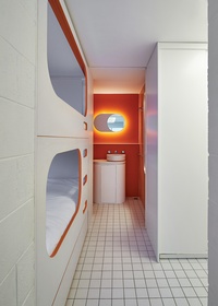
Curvilinearity flows from function to form and further defines the detailing of the space-capsule aesthetic. According to Rodney, curving all of the corners was a natural move that prevents hips from being caught on sharp edges in a narrow space. “When you’re dealing with a six-hundred-millimetre-wide corridor instead of standard nine-hundred-millimetre-wide openings, you’re really beginning to challenge the metric handbook on what is traditionally acceptable for a building. With these manoeuvres, the project almost starts designing itself,” he remarked.
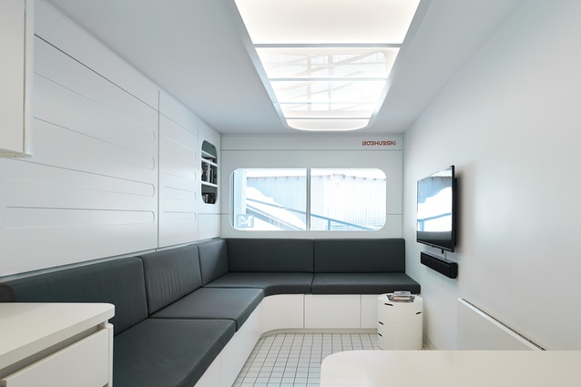
Systematically addressing the practicalities also resulted in a space that is reconfigurable for different modes of habitation. Building in the L-shaped lounge defines the living room, while a concealed fold-down queen bed allows it to be transformed into a bedroom within moments.
Clever and “secret” storage solutions are tucked into every nook. This includes an integrated ski and snowboard locker adjacent to the front door, a heated drying cupboard in the new entry, a lockable equipment cupboard behind the fridge cavity, under-seat storage, under-bunk drawers and a stash for valuables. In an era when Airbnb rentals can help offset an investment, it is still important to know that the aged single malt will be there untouched when the owner arrives to enjoy the apartment.
Addressing the lack of light was the next priority. A new, large-format, double-glazed window now draws in abundant natural light while presenting views of the summit. Instead of studding the ceiling with downlights, Rodney proposed an LED-filled light box that can be controlled for the desired ambience, from bright task-lighting to a subtle glow. This illuminating gesture feels like a skylight and helps to further unify the interior.
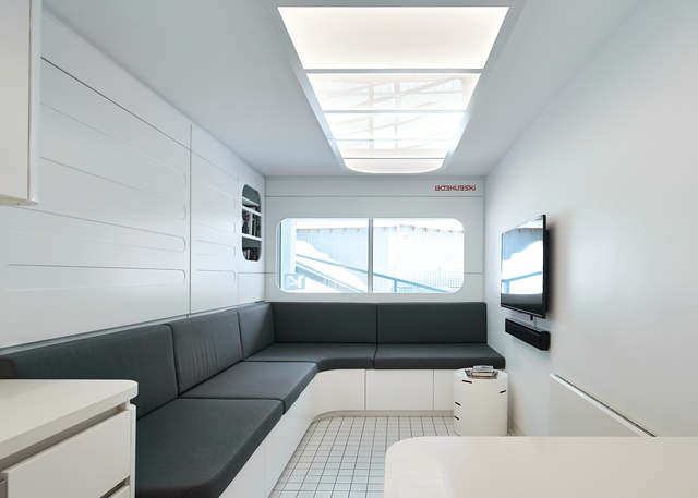
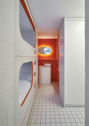
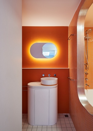
Predominantly finished in white on white, Bobhubski represents a stylistic departure from traditional alpine lodge interiors, which are characterized by timber panelling and flagstone fireplaces. Orange accents – in Bob’s favourite shade – are the counterpoint to the otherwise monochromatic palette. The hint of warmth seen in the custom dining stools is picked up in the detailing of the sleep pod ladders and carried deep into the bathroom, where it fills the wet area.
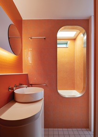
Here, orange Pirelli matting and orange mosaic tiles line the walls. Along with the elliptical fixtures and a round basin and mirror, they tie back perfectly to the “1970s Japanese spaceship” concept. Taking the theme to its logical conclusion, Bob insisted on a personal onsen and March Studio obliged with a deep plunge bath accessed via a stainless-steel-trimmed hatch.
Like March Studio’s Sneakerboy retail project, Bobhubski continues a fascination with what Rodney calls “future retro-ism.” There is an impression that this interior could be drawn from the set of 2001: A Space Odyssey . However, rather than sourcing deliberate references, Rodney explains that a love of scifi cinematic scenography is very much impregnated in March Studio’s psyche. He says, “There is certainly something within film that informs our thinking, in that interior spaces become the sets in which we enact the daily rituals of our lives.”
“While we are modernists in the way we design and detail things, it is really important to us that architecture is fun. Bobhubski is just that. If you have a weekend up there, I hope you will feel transported to another place and time. You’ll feel like you’re in a totally different environment – inside and out.”

