Future context
Richard Naish reflects on what drives his practice in the pursuit of its stand-alone housing designs.
After 20 years of RTA Studio practice, I am intrigued to be able to count on only one hand the houses we have designed with flat roofs. This is unsurprising to me but is indicative of a conversation we have been having continuously in the studio over the last two decades. Upon reflection, our practice, in the pursuit of the design of a single house, draws upon both nostalgia (memory) and future (fiction) combined with our interest in vernacular context and, in turn, the exploration of the distributed plan and, sometimes, the fragmented form.
This journey has explored and evolved an architectural language of contextualism that seeks to express our understanding of both our place in the Pacific – bicultural, multicultural, colonised, Anglocentric, seismic, geomorphic and pluralistic – and our endeavour to understand an unknown future. A future which demands flexibility, adaptivity, aspiration and an idealistic sense of optimism.
This pursuit drives us to connect the known with the unknown, the nostalgia with the dream, the past with future and, of course, the function with the form. If function is the mathematician, then form is the poet.
Early in the practice, I established a firm view that it is not a prerequisite for a building to appear appealing. If anything, I think this served as a constant reminder that the pursuit of beauty was the error of an architect’s way. That’s not to say that we have no interest in delight.
One of my early influences dating back to my final years at architecture school was James Stirling and, in particular, his work at the Neue Staatsgalerie in Stuttgart.1 Here, he curated a dialogue with the nearby classical 19th-century Alte Staatsgalerie by Schinkel, which had a typical enfilade arrangement of galleries.
He also made reference to the classical museum organiser – the domed hall – but his design had a roofless dome open to the sky and open to the public to walk through without entry to the gallery. This created an ambiguity of programme together with its architectural commentary on different periods of art and design. This clearly postmodern building is highly contextual and the way it dealt with past and future contexts continues to influence my thinking today.
Our design usually starts with a dialogue with the context of the site and an interrogation of the fertile layers of contextual intelligence that the site and the client have accumulated over the course of their respective histories and will continue over their future trajectories. The functional brief is unravelled in parallel to this and is generated from the client’s custom requirements.
The way we inhabit a house is constantly evolving. Even in my generation, the dining room has ceased to remain relevant to the everyday life of a Kiwi family. The digital age has changed the way that we view programmed TV. In one generation, we have seen the evolution of the radio to the black-and-white TV to colour, to the VHS to the DVD to Netflix – all now viewable on anything from a smart TV to a smartphone. The term smartphone is no longer needed as they are all smarter and smart.
This is changing the way we socialise as families in rooms like living rooms. Devices get watched in bedrooms; eating occurs in kitchens and living rooms. There is less of a necessity for domestic rooms to have strictly functionally specific purposes. So, programmatically, there is a lot more freedom as to how we plan a house and how we occupy a house. And, as this programmatic freedom increases, I sense there is more of a desire from clients for their houses to be so much more than functional.
Functionality is assumed to be more flexible, more informal. There is more of a desire for houses to be uplifting, aspirational, nostalgic, autobiographical, sociable, sustainable, affordable and flexible. So, the exploration of the functionally non-specific space and its relationships to functionally specific spaces offers a new anatomy of a house that has possibly adapted in anthropological terms to a new architectural epoch.
The early modernists’ experimental houses, such as Philip Johnson’s Glass House, couldn’t help but grab my attention during my discovery of their pursuit of less is more. What fascinated me about the Glass House was the way its erosion of interior constraints, such as walls, was followed by a freedom of functionally non-specific space. The placement of the single brick bathroom drum is really the only move to define specific programme in the house.2
In his analysis of Johnson’s body of work, Stover Jenkins documents what influenced him to arrive at this final concept and how many dozens of versions of the concept he interrogated before he finally got there. This became a powerful lesson to me on how important the rubbish bin is as a necessary tool in the pursuit of good architecture.
Finally, and more currently, although Herzog & de Meuron is not renowned for its houses, I have followed with strong interest the approach of this firm, which has denounced the styles of the ’70s and ’80s and developed more of a non-style. Herzog & de Meuron’s interest has been in the generation of an architecture that has been influenced by everything outside of the project – the unglamorous context, the banal and the ubiquitous.
“The plainness, going on banality of non-form which deflected attention to other properties: their surprising use of materials, unexpected inversions of weight and voids, ambiguities of scale. Deadpan was a favoured tool.”3
This, together with Herzog & de Meuron’s obsession with surface and new materiality, has captured my interest in its work and resulted in travelling to otherwise unintended places to visit its projects. The privilege of this sort of engagement has informed our practice not only in houses but in our institutional and commercial projects.
I have selected a handful of houses, either built, being built or on the drawing board, to try to expand this explanation of the practice of making single- house architecture within the New Zealand context.
Shaped like an ‘E’
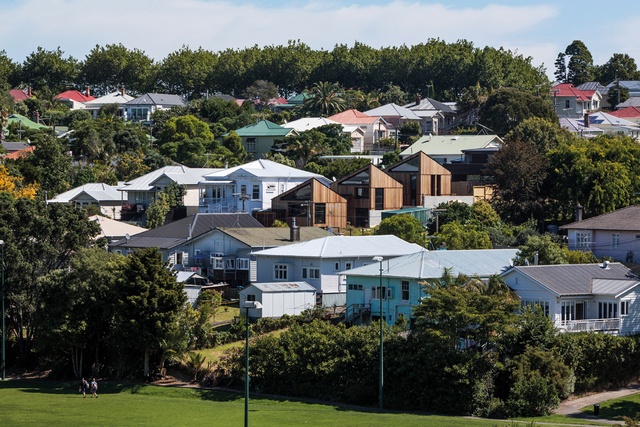
The E-type House for my own family of five rapidly changing human beings is a suburban family house, designed to span the evolution of the toddler to the teenager and the parents to the empty-nesters – an experiment in making a modern family house typology. But it was also a house to be inserted into the historic neighbourhood of Grey Lynn – reputed to be the largest collection of Victorian and Edwardian wooden houses in the world.
Despite this, the site was not within the conservation zone that required certain measures to be taken to ensure that the house was an appropriately courteous neighbour to its Victorian street-mates; nevertheless, it is trying to fit in. My interest was not so much in the context of history but in the context of form. So, this familiar dialogue between the functional brief and relevant context began.

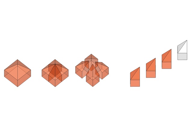
The solution is a house that distributes its programme through a variety of indoor and outdoor spaces, which facilitate a modern suburban family’s myriad diverse requirements. These spaces between the three forms became indoor and outdoor functionally non-specific spaces that allow activity to change through family evolution.
A fragmentation of plan required a fragmentation of form. Taking the context of the pyramid-roofed villa form and dissecting it into quadrants enabled us to step three of these up the slope both to accommodate the programme but also to respond to the repetitive, familiar form of the Victorian hillside. Issues of sustainability, daylighting, ventilation and topography, in turn, fell into line to offer an alternative approach (to the villa with alterations) to occupying a typical 500m2 Grey Lynn site.
Rural shed dissected
The Vineyard House is on a medium-sized vineyard in Central Otago, which has its roots in one of the earliest RTA projects – a winery building on a hilltop in Mahurangi, north of Auckland, completed in 2000. In this early work, we were determined to infuse the New Zealand rural vernacular with the language of wine processing, resulting in a shed with tanks or chimneys on the roof, indicating some sort of processing function. (They are actually skylights.)
This early dialogue with context and ambiguity of form was an important development in what has become a longstanding interest in attempting to make buildings that seem both appropriate but also provocative in their settings (Stirling’s Staatsgalerie, undoubtedly, was on my mind). Ironically, and also a testament to adaptation to the future context, this building has become a house. It has been bought by a family to live in with their two children and three horses.
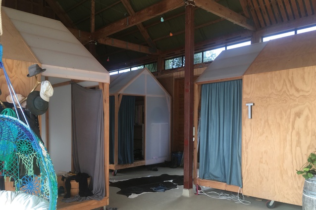
The cellar is now a stable and the processing floor a shed full of mobile bedroom huts on wheels. The café and tasting room became a living room and kitchen, and so on. So, the functionally non-specific nature of this series of rural/industrial spaces has allowed transformation beyond the building’s original intended use.

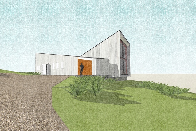
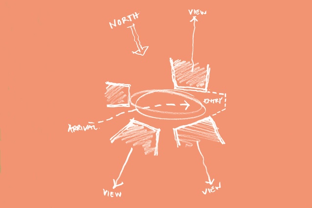
Considering this current Vineyard House in Central Otago, we once again thought carefully about the relationship between programme and context. The programme required two key spaces in this one-bedroomed house – the living room and the bedroom. The site at one end was nestled into a hillside that borders a quiet pond and, at the other end, extends to a slope, opening up to an elevated view over the vineyard. So, a duality presented itself between: contained view and unrestrained view, private and public, quiet and loud, and so on.
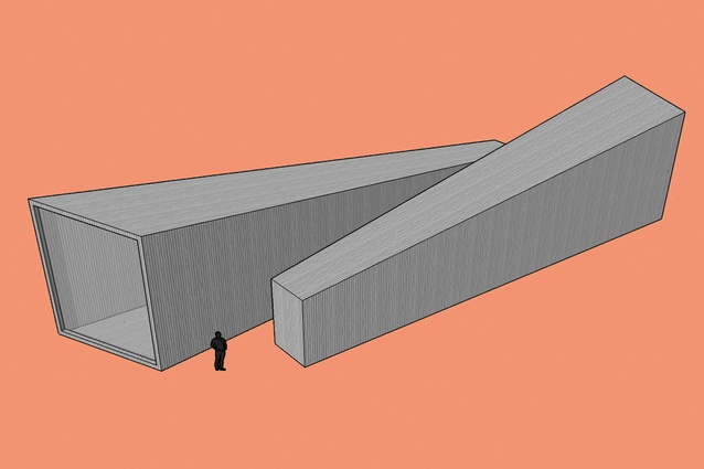
The programme suggested two forms so we looked to the formal and vernacular context of the vineyard and its wider district of fruit-growing shed architecture. The low gabled shed became chopped and bisected into two half-gabled forms; one rotated and slid up next to the other, allowing circulation to run between them. This offered an envelope that each end of each opposing half shed opened to its respective environment; each draws in an alternative ambience relevant to the function of each of the two primary spaces.
Of the landscape
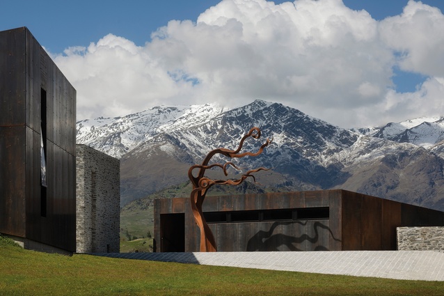
The Arrowtown House, in the same region, also draws from the context of natural landscape and vernacular form but it looks back to the occupation of the land used for farming and, further back, to goldmining. This house is of the land rather than on the land. Here, with so much space around the site and with such astonishing views in all directions, our response became one of respect for the natural environment.
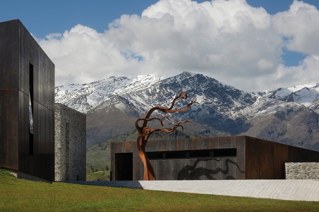
The solution was to extrude the house out of the ground like the natural rock forms of Central Otago – some forms clad in stone and some in steel so that they become both rock anchors and remnants of past human occupation, goldmining and industry. The house looks out rather than in so it forms a forecourt rather than a courtyard. It is extroverted rather than introverted. All spaces look out to the horizon of mountains – to the edges, to the future.
Tūrama whakapapa
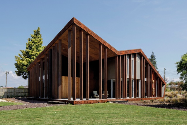
In one of the lowest socio-economic neighbourhoods of Rotorua lies a piece of land that has been in the custodianship of one whānau for 15 generations: from a time when its land stretched all the way to Ohinemutu marae, its pā on the lakefront. This land, once fertile vegetable gardens, is now a quarter-acre section where our client and creative collaborator, Paul Tapsell, asked us to consider another way to look at the context of a house.4

Here, we drew ley lines from this site to the important places of this whānau’s whakapapa. We made a geometry that was carved out by origins and resting places so the house became shaped by a cultural and a temporal context defined by the past and is now a beacon for future generations.
Gen Z House
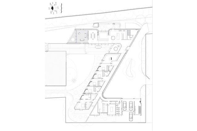
At 12:51pm on 22 February 2011, one of Fendalton’s quintessential two-storeyed brick mansions came tumbling down and, with it, all the spaces and objects of multiple generations. Several years later, we were asked to design a new house by the family whose parents and grandparents once occupied the site and whose children (Generation Z) will take custody in the future. What a responsibility. Our plan scribes a zed, holding the formality and memory of the past in the arrival court to the south and the informality and optimism of the future in the garden court to the north. This is a simple gesture, off which the entire programme of the house hangs.
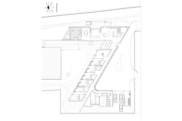
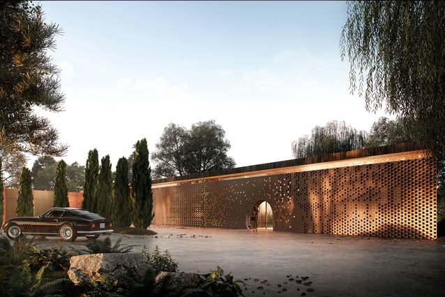
Living spaces stretch north and open west, bedrooms all line up to participate in the north-facing garden and service spaces stretch south. The form of the house rises up out of the fluvial plain like layers of time. It cloaks itself in a highly layered and textured skin of brick – a screen of rough, broken and smashed bricks that gives way to a more precise perforated wall, letting light in by day and emitting a warm homely glow by night.
So, formality, memory and tragedy of the past become a glowing beacon for the future generations. This house wraps its plan around its family – Fold, enfold, unfold 5 – as a poem commissioned by the owners to welcome guests at the entry observes. We wanted this house to offer a new way to occupy this multigenerational site.
High-Tide House
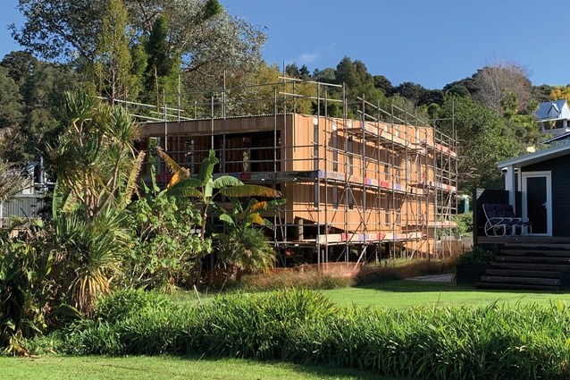
This north Auckland coastal site seemed to encapsulate all of the potential dangers and ominous forewarnings of the current conundrum of occupying the acutely changing zone of coastal New Zealand. Inundation, overland flow and sea-level rise all beckon to interrupt occupation. At first glance, this site seemed unbuildable and, if possible, then possibly an insensible proposition.
But then it also offered a challenge to the unknown or even a provocation to the unpredictable future context of climate change. The programme, then, required a solution that was to be part boat shed, part tree house, part wharf, part ramp. This three-bedroomed house and boat shed needed to touch the ground at the highest part of the site, to allow boat access, and then ramp up, to allow both current overland flow and future inundation to flow under while occupying an airspace that allowed access to birdsong and water views.
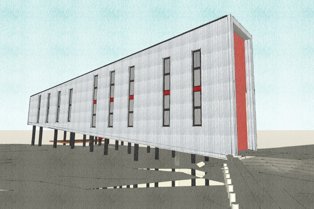
Gripping the solid earth 12 metres below ground level, a multiplicity of poles bears the mass of a formal geometry that was facilitated by a ramping floor connecting two rectangular framed views, each rotated 90 degrees – one horizontal to the sea’s horizon and one vertical to an ancient pūriri tree at the rear of the site. This house possibly imbues this multifaceted dialogue between form, function, sustainability, ambiguity, systematic interdependency and an overall pursuit of simplicity that sometimes aligns to create a house that really works.
Like a beguilingly simple object with a highly complex function – perhaps an architectural ‘device’, where form deceives function. It might not look normal but what does a house look like anyway?
1 Alan Colquhoun, ‘Democratic Monument’, The Architectural Review 176, December 1984.
2 Stover Jenkins and David Mohney, The Houses of Philip Johnson. New York: Abbeville Press, 2001.
3 Rowan Moore, ‘Two decades of Herzog & de Meuron’, The Architectural Review, 18 March 2015.
4 Paul Tapsell, turamaretreat.com
5 Cilla McQueen, Fold, commissioned, unpublished poem, 2019.

