From ’80s drab to ’80s-inspired fab – the reincarnation of a brick-and-cedar
Designer Thomas Ward affectionately describes the brick-and-cedar, rent-by-room house he and his partner Jessica Driver bought last year as a “1980s wonder”, its kitchen sporting memorable features such as a corner dishwasher with a cooktop directly above it, with no extraction, farmhouse-style cabinetry and a view out to the neighbour’s aluminium fence. Not to mention some “very nice vinyl tiles to the floor”.
Driver, an artist by training, recalls thinking the home’s aesthetic, with its brick base and cedar cladding, resembled that of a Pizza Hut restaurant, with matching carpet and curtains throughout. But, first impressions aside, the design-savvy duo could still see the potential in this Point Chevalier entry opportunity. “Firstly, there was an additional ancillary building, already set up with kitchenette, bathroom and bedroom, offering a work from home option and a space for me to paint,” says Driver. “And then there was the private north-facing courtyard wrapped in a brick wall and surrounded by neighbours’ rear gardens.”
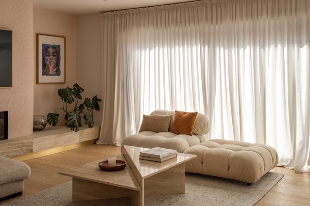
The challenge was to use the brick, with its colour, texture and proportions, and to echo it throughout the main house and the studio. The couple planned to reorientate the ground floor kitchen and living spaces, to better connect with each other and the outdoors, while at the same time removing the over-saturation of dark brown and beige, softening the spaces with colour and materiality, exploring and embracing texture and, ultimately, elevating the home from “’80s drab to ’80s glam”.
“What was key was that we wanted to retain the essence of the 1980s,” explains Ward. “We didn’t want to remove it altogether.”
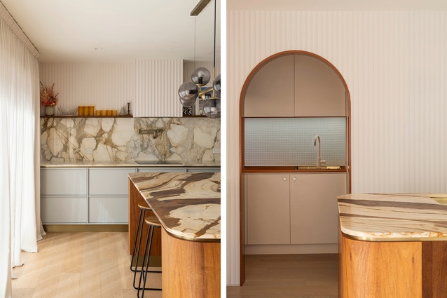
The first stage of the project was to address the floor plan, to open up the various spaces and to reconfigure the kitchen/dining/living area to make the most of the visual connection with the garden downstairs. This was done within the constraints of the original house footprint and without shifting load-bearing walls. “The key change was to switch the kitchen from an eastern orientation, looking out a small window to the utility side-yard, to a northern orientation, looking out over the garden,” says Ward. “This then allowed us to tuck the scullery through a new archway behind the existing load-bearing wall, freeing up space to create a guest bedroom behind where the laundry used to be.”
The upstairs was also reconfigured to include an ensuite and second bathroom. Finally, the garage was converted into a self-contained unit, with a full kitchen downstairs and a bedroom and ensuite upstairs, to act as both a work from home office and an art studio.
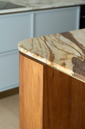
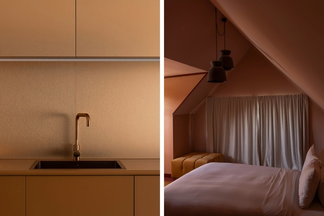
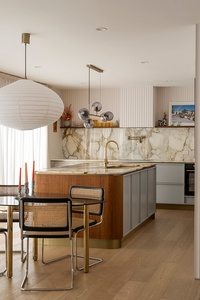
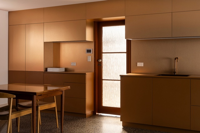
Ward and Driver chose a ‘modern 80s’ material palette, with a focus on “soft and glamorous as opposed to retro and neon”. Turned to face the garden, the large kitchen island is topped with an ochre, umber and beige-coloured quartz bench, wrapped in warm oak surrounds and finished with brass detailing and soft blue cabinetry. The rear wall incorporates the same blue cabinetry with integrated handles and brass detailing but, this time, topped with a marble benchtop that wraps up onto the splashback. The wall and rangehood above are lined in fluted Surround panels by Laminex. The studio kitchen is based on a two-tone copper and umber palette.
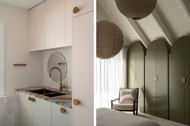
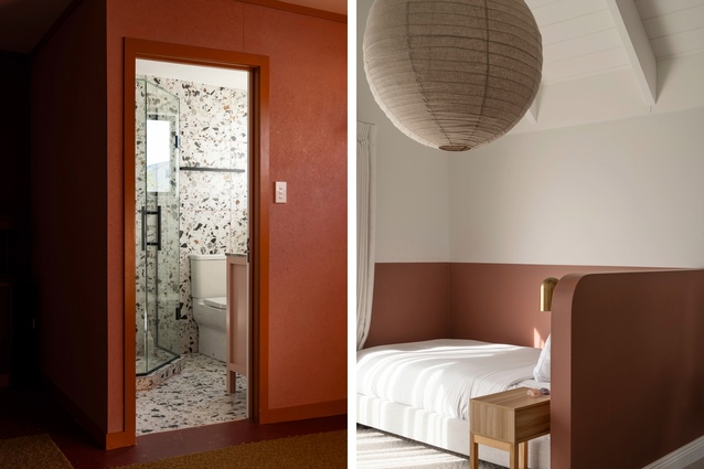
Upstairs, bedrooms and bathrooms are more muted, with bursts of colour on both walls and wardrobes. The bathroom tiles are a mixture of travertine and beige, midnight and dark green and, again, are finished with brass detailing.
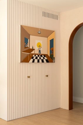
“The key to this project was injecting slightly varied aesthetics between adjoining spaces but keeping them within the same realm of modern 80s” says Ward. “The two curved archways downstairs, for example, help act as portals between these ideas, one from entry to living, the other from kitchen to scullery.”
A limited budget led to the couple selecting “key moments to spend and moments to save”, Driver adds, “such as the travertine used to make a bench seat beneath the fireplace, and to create ledges in the bathroom and ensuite upstairs, or the spend on the kitchen island benchtop, but then we pared back the scullery and studio kitchen, using colour combinations and details for effect, such as the burnt orange Formica benchtops with bull nose edging.”
What Driver and Ward have done here is totally transformative. And while they admit “there’s a lot going on”, the end result is elegant, cohesive and a considered nod to history. Long live the 80s.

