Free range
Jeremy Smith discovers a small ‘mufti day’ in the search for housing when he visits a reworked flour mill by Malcolm Walker Architects.
We all need somewhere nice to live: a house with a way in, some friends and a little respite. Yet, these days, private life seems to require more planning than ever: setbacks, height restrictions, living circles, fencing, acoustics, fire ratings. Throw in some curtains or blinds and our seclusion seems well guarded if not a little blinkered. Boundaries increasingly come with walls and, as housing efforts ramp upwards and outwards, communities are easily lost amongst all that privacy. Going to town with your housing development and pushing copy on that plan for the afternoon can quickly contribute many individual spaces but the divided uniformity of a spreadsheet. It’s all math and ever-decreasing squares. Ironically, in the search for neighbours, plans that follow the plan seem to do well keeping us apart.
The outcome of all this privacy planning is, of course, most evident in Auckland, where the success has been in not running houses quite as far as Hamilton. But it’s not all the same out there; not all housing demands space. Malcolm Walker and the team at Malcolm Walker Architects’ reworking of a former Epsom flour mill into a café and house tangles things up a little and sets a table where people might actually live and meet. This is a different kind of housing plan: one without a uniform, and one about connections, where asking your neighbour if you can borrow some flour isn’t so far-fetched. Flour Mill is a small mufti day in the search for housing.
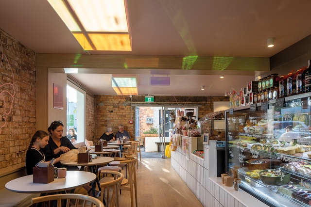
Food critics seem quicker to review good things than architects and Flour Mill’s pink coffee cups were quickly praised by the likes of Denizen, Zomato and Metro after the café opened in February 2019. The foodies are right. It is a good space: little, warm and full. But it’s around the edges where everything comes alive. Out on the street, the borders between café and footpath have been opened, just as American urban activist Jane Jacobs might have liked with her coffee. “Often, borders are thought of as passive objects, or matter-of-factly just as edges,” she asserts. “However, a border exerts an active influence”1 and that’s the trick here. Neighbourly life keeps breathing because you can brush shoulders a little. This blueprint feels drawn rather than printed.
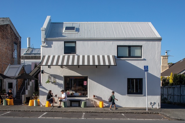
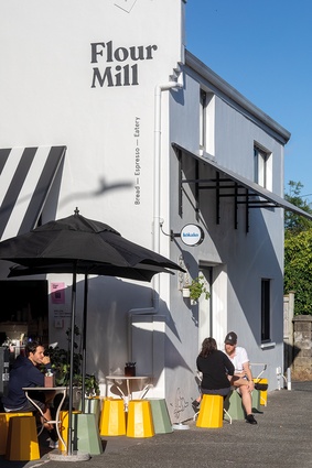
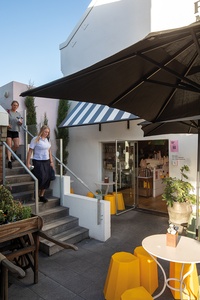
Walker is also a renowned cartoonist and long-time back-page provocateur for Architecture NZ. He occupies the street here with the same clever informality. There’s none of the strict chair orientation of Parisian cafés or the strings that seem to delineate outside café spaces in New Zealand when they step out onto the street. His chairs carry the right planning certificates to be let out like this, I’m told, but roping these multidirectional, yellow stools in won’t be easy; they’re free-range out there on the footpath. This is more like the space-finding in off-the-beat places in Tokyo. There, amongst all the action and demands on space, the void of the street often offers the only possible place to perch with something to eat or drink while everyone and everything slips by. This live planning seems to work in Epsom just as it does in Tokyo. Funny that, and here’s where we find the house.
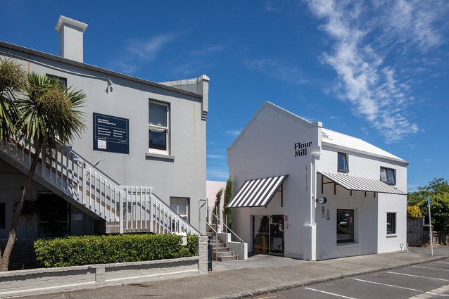
Walker has freed the stair from inside the Flour Mill and fitted it into a gap between buildings so that it ascends from the midst of those yellow stools gathering at the café entry. The stair then winds up and around to find the house in the upper storey. Along the way, it makes a little outdoor deck and helps out by connecting and liberating a neighbour’s upper level for good measure. Come join the party: coffee?
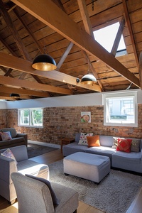
There’s not much fuss in putting all this together. It is mostly what is there already – some brick and some render, with earthquake strengthening artfully added to bond beams and gables, and, no doubt, down low as well. Throw in some new insulation and it is all feeling nice and homely up there. But, even with these new bits and pieces, the building is as much about what is not there as it is about any walls or finishes. This is all about finding space. Walker suggests that, if we work to better grade the edges to those buildings we already have, we might find more places to live much closer to home. Even better, we might meet some people along the way.
Sitting on one of those yellow stools, sampling a coffee with Walker and pretending to be food critics, I’m reminded of Japanese architect Akihisa Hirata footnoting an apparent mayhem of stairs, balconies and balustrades in residential Tokyo. “Houses, although small, should be more than simply buildings” and things like “greenery”, even “birds”, all encourage connections.2 Walker simply adds what he likes best: life. In true style, he then raises the roof a little and lifts a striped canvas awning unnecessarily high over the street, as if to say “it’s just a footpath and up there is a house!”
Unnecessarily high, did you say? Walker leans in a little and I learn that verandahs aren’t so easy to let out onto the street. The height isn’t necessitated by social niceties like shade and weather protection, or even any mother-duck parenting efforts to keep those stools from wandering far from home. There’s a transport rule book involved and another certificate in a bottom drawer somewhere. I can feel a cartoon coming.
Finding places to live isn’t just our problem, of course. “Living space is a scarce resource” the world over and this, German writer Mateo Kries suggests, has “led to a quiet revolution in architecture and housing”.3 Kries cites collectives banding together to solve housing problems. Such ‘Vive la Révolution!’ cries may be true in the re-imagining of Berlin or the freedoms of the Amsterdam canals, but rebellions here still seem somewhat dampened under the noise of trying to build all the way to Hamilton.
But aficionados shouldn’t plan on all the fun heading farther out into the hinterland to set up life with bells on, like Paolo Soleri in the desert at Arcosanti, or even scaling up buildings to have their own social street networks, like Corbusier’s Unité d’Habitation. There’s a simpler and less-evasive way to form a troupe. Cities are already collectives; they have bands of buildings that might band together if we let them.
So, it is also a little ironic that it is, now, 110 years since more New Zealanders were found living in cities than in the country,4 and we find a small café and house reminding us not to forget neighbours in the frantic search for places to live. Sometimes, it takes a clever architect or a good cartoon to point us back in the right direction. It feels like time to make a collective plan and we should pay close attention when Walker and his free-ranging drawing board add to their Sod the Villa housing discussions like this. There is plenty of fun and good living to learn. I know which house I’m in; you can never have enough flour.
1Jane Jacobs, The Death and Life of Great American Cities, Harmondsworth, Pelican Books, Penguin, 1964, p. 257.
2Hiroyasu Fujioka, referring to Kotoriku 2014, ‘A history of the individual house in modern Japan’, in Pippo Ciorra and Florence Ostende (eds.), The Japanese House: Architecture and Life after 1945, Marsilio Editori in association with Barbican Art Gallery, London, and MAXXI, National Museum of 21st Century Arts, Rome, 2017, p. 23.
3Mateo Kries (ed.), Together! The New Architecture of the Collective, Vitra Design Museum, Weil am Rhein, and Ruby Press, Berlin, 2017, p. 35.
4Ben Schrader, The Big Smoke: New Zealand Cities 1840–1920, Wellington, New Zealand, Bridget Williams Books, 2016, p. 353.

