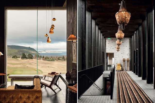
Fortified luxury
Like a modern-day castle on the banks of Lake Taupō, Kinloch Lodge provides shelter from the elements in rooms that are opulent, comfortable, and a bit magical.
Located on the edge of Lake Taupō and with views across the revered, Jack Nicklaus-designed Kinloch Club golf course to the central plateau, Kinloch Lodge is highly exposed to wind, which funnels up the lake.
The tussocky landscape and geology of the area inspired the golf course design, which in turn inspired architect Andrew Patterson to design the main building as a kind of embattlement, which appears steeped in history despite being only a year old. Stone wraps around the outside of the building, shielding it from the prevailing southerlies that come off the lake. Courtyards open to the north on the other side of the building, providing sheltered outdoor spaces.
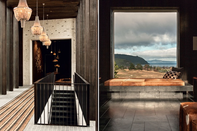
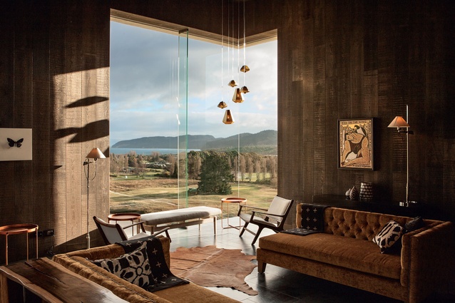
“You can sit with the sun on your back with these framed views that go right through the building’s big masonry walls. Without the frame, the view is distant, but if you frame it and stand back from it, it’s a bit like looking at it from binoculars and it brings it all into the room,” explains Patterson.
Often these window frames have small stages in front of them, due to the thickness of the walls, which provides intimate spaces for dining or seating. Internally, the rooms are lined in cedar. “We wanted to create a timber lined box within the rock. When you go to old stone buildings, it’s almost like they’ve been assembled out of rock and hollowed out inside,” explains Patterson. The exception to this is the Great Room, where the bagged stone walls give the room a monumental feel.
Renowned lodge designer Virginia Fisher (Huka Lodge, Kauri Cliffs, Matakauri Lodge, Eichardt’s, Cape Kidnappers, and more) worked closely with Patterson from the outset to deliver the interiors for Kinloch Lodge. “Virginia was great to work with as her style compliments the architecture,’’ says Patterson, who has designed several lodges with Fisher as well as designing her own homes.
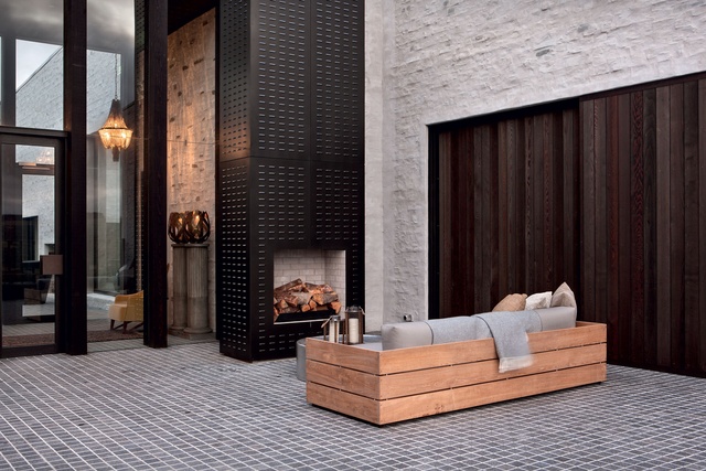
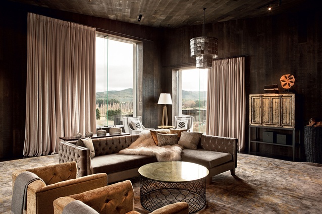
Fisher says this project was completely different from other lodges she has designed. “This is a major stone edifice, a modern castle,” she says. “So, I thought, castles are usually bare in some ways but make up with it with fabrics. Lots of depths of fabrics: velvets, furs, buttoning, deep velvet curtains hanging from great heights. It needed to be slightly regal but not in a pretty way, more lord of the manor. Hides, leathers and velvets are my main textures.”
It terms of colour, Fisher used a scheme of blacks and creams, with warm metallic elements such as gold, brass and copper. In some rooms, colours are taken from the landscape, such as the khaki green in the dining room.
“The landscape and view is the whole point of the place. I didn’t want to compete with it, just complement it. I wanted people to be in a very comfortable place inside but really notice the outside,” she says.
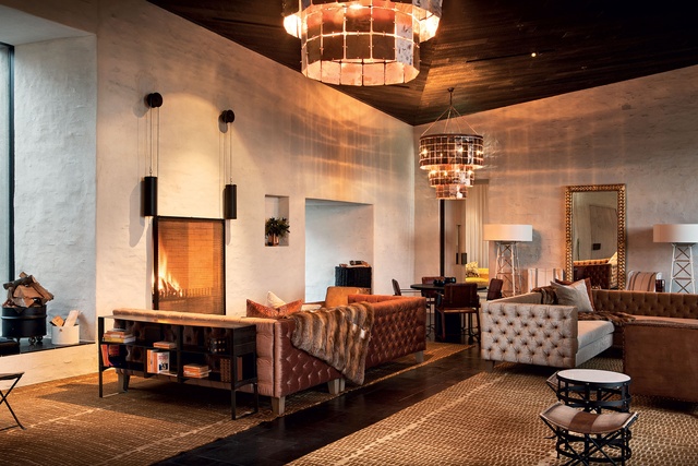
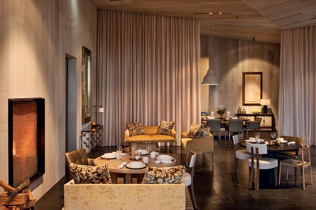
The dining room is not your classic restaurant space, filled with tables and chairs (“because I didn’t want it looking like the bridge club,” says Fisher) but instead has a variety of seating arrangements, such as couches and upholstered armchairs alongside straight-back chairs.
A long velvet curtain can be drawn across for private dining or to truncate the room when it is not busy. The space glows with the shimmering light from the fireplaces, which reflects on the gold colours that are used in the cushions and couches as well as the artworks and lighting.
A Picasso loaned by property developer John Sax, who is one of the lodge’s directors, graces the dining room walls, but New Zealand art is a key feature of the interiors. A Stephen Bambury piece hangs in a key spot near the entrance hall and a Nigel Brown hangs in the dining room.
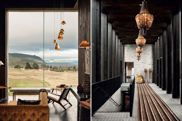
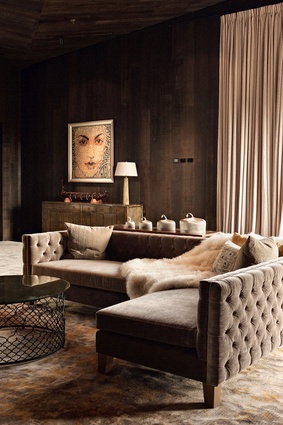
“I think it’s important for people who come from overseas to see what we have to offer,” says Fisher. “Just about everything was made in New Zealand, including the chandeliers. The conference room has a strong early Māori theme, with a beautiful painting by Jenny Mehrtens of a women with her face painted with gold moko.”
While called a conference room, this space is in no way utilitarian but very comfortable, with soft furnishings in a pale palette of greys, timbers, sheepskins and gold. By contrast, the bar is decked in dark timber walls and has large picture windows overlooking the golf course. All of the rooms capture the beautifully and architecturally framed views as well as the northern sun. These monumental materials create a kind of legacy that is rare in New Zealand architecture.
Despite being on the opposite side of the world from the Kinloch castle from which the lodge takes its name, the architect and designer have created a place with a sense of solidity and timelessness that give it an almost instant sense of history.

