Fluid forms: ANZ Centre, Christchurch
A central-city block in Christchurch has been revitalised by this multi-use building with a striking atrium and a curved and façeted form, designed by Esquisse and Peddle Thorp.
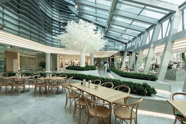
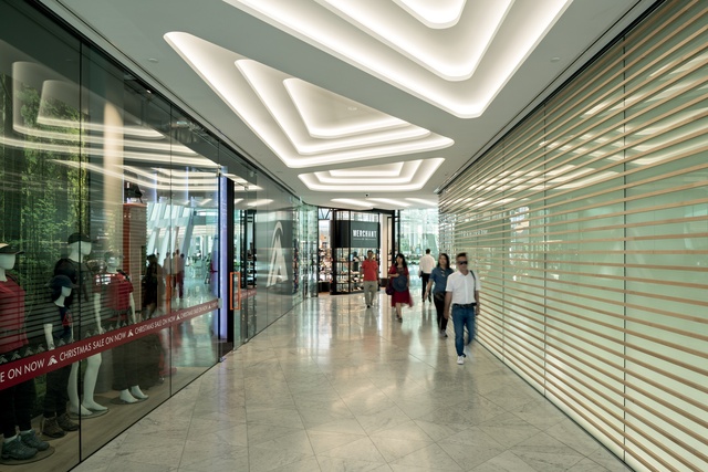
It’s a sunny, clear day in Christchurch and High Street is buzzing with pedestrians, shoppers and tourists taking in the city. Many are enjoying cups of coffee inside and outside the new ANZ Centre, which takes up the triangular block between Cashel, Colombo and High Streets. The building, with its facets and curves, seems to invite visitors into the central atrium, where hospitality offerings and retail stores spill into the light-filled space.
While the site has a rich history – and was once the main trade route through the city – in more recent times, this area of central Christchurch had lost its liveliness, explains Allan Stevens of Sydney-based practice Esquisse, who created the concept design for the building.
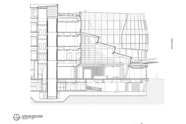
“Pre-’quakes, High Street felt like a back door but, because it had great aspects, we wanted to turn that around. We wanted to create an internal room that faced north and east: a year-round atrium that would create a new front room for the building and engage with High Street.”
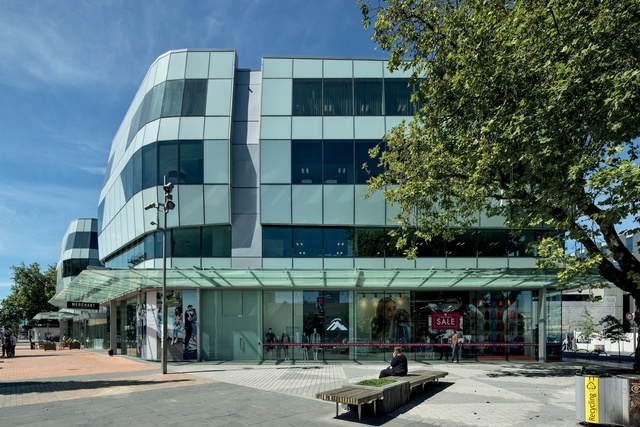
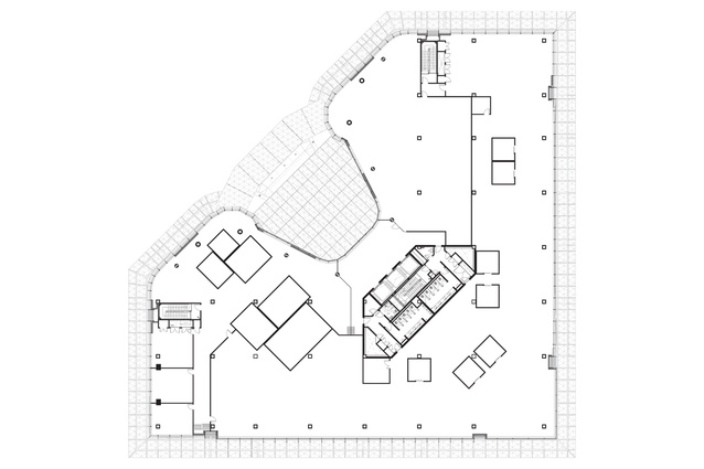
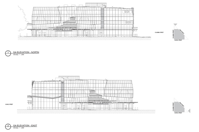
The design was motivated by the three-sided nature of the site. “It wasn’t bound by any other buildings. We thought that was a great opportunity to create a distinctive building that could relate to its three corners with three different expressions, and create connections to the laneways that were being planned parallel to Cashel Mall.”
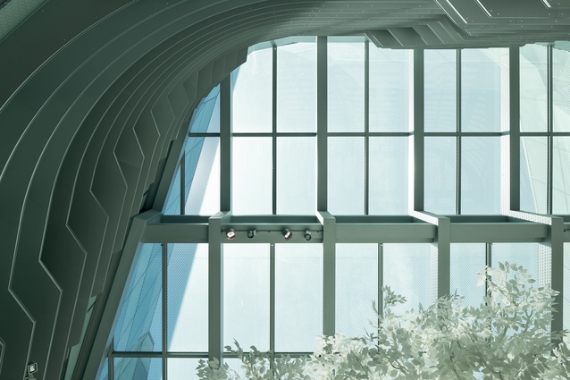
Stevens looked to the ranges that loom above Christchurch for inspiration and the shape of these is manifested in the façade. “These are natural, environmental responses that reflect the topography, geography and greenery I associate with Christchurch and, also, the Avon that moves through the city – sinuous and quiet. We were interested to see all of the forms, including the planters and the ceiling in the atrium, referencing the fluid forms that run through the site.”
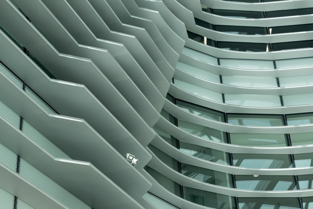
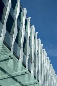
While unified by the singular colour and glass façade, the three different aspects of the building vary, with canopies at different heights and fins across the Colombo Street façade. A triangular shape carries through the entire building, seen in the forms of some of the glass segments on the faceted sides of the building and in the patterning on the glass, as well as within the atrium in the marble tiling on the floor, in the beams and on the low internal walls.
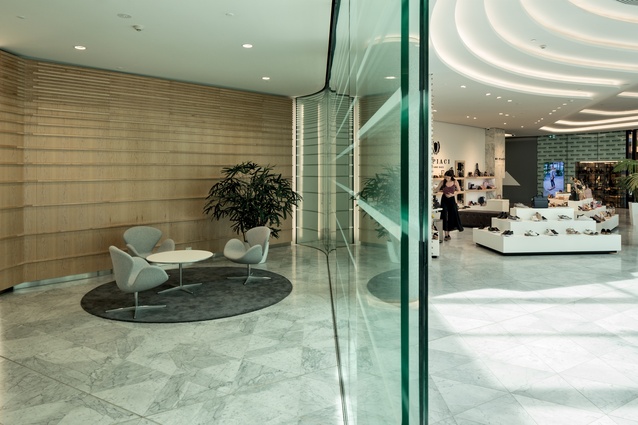
“White Carrara marble links the spaces together internally and this triangular pattern carries through and changes scale,” explains Stevens. The triangular pattern is a reference to the Triangle Centre, which used to occupy this site.
Marcus Hogan, who heads Peddle Thorp’s studio in Christchurch, worked to deliver Esquisse’s design to the site. He knew the area well, both pre- and post-’quakes, and was one of just a small number of people working in the area after the destruction happened. “I used to see the same handful of people every day; it was really a wasteland so this site was used for a car park,” he says.
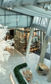
“Originally, there was quite a range of Victorian buildings here with smaller footprints. Council sold the land in whole blocks instead of selling them separately so it was important to break it down into what appears to be smaller elements. The tall, glass canopies also help to keep the retailers happy, as they are able to create double-height displays.”
Thanks to the structural engineering of the building, these retail frontages are also unimpaired by bracings. The building is base isolated, with the engineering carried out by Beca, which has its offices in the building. Jared Keen worked on the structural engineering: “Underneath the ground floor, under every column, there are isolator units,” he explains. “I describe them as two big steel woks facing each other with a big steel hockey puck between them, with a Teflon-like surface,” he explains.
“The building, ground floor and above, slides around on these things like big roller skates when the ground starts shaking. That means it shakes a lot less than it would otherwise and it holds together as one unit. The big benefit is less damage to the internal fit-out and the façade. Also, you don’t need special joints in the façade to tolerate the movement as much as you would in a conventional building.”
Because of the base isolation, all services that go through the basement of the ANZ Centre have to accommodate a potential sideways movement of 500mm. The sprinkler main has a stainless-steel elephant’s-trunk-sized loop as it comes into the building from the basement. Each high voltage cable has a similar, curved loop.
“These things take up a lot of space,” says Keen. “There’s a whole area in the ceiling of the basement dedicated to the high-voltage cables. It causes complications to the lifts – the lift is not going to enjoy being twisted 250mm if the bottom half of the building moves. The base of the lift hangs down from the ground floor in a stainless-steel cage, which sits inside a larger pit in the basement.”
The showers in the basement, provided for cyclists, have walls that are attached to the basement and a ceiling attached to the ground floor above. The car-park ramp has a slice through the middle of it as it spans both segments. In the atrium, the back area is tied into the upper levels of the building, while the front with the espresso bar is tied into the ground floor and is, effectively, its own separate structure.
“There is allowance for 100mm of movement there, thanks to a join in the structure above the espresso bar,” says Keen. “When the building wants to lean over and accordion the atrium out, that join will stop it.”
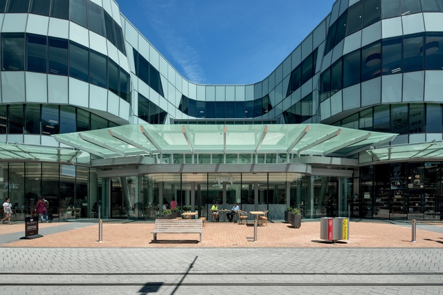
All around the exterior of the building, a band of tiles bordered with rubber edges is the only evidence of this system. In the event of an earthquake, this border would pop out of the ground to allow the building to move. Inside, Peddle Thorp coordinated the construction of the atrium to Esquisse’s plans.
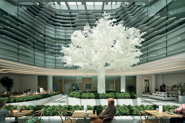
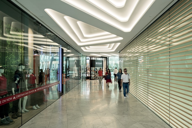
“The curved horizontal battens on the ceiling link all the way around the edges of the atrium, allowing the retail to spill into the room. This ceiling was made from fibrous plaster by Seddon’s, Dunedin, and fixed to the ceiling by Hush Interiors. The panels are backlit with LED lights,” says Hogan.
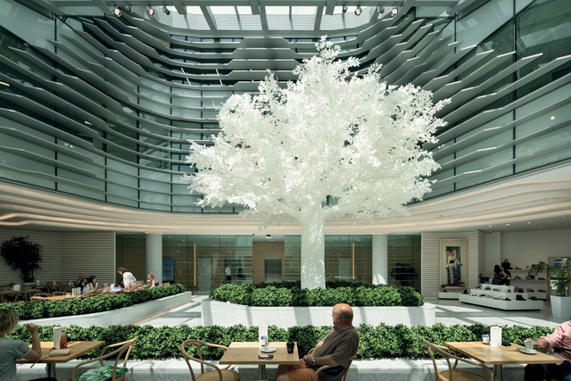
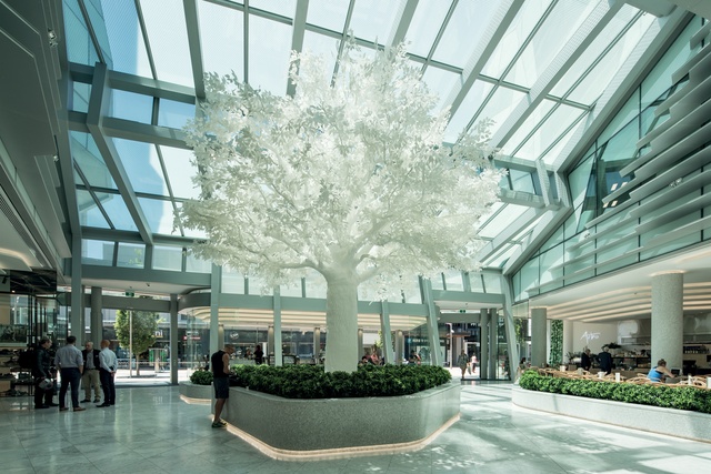
The most obvious feature for visitors to the building is the artificial tree which stands in the centre of the atrium. Created by TreeLocate, a company based in the English county of Northumberland, the white tree is an emblem for the building, giving the atrium an identity and a memorable point of reference.
“A series of lights shines down and changes colour depending on the day,” says Hogan. “On a miserable day, the lights are lit up and the tree becomes a sort of beacon to the area.”
The colours of the lights can also be changed to reflect seasonality and events. Underfloor heating in the atrium is programmed to turn on when the temperature drops. Similarly, if it becomes too hot, upper-level windows will open automatically to let out the hot air.
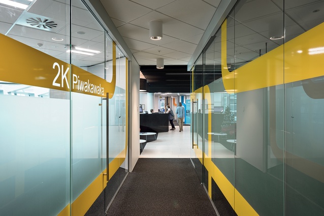
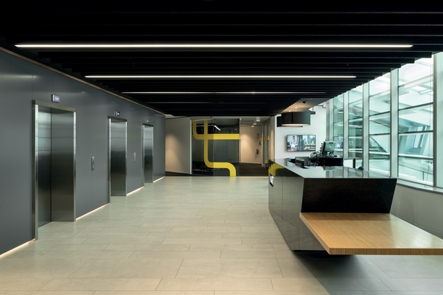
Upstairs, the offices were initially designed speculatively, with ANZ coming on board when the building was in the development phase. The fit-out for ANZ’s office floor was designed and delivered by Warren and Mahoney.
Beca’s offices, which carry over two floors, were designed by Studio Pacific Architecture and delivered by Beca Architecture. Peddle Thorp did all the base build modifications for the offices, which feature moment framing allowing for wider floor plates.
Positioned opposite The Crossing retail precinct, with its distinctive black forms, and across the road from the vibrant and colourful BNZ Centre, the ANZ Centre plays a definitive role in the creation of central Christchurch’s new character and culture.

