Flooring focus: part two
We talk to four architects who are using flooring as a deliberate design move, rather than an afterthought.
French oak
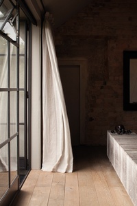
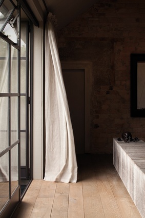
“There is a distinct relationship between the Humphrey Ikin bench, which is an outdoor furniture piece that has been brought indoors, and this solid French oak flooring. The flooring is from Designsource and was sent over from France all pre-finished. The edges are beveled so you read each individual board. There are also three different board widths. The idea behind this is that the whole project was an old building that had been stripped of a lot of its original services, and with them, its original character. If you look at old floors, the boards shrink a bit and not everything is properly ordered. Varying the boards gives the perception that the boards have been there a while and loosens the linear grid they provide. The colour of the stained oak is greyed to give a faded look.”
– Jack McKinney, McKinney + Windeatt Architects
Blackened concrete
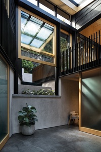
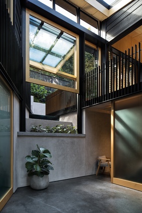
“This is a concrete floor with a hard-trowel finish that hasn’t been ground or polished. Black oxide was added to the concrete mix to darken it; this allows some contrast and also a relationship between the floor and the rendered blockwork walls. The floor was given a good-quality hard trowel finish when they first laid the slab, then coated with a clear polyurethane system to seal it. The homeowner had seen this kind of floor in another house and appreciated the even but varied texture and the fact that it didn’t appear busy. Concrete helps with passive solar gain in this house, and works really well to retain and radiate heat from the hydronic underfloor heating system through the slab, providing a stable interior environment.”
– Roy Tebbutt, Strachan Group Architects
Javanese herringbone

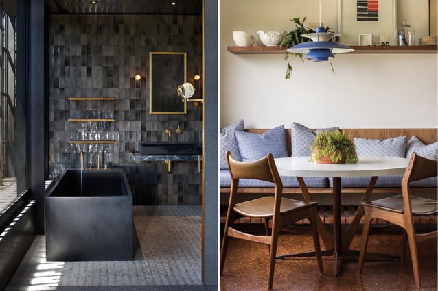
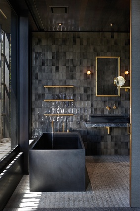
“As with most of our bathrooms, we chose tiles for good waterproofing and longevity. In this bathroom the tile is a little marble herringbone design that the homeowner sourced during their travels in Java. They travel a lot in that area of the world and they saw this tile and loved it. It is quite stunning as it almost looks like a carpet due to the marble pieces, which aren’t all uniform, so you get a nice undulating appearance out of it. The tiler cursed it but he was happy with the result. The house has a dark colour palette in general, with dark stained timbers and carpet, so the marble tile fitted quite nicely with the darker tones in the carpet and walls. It also helps to bring out the warmth of the brass detailing and fits nicely with the bathtub, which the client also sourced from Bali.”
– Andre Fourie, Herbst Architects

Soft underfoot
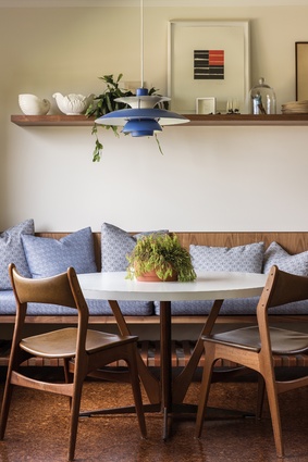
“In this renovation, the cork floor was something the original late-1960s modernist house had already (although not as extensively) and it felt really specific to the mid-century character that was so charming. Cork flooring creates a softness underfoot in the working spaces (kitchen and laundry) and makes a surprising difference in acoustics and comfort compared to harder surfaces such as concrete or tiles, as well as being far more forgiving. The new colour was richer and darker than the original and chosen to work in with the walnut tones of the built-in timber cabinetry. The result was practical, while adding warmth and texture against the cream-painted walls.”
– Jessica Walker, Bureaux

