‘Essentially romantic’: Eyelid House
Often in life, everything happens all at once – and this was the case for Fiona Winzar of Fred Architecture, who twelve years ago started her own architectural practice while pregnant with her baby, Agnes. Fiona reflects on the first project that began this new chapter of her life, Eyelid House.
If you really knew what was ahead of you, you’d think twice about starting your own architectural practice. Verging on madness and being a risk-taker are prerequisites. My first clients were my husband’s former neighbours: Jo and Shaun and Jo’s mother, Carol. After several conversations and a fair bit of red wine they took a leap of faith and commissioned me to design their home, with only our own home renovation as a form of project reference.
Jo’s, Shaun’s and Carol’s trust was unwavering when they discovered I would have my second child in the middle of the project and that their project would ultimately launch my practice, Fred Architecture (formerly Fiona Winzar Architects). I was employed at the time they engaged me, but was thinking about starting my own practice. Having their project and a baby “under my belt” sealed the deal, as completely against the odds as that would seem.
As it turned out, babies were a feature of the project. Jo was soon to have identical twins, which, with their first child, Max, would make them a family of five. My baby, Agnes, was born the day after a four-hour meeting with the clients and the builder to sign the construction contracts. No rest for the wicked!
That was a few days before Christmas of 2005. When building started in the new year, Agnes came to every site visit in a pouch and the site office became the change and feeding room when required. A baby is a calming device on site, with the odd swearing or heated conversation toned down to whispers and cooing from the tradies.
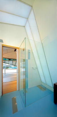
The challenge for this project – Eyelid House – was to create a light-filled, open-plan, three-bedroom, two-bathroom house on a tight and difficult site. The starting point was a typical single- fronted Victorian terrace, poky and dark. Here was a great opportunity to contribute to sustainable and compact inner-city living for a family.
The clients’ lack of pretension and relaxed lifestyle meant that a pristine white box with designer furniture was not something that would work for them. With young children, they wanted spaces to be informal, warm and functional. I used a layering of ideas to respond to the brief.
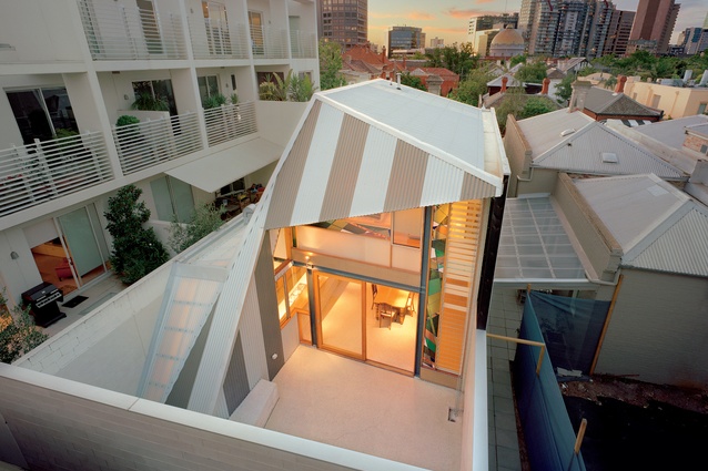
The central idea of the design is the roof form of the extension. Its shape has been manipulated like an eyelid, to create an open outlook to the rear courtyard while ensuring complete privacy from a dominating apartment block to the south and a three-storey hotel at the rear.
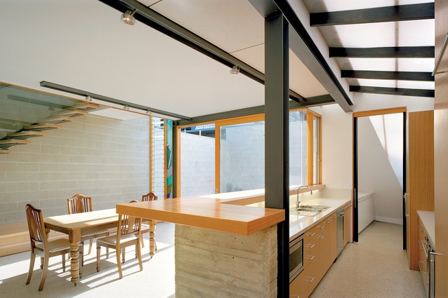
The roof overhang shelters and shades the glass facade to the east. The unusual internal spaces that result from the roof form are emphasized with tessellated plywood panelling and translucent materials.
“The first-floor bedroom and study space is my favourite part of the house,” says Jo. “The angled ceiling and wall planes are treated as a single form and the tessellated ply panels accentuate the form. While the bedroom is spacious, it gives a feeling of being in a treehouse or cubbyhouse, which is unexpected.”
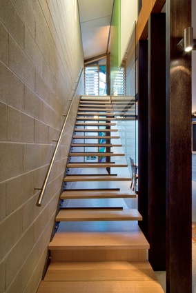
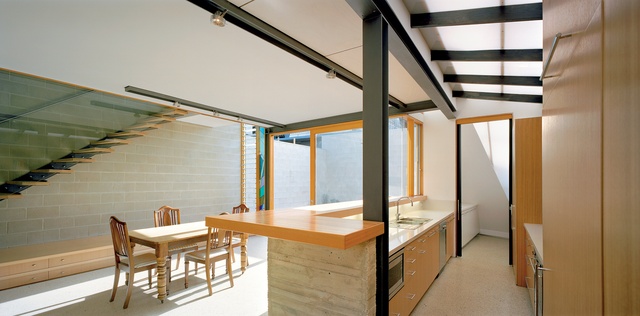
The simple striped pattern of the corrugated folded roof is a reference to local Victorian terraces that feature striped corrugated iron roofs on their front verandahs – a character that is very much Melbourne, Australia. The striped roof establishes a dialogue between contemporary and traditional architecture. This dialogue is reflected in the interiors, where raw materials including concrete, steel and timber are blended with more traditional elements such as stained glass and Turkish tiles. The design is contemporary but simultaneously creates an ambiance of warmth and intimacy.
Having a baby and making a building at the same time doesn’t give you much time to ponder, so it was a wonderful reward to have super-appreciative clients and to be acknowledged by the profession with an award from the Victorian chapter of the Australian Institute of Architects. The Eyelid House helped me to understand what my work is about. Winning an award gave me confidence to continue to run my own practice and helped me gain exposure to attract new clients.
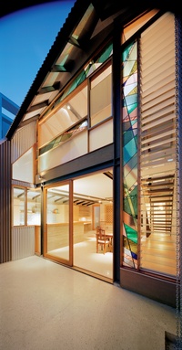
The work is conceptual and site-sensitive, but the architectural language is essentially romantic and expressive. I am particularly interested in creating spaces that vary in scale, have a fluid quality and make subtle suggestions about how to use the space. The appearance of the space has a looseness about it, but the way people use the space is being quite subtly manipulated.
While I haven’t really focused on the origins of my design approach, I can see that similar qualities can be found in Australian architecture from the late 1960s and early 70s. The approach is to create relaxed, sociable and comfortable living environments.
Over time, a preoccupation with fluidity of space and with creating environments of social intimacy has become very apparent in my work. This is largely in response to working with dark, poky or very cellular older-style buildings, such as the existing dwelling I worked with on this first project.
More than ten years on, Jo, Shaun, Max and the twins, Nina and Imogen, still love living in the Eyelid House, around the corner from Carol. We stay in touch and they always have a million stories to share. As an architect, knowing that your clients love their home and thrive in it is what keeps you going.
This article was first published on architectureau.com

