Eye-catching airport for Chinese city
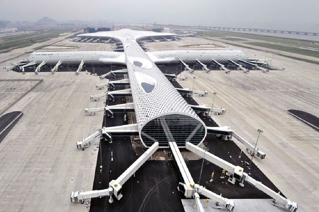
Designed by Italian-based Massimiliano Fuksas Architetto, the highly anticipated new terminal at Shenzhen Bao’an International Airport encompasses 63 contact gates, with a further 15 remote gates and significant retail space. It will increase the capacity of the airport by 58%, allowing the airport to handle up to 45 million passengers per year.
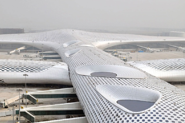
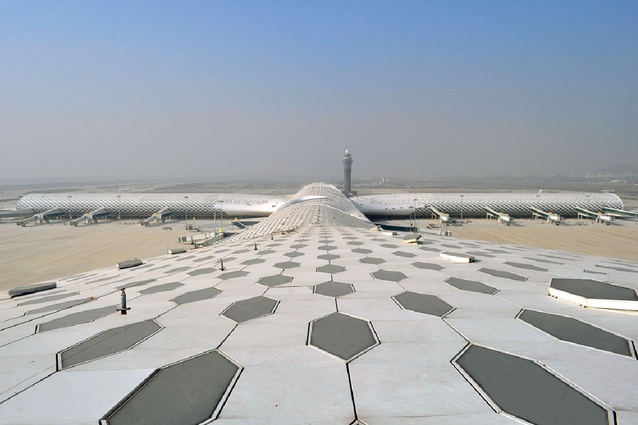
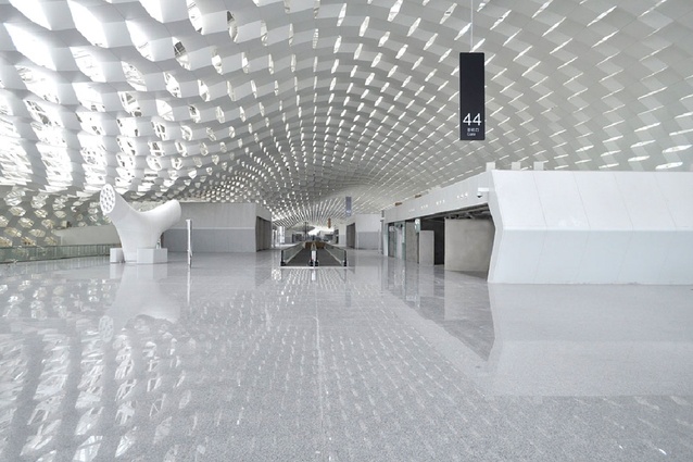
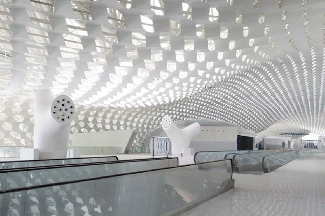
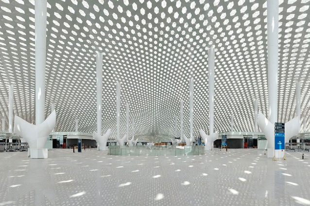
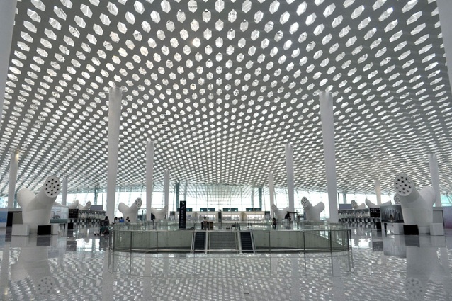
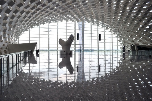
Chosen by international competition, the design of the sculptural 500,000 sq m terminal evokes the image of a manta ray and features a double skin façade that wraps the structure. Measuring 1.5 km long, with roof spans of up to 80m, the terminal’s façade is punctuated by honeycomb shaped metal and glass panels that allow natural light to filter through. On the interior, the terminal is characterised by distinctive white conical supporting columns that rise to touch the roof at a cathedral-like scale.
So taken with the design is the client, Shenzhen Airport (Group) Co., that it is taking the unusual step of trying to copyright it.
The focal point of the design is the concourse located at the intersection of the building. Consisting of three levels – departure, arrivals and services – they vertically connect to create full height voids, allowing natural light to filter from the highest level down to the lowest.
Studio Fuksas has created an interior in keeping with the exterior. The spatial concept is one of fluidity and combines two different ideas: the idea of movement and the idea of pause. Carefully considering the human experience of such environments, Studio Fuksas focused on processing times, walking distances, ease of orientation, crowding and availability of desired amenities.
Interior features include stylised white ‘trees’ that serve as air conditioning vents and check-in ‘islands’, gates and passport-check areas with a stainless steel finish that artfully reflects the honeycomb patterns from above. The honeycomb motif translates through into many aspects of the interior and at different scales – from the larger retail boxes to smaller 3D imprints in the wall cover.
Studio Fuksas is engaged on two further phases of the airport extension, scheduled to complete in 2025 and 2035 respectively.

