Elegant Samba

Click to enlarge
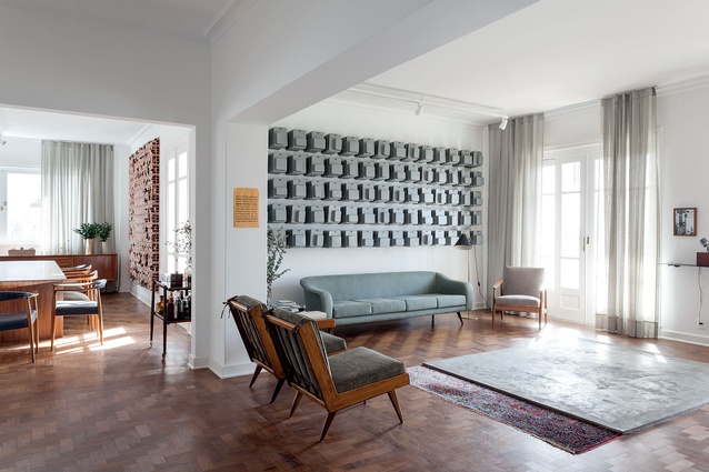
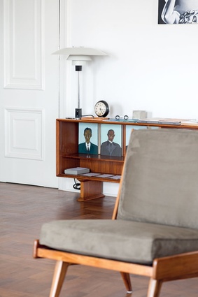
High studs and delicate Modernist furniture from Brazil and Denmark allow light to dance freely within this interior.

High studs and delicate Modernist furniture from Brazil and Denmark allow light to dance freely within this interior. Image: Fran Parente

1 of 12
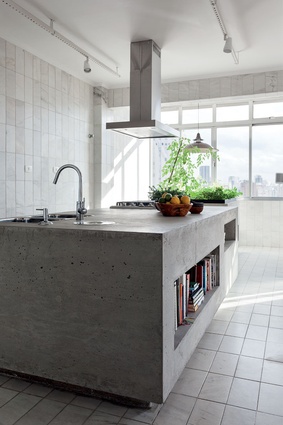
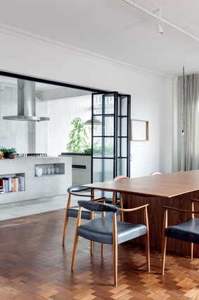
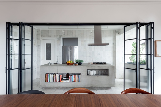
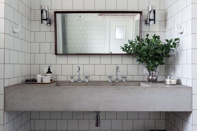
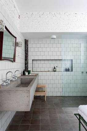
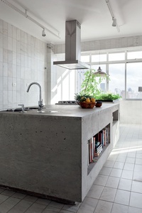
The elegant line of the furniture and the warmth of wood are contrasted with a Modernist materiality of concrete, steel and glass in the kitchen.

The elegant line of the furniture and the warmth of wood are contrasted with a Modernist materiality of concrete, steel and glass in the kitchen. Image: Fran Parente

2 of 12
The elegant line of the furniture and the warmth of wood are contrasted with a Modernist materiality of concrete, steel and glass in the kitchen.

The elegant line of the furniture and the warmth of wood are contrasted with a Modernist materiality of concrete, steel and glass in the kitchen. Image: Fran Parente

3 of 12
The elegant line of the furniture and the warmth of wood are contrasted with a Modernist materiality of concrete, steel and glass in the kitchen.

The elegant line of the furniture and the warmth of wood are contrasted with a Modernist materiality of concrete, steel and glass in the kitchen. Image: Fran Parente

4 of 12
The 70-year-old craftsman behind the concrete additions to this apartment had been a close collaborator of iconic Modernist architect Oscar Neimeyer.

The 70-year-old craftsman behind the concrete additions to this apartment had been a close collaborator of iconic Modernist architect Oscar Neimeyer. Image: Fran Parente

5 of 12
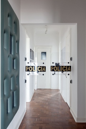
The police barricade intervention to the hallway is Swinging Doors by conceptual Turkish artist – Ahmet Ogut

The police barricade intervention to the hallway is Swinging Doors by conceptual Turkish artist – Ahmet Ogut Image: Fran Parente

6 of 12
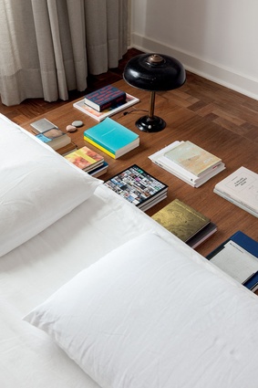
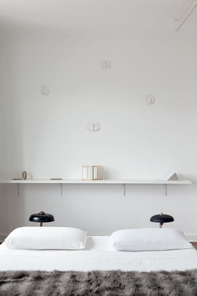
The bed was designed by Felipe Hess and all detailing in the room chosen to let the artwork be the focal point.

The bed was designed by Felipe Hess and all detailing in the room chosen to let the artwork be the focal point. Image: Fran Parente

7 of 12
The bed was designed by Felipe Hess and all detailing in the room chosen to let the artwork be the focal point.

The bed was designed by Felipe Hess and all detailing in the room chosen to let the artwork be the focal point. Image: Fran Parente

8 of 12
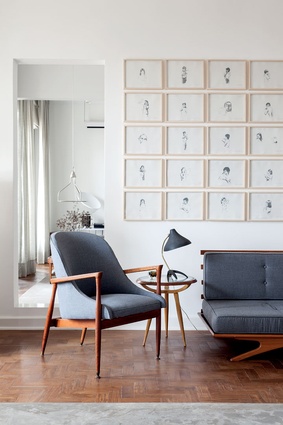
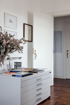
A muted palette of grey and white is used to balance rich Brazilian timbers and intricate details of many of the objects in the home.

A muted palette of grey and white is used to balance rich Brazilian timbers and intricate details of many of the objects in the home. Image: Fran Parente

9 of 12
A muted palette of grey and white is used to balance rich Brazilian timbers and intricate details of many of the objects in the home.

A muted palette of grey and white is used to balance rich Brazilian timbers and intricate details of many of the objects in the home. Image: Fran Parente

10 of 12
A muted palette of grey and white is used to balance rich Brazilian timbers and intricate details of many of the objects in the home.

A muted palette of grey and white is used to balance rich Brazilian timbers and intricate details of many of the objects in the home. Image: Fran Parente

11 of 12
A muted palette of grey and white is used to balance rich Brazilian timbers and intricate details of many of the objects in the home.

A muted palette of grey and white is used to balance rich Brazilian timbers and intricate details of many of the objects in the home. Image: Fran Parente

12 of 12
The elegant line of the furniture and the warmth of wood are contrasted with a Modernist materiality of concrete, steel and glass in the kitchen. Image:  Fran Parente

This 400m² apartment in the heart of Sao Paulo, Brazil, has some impressive Modernist credentials. The building in which it is located was designed in the 1950s by Franz Heep, a German architect who had worked with Modernist icons such as Adolf Meyer and Le Corbusier before migrating to Brazil after World War II.

“The apartment was very good,” says architect Felipe Hess who was charged with renovating its interior by a friend who had recently acquired it. “We closed a couple of doors and opened another one. That was it. We didn’t want to make any changes to the structure.”

The most successful intervention, however, included the design of a steel and glass door separating the kitchen from the dining area and rethinking the kitchen and bathroom with a Brutalist touch.

According to Hess, many of the walls used “original marble – so we thought, ‘what can we put to make a contrast?’. I had used concrete in the past and had worked with a gentleman in his 70s who used to make concrete for Oscar Neimeyer and Ruy Ohtake. We called him again and we designed two very simple boxes.”

The boxes in question are indeed simple, solid, horizontal volumes that act as kitchen islands and planter boxes for herbs and vegetables. Although somewhat of a departure from the original wood and marble palette, the grey mass adds a subtle touch of newness, a refreshed point of difference and tension that fits perfectly within this space.

A muted palette of grey and white is used to balance rich Brazilian timbers and intricate details of many of the objects in the home. Image:  Fran Parente

“The kitchen and dining room are very special,” corroborates the designer, “they are very unique and we will never do that again. They use the correct materials, proportions, and ideas… [the design] is very respectful to the original building and it is elegant too.”

There is no denying that sense of elegance. It was achieved in part by using original pieces from the 40s and 50s – Brazil’s golden age of furniture design, pared with similarly aged objects from Denmark.

A muted palette of grey and white is used to balance rich Brazilian timbers and intricate details of many of the objects in the home. Image:  Fran Parente

When it comes to furniture, Hess says, he suggested pieces and the owners developed an interest in the period. “We started to choose together the fabrics, the restoration, looked at auctions. The only item we designed was the bed which was also inspired by Modernism.”

Another of the main drivers here was to keep the furnishings sparse to accommodate and complement the owners’ highly political art collection. Hess’ wife is an art dealer and the couple have known the owners for many years and assisted them in pairing their collection to the modernist simplicity.

There is a balcony outlining the main social areas and Sao Paulo’s crisp light bathes much of the interior. “Its on a 22nd floor with an amazing view of the city,” says Hess, who insists that at night “you hardly turn on a light there… it is that beautiful”.


More projects