Dynamic expression: Unfurled House
An interplay between “sensual curve and straight edge” gives spatial drama and delight to this addition to a Federation home in Sydney by Christopher Polly Architect.
For Christopher Polly Architect’s clients Warrick and Kate, it was a recent online article about Elliott Ripper House that convinced them to engage the Sydney-based architect. His highly regarded project may be close to five years old now, but it’s still widely discussed and critiqued, having set a kind of unofficial benchmark for easy, modern Australian living. While they didn’t want a mere copy of Christopher’s past work, they did ask him to inject a comparable sense of programming vigour, spatial efficiency and aesthetic finesse into their own home.
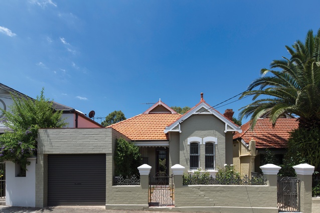
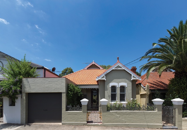
The couple’s Federation house in Sydney’s inner-western suburb of Petersham is typical of the area’s dwellings, bar the occasional oversized renovation and block of units. It has plenty of character and charm, but it suffered from a lack of space and light, which over time had become untenable with three young children. To meet their straightforward brief for more room, Christopher removed the rear skillion addition, making way for a two-storey addition comprising a new main bedroom and ensuite, kitchen, laundry, bathroom, living areas and study, all within the same footprint.
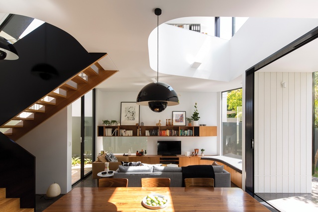
Unlike so many contemporary extensions, this one doesn’t attempt a seamless transition between old and new. On the contrary, Christopher deliberately retained the house’s original rear wall and even reinstated the edge of its roof. “My strategy was informed by a sense of preservation, to leave as much of the old fabric as possible, and so I cleanly attached the new two-storey volume, which has a split-level relationship to the old house,” he explains. The resulting landing level at the end of the existing west–east corridor dynamically unfurls into a series of internal spaces that extend outward, both left and right, up and down.
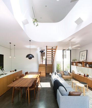
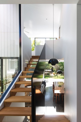
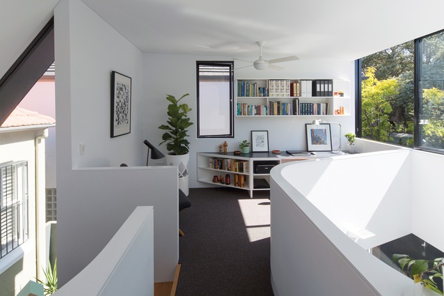
It’s an impressive exercise in spatial gymnastics, not to mention effective planning, which positions the bathroom and laundry in a central core so the living spaces can have a connection with the outdoors. While these utilities each have skylight access, the new north-facing courtyard also allows greater light penetration via a double-height trapezoidal window adjacent the stair. It opens up this circulation zone and makes the transition to the upper-level study and main bedroom seem all the more bright and breezy.
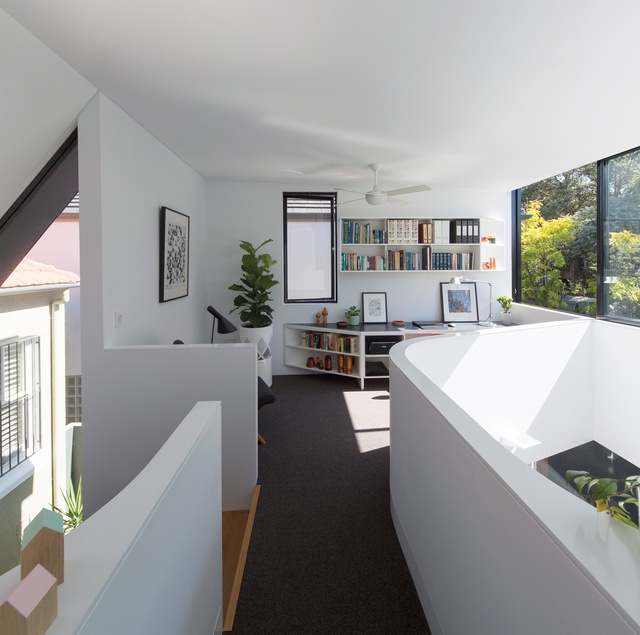
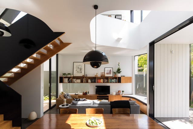
A bridge, formed by the stair void and another large void that vertically extends to the ground-level living areas, essentially connects these two spaces. The low balustrade wall of this bridge lends the interior its most compelling design expression. The curved form is unapologetically bold and works to soften some of the internal right angles. It’s a particular design language Christopher first began exploring in Elliott Ripper House and something he has successfully developed. The interplay between sensual curve and straight edge instils the overall plan with a sense of informality, not compromising its sophisticated aesthetic.
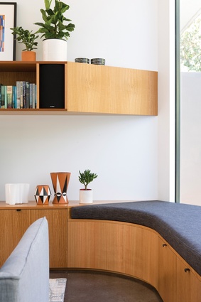
His pared-back material palette reinforces this sense of restrained elegance and determines the understated colour scheme. “I suppose my efforts to keep this palette to a minimum is something I always try and do, both internally and externally,” says Christopher. “I was also trying to work with the existing fabric of the old house, so I wanted to contrast strongly with that.” He has long favoured blackbutt for its warm honey tones and used it here for the staircase and for the joinery in the kitchen and lounge areas. While cost saving informed his choice of MDF for the stair’s balustrade, the glossy black paint effectively resonates with the black powdercoated aluminium window frames, against the all-white walls.
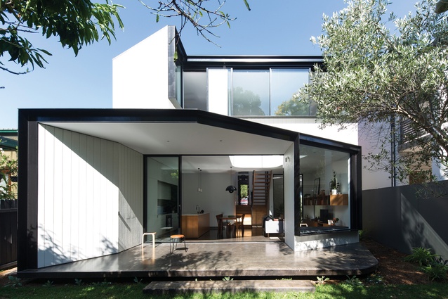
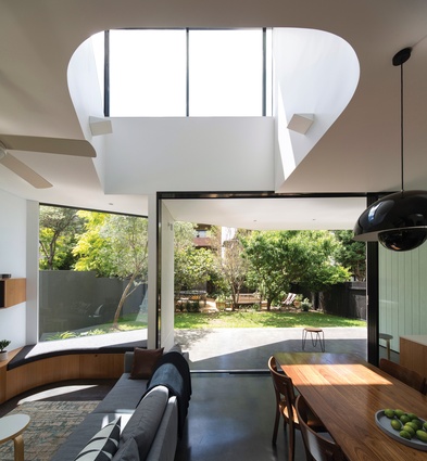
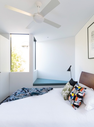
Christopher’s use of burnished concrete on the ground level adds a somewhat industrial grittiness to the interior, but most significantly it extends as a cantilevered terrace beyond the rear sliding doors. Crafting this connection with the backyard opens up the kitchen, dining space and lounge and makes their 8.3-metre-wide arrangement, while logical in plan, appear even roomier in person. Two window seats – one in the lounge and the other in the main bedroom – further strengthen this connection by extruding from the two-storey envelope.

“I took advantage of the clients’ request for window seats by using them to help develop the geometry of the scheme and respond to the setting,” Christopher explains. “As wedged sections they pop out and contribute to a more dynamic expression.” This programmatic requirement could have worked just as effectively in less dramatic form, but the idea was to capture as much northern light as possible. Privacy constraints meant orienting the lounge window north–east, away from the two-storey northern neighbour, while the main bedroom’s glazing had to be shielded from the four-storey block of units directly behind the property.
The rear elevation’s strong angles are even more defined by thick, black steel window reveals, which makes for a striking contrast against the white plywood cladding. Christopher has also incorporated a couple of subtle cranked edges externally – on a corner of the deck and in the form of the built-in shed – to retain cohesion with the interior. While his design is impressive in tackling the project’s complexity, its ultimate success is in providing an abundance of function and comfort.

