Dunedin Town Hall
“I was specially struck by what I cannot but call the hyper-excellence of the room… The architecture, furniture, and general apparel of these Houses – such of them as I saw – struck me as almost grander than necessary. The gentlemen as they sit are very much more comfortable than are the members in our own House at home and are more better lodged than are the legislators in the States of the American Union.” That is how British novelist Anthony Trollope described the Dunedin Municipal Chambers in 1855.
Although the accolade came two decades before the Scottish architect Robert Arthur Lawson began construction on the Michelangelo-inspired palace that to this day houses the city’s legislators, it gives a glimpse of the style to which these early bureaucrats were accustomed to. It hints at the level of comfort and the needs that Lawson was likely to have been working towards when he set out to erect the Chambers in 1878.
Throughout the years, many changes and refits have been made to Lawson’s original build including the addition of the Town Hall (in 1929) and the formation of the Dunedin Centre (in 1938).
For this 2010–2013 refit (defects and maintenance period ended recently) , Opus Architecture was asked to take these three independent structures – some of which were clothed in triple brick walls and separated by internal cavities – and knit them together into one large complex.
The firm was tasked with, among other things, improving “the way-finding between the three facilities so that they became linked and… fit for purpose,” says Julian O’Sullivan, South Island Studio Manager for Opus Architecture. The task was made all the more difficult by the fact that “no one level lines up with the other [building’s corresponding] level. The challenge was connecting them while maintaining a level of architecture,” he continues. Opus had only around six original water-coloured A1 plans to work from. The project team ended up producing around 700. “It was a highly complex job, we had nine work fronts and at its zenith about 150 guys on site. It took the time of three full time architects,” says site architect Dean Shanks of the 16,000m2, $45 million, three-and-a-half-year project.
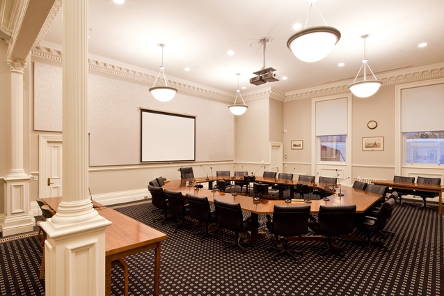
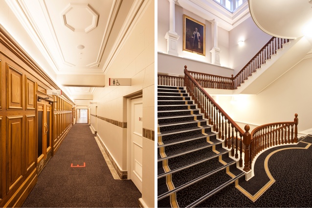
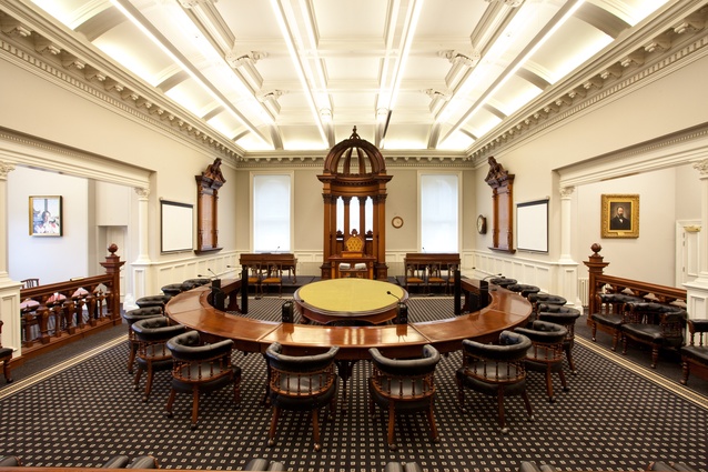
Along the way, the firm was expected to undertake highly overdue improvements such as: insert air conditioning (something Lawson didn’t quite foresee in the 1800s), as well as fire sprinklers, smoke alarms, an up-to-date electrical system and safer light fittings, safety improvements, modern communications and tech systems. The interior décor – such as the lemony-yellow, blue, salmon pink and gold-filigree colours splattered around the complex – needed to be refreshed and the popular convention and conference facilities needed to be expanded and improved upon. A neutral, tea and warm timber palette was chosen. Carpets with classic geometries were designed (the Municipal Chambers has a particularly memorable one).
As would be expected these relics needed to be treated carefully to protect the history and archaeological surprises this grand old lady eventually let out of her grip. Buried amongst the debris of past interior design fashions were such treasures as the country’s first post-tensioned beams and imported Colville trusses, which “were manufactured over in England and brought here and basically bolt by bolt perfectly installed”, says O’Sullivan. There are bomb shelters in the basement from the 1940s when many thought the Japanese were ready to raze the Pacific. Behind a wall panel under the plant room, builders found an old metal-bladed fan that looked like the propeller of a ship. It had been buried into the wall, like some sort of talisman. Graffiti etched under a Juliet balcony in the ‘80s was discovered.
This fit-out was a bulky and finicky three-dimensional puzzle completed while wearing the white, silk gloves reserved for such heritage structures. “We pulled it apart then put it back together,” confers O’Sullivan.
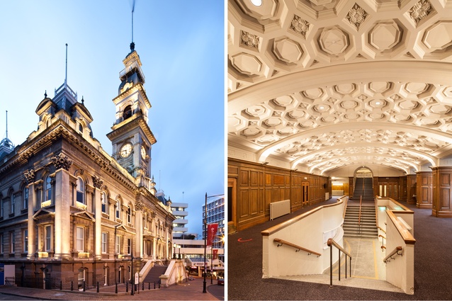
Aesthetically, there are very distinct gems to have come out from this massive (over 370 rooms in total) project: the Council Chambers, the Glenroy, a meeting area underneath the plant room and various transitional spaces such as the foyer to the Town Hall.
The Glenroy in particular, underwent a meticulous interior refurbishment that, in a way, synthesises much of what this project was about: retaining the heritage and modernising while, at the same time, treating any addition as a clear and visible insertion (rather than an imitation of past design vocabulary).
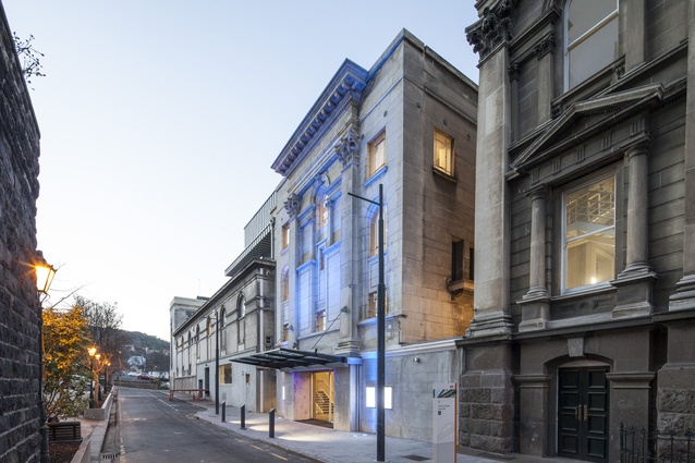
The Glenroy’s entrance reads like a play of light and proportions. It is made of full-height glass doors and canopy that highlight the original façade. Inside one is received by darker tones of full-height feature timber walls.
The refit of the Glenroy included other niceties such as removing its neighbouring, noisy, commercial kitchen and providing an acoustic treatment to a staircase that ruptures through the back of the space. The Glenroy’s new iteration exudes a combination of classic and streamlined beauty. The ceiling’s sculptural, acoustic panelling, the twin pendant lamps and Opus’ solution to the noisy staircase, a new stunning light treatment and colour upgrade make this one of the most blatant and probably the most telling of the project’s overall interior renovations.
Yet, as the architects insist, much of the work that went on here resides behind the walls: structural and engineering work, which is aimed at improving services rather than at being viewable by punters.
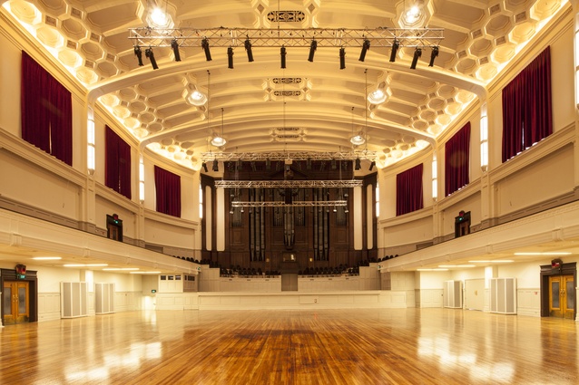
“There are 12,000m of cabling underneath the building,” says Shanks of the electrical, fire-alarm and data wiring that had to be stuffed into all manner of ceiling, floor and wall spaces. “The smoke extraction plant to the Town Hall resembles the engines of a space shuttle,” says O’Sullivan. The basement, which acts as a hub for new services and is made of piping and tubing, seems to emulate Norma, the 1919 symphonic organ that ebbs in and out of the walls of the Town Hall.
Along the way, the team had its share of challenges and sacrifices and unexpected discoveries. The biggest came due to a $5-million budget cut which forced an end to a planned and much-needed (aesthetically at least) entry to the Town Hall. It was expected to be a signature part of the project and behave like “glass box on a podium” as O’Sullivan calls it. “It was a way of paying respect to the heritage and allowing it to be visible.”
Another unfortunate happenstance occurred in 2012 when, as the story goes, a digger chanced upon former gasworks material that used to supply the old gas-powered street lamps. “All the by-product [of making the fuel] was dumped there,” says Shanks; “they basically laid down 150mm of concrete over it and buried it. No one knew about it.” The find sent the driver to the hospital for observation and forced the site to shut down for two weeks. Perhaps as a poetic silver lining: the workers had to regularly dump tonnes of coffee grinds onto the contaminated site to counteract the nauseous fumes. It is said the accidental perfume of coffee and tar wafted around Dunedin’s CDB for close to six months.
“You have love hate relationships with buildings like these,” says O’Sullivan. “Sure, you have your dark moments but, in the end, I have a great sense of pride because I know what went into it. It fills me with a sense of joy.”

