Drawing on ideas: It’s all about the drawing
Craig Moller reflects on his architectural drawing practice and finds a focus on how he draws, rather than what or why he draws.
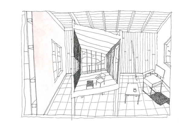
One idea of a theory of drawing is that a drawing is a collection of ideas similar to any architectural theory. My theory of drawing has developed from the engagement with the drawings of architects and artists I have studied and the influence that has had on my output.
Gourd House Town
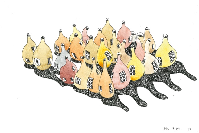
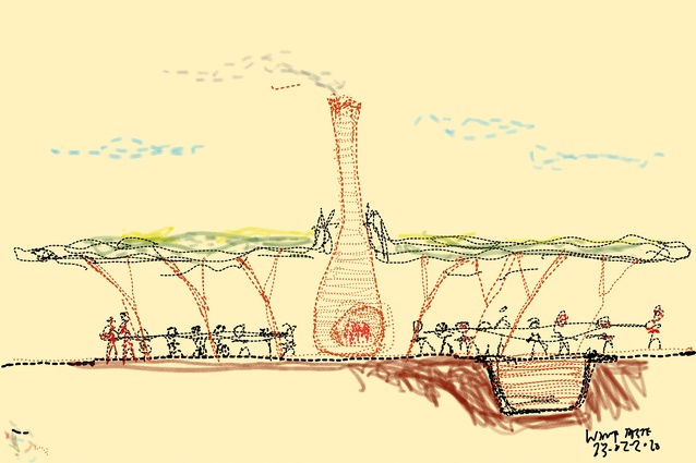
The Gourd House Town drawing started from a mistake when trying to draw our Tall Hut project for the Sculpture on the Gulf Pavilion 2019 competition. The drawing went in the wrong direction, in that the pencil didn’t quite do what was in the mind’s eye. I have found that it is important not to question these mistakes too much. Sometimes, it’s better to rely on what’s in front of you and work with that.
The resulting drawing reminded me of the gourds in the photos of the Casa Gilardi House by Luis Barragán.1 Like the nursery rhyme of the old woman who lived in a shoe or the Barbapapa cartoon house,2 it is an idea of architecture inhabiting something that it is not meant to – not unlike the ‘house in the tree trunk’ scheme that often appears in first-year architecture student projects. What if a gathering of gourds was an alternative way of building a town? This, for me, is drawing at its best: for pleasure and as a means of escape from work and everyday life – a mix between the imaginary dreams and the real work.
Early on, starting with the portfolio submitted for admission to architecture school, I realised I couldn’t draw in the way that I wanted or aspired to. The talent was modest at best and to ‘draw like an angel’ wasn’t on the cards, despite my architectural heritage.
As a way of reacting against that, as the youth are inclined to do, I developed another way of drawing, drawn out of the necessity to convey an architectural idea as fleeting, as ideas often are. This leads to a question of how one should draw. Often, when the pen or pencil hits the paper, the drawing doesn’t quite eventuate in the way that you would like. Rather than be disappointed with those efforts, as I was, I began to construct an approach that supported the drawing output, in assembling a range of ideas that formed a theory of drawing.
House as Still Life
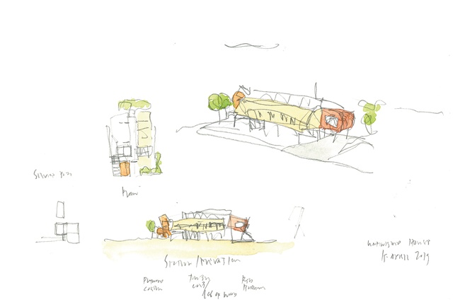
In the early phases of my architectural education, Norman Foster and Frank Gehry seemed to be two polar opposites, in both their architecture and their way of drawing. Foster, seemingly, can draw effortlessly like the proverbial angel.3 Gehry appears not to be able to draw in a conventional sense.4 His drawings are, at best, described as scribbles but, with enough power that, once the project is known from the model, the outline of the scribble can be detected.5 I always had the desire to draw like the former but often veered towards the latter in terms of output. Foster’s drawings seem to be mostly about conveying the ideas of a project to someone else – a client, a local community and other architects. Gehry’s drawings are trying to extract the idea of the project and the idea is, perhaps, represented better in other media, such as the physical model. When my drawings have got away from me, such as ‘House as Still Life’, and become unrecognisable, the introduction of watercolour enables a post drawing state, to clarify and distil the ideas embedded within and start the debate between line and colour.

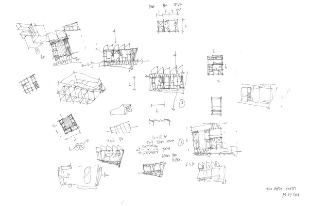
House as Two Apple Crates

The idea for this house and its representation is as a series of thumbnail sketches across a sheet of paper – the architect chasing the idea across the page. There are numerous examples of this to reference and draw upon in other architects’ work: James Stirling6, Alvaro Siza7 and Eduardo de Souto Moura8, to name a few. Often, for me, these frantic sketches are done in desperation, when trying to seek out or resolve an idea. Often, the idea of a project becomes The Architecture of Desperation.
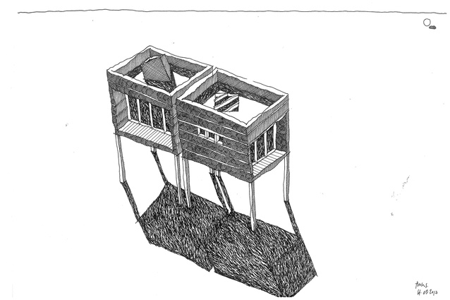
Only the Lonely

Then, when the idea is resolved, comes the more considered drawing. The influence is Giorgio de Chirico and Aldo Rossi, the melancholy of the Italian landscape, the long autumnal shadows and the sense of time passing. All reinforced in the idea that, while architecture can be permanent, the representation and occupation of architecture is temporary, a representation of a moment in time – as seen in the smoke of the train in de Chirico’s work9, or the bouncing ball in the background. The shadows here are shamelessly cribbed from both Rossi10 and de Chirico and the penwork from Giorgio Morandi’s etchings.11
Unfinished House

There are parallels to be drawn between the idea of an architectural theory that an architect operates under, whether that theory is implicit or explicit, and the idea of expressing that theory in a drawing.
In a media course lecture given to first-year architecture students, I talk about how the style of drawing contains an embedded microcosm of an architectural theory that is sometimes seen and sometimes concealed. I see the architectural drawing as a museum; a collection of ideas, half-remembered solutions, things seen and forgotten, an architecture of memory, recurring forms and archetypes. If the architectural theory of any architect is a collection of ideas and theories, things seen, half-remembered and forgotten, then the drawing is potentially the same and can be examined as such.
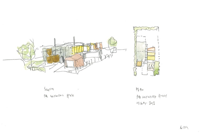
The thumbnail sketch and plan idea in the drawing above for the ‘Unfinished House’ sees the notion of the unfinished as an assemblage. Both the drawing and the architecture embody the idea of the museum and the unfinished – a collection of things, assembled like the still life in Giorgio Morandi’s paintings and etchings. It also draws on the axonometric rather than the perspective – a mode of representation that was popularised in the 1980s by Peter Eisenman12 and James Stirling13 as a way of thinking and explaining three-dimensionally in the one drawing.
Pre-Renaissance Triptych + Rossi
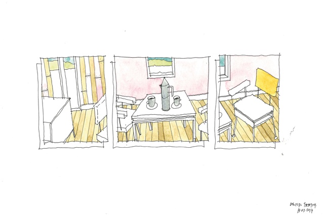
The triptych drawing (above) represents a combination of ideas from the pre-Renaissance perspective14, a triptych from art at the time15, plus the more recent work of Francis Bacon16 combined with the writings of Aldo Rossi17 and his espresso coffee pot designs for Alessi. It is a collection of ideas and objects focussed around the idea of domestic architecture, in which the life of the room is important and foregrounded and the architecture of the room is background.
The idea of perspective was present and known in the pre-Renaissance painting works but the singular vanishing point wasn’t grasped until Brunelleschi.18 Multiple vanishing points of the pre-Renaissance have acted as a reference point of my inability to draw a perspective correctly or convincingly in either one or two-point. Alternatively, it may reflect on me lacking the patience to set the drawing up properly and, therefore, finding justification in the shortcomings of the pre-Renaissance. Once the idea is grasped and takes hold, then it is sought out, developed and looked for in other forms of representation and illustration.
Tasting Room Section

The idea of thinking through drawing, to tease out architectural possibilities, has been covered by others. The ‘I think therefore I draw’ or ‘I draw therefore I think’ mode of operation is a way of developing ideas, as noted by Marian Macken19 in her review of Pete Bossley’s book One Year Drawn. Such thinking is particularly evident in the plan and the section. To paraphrase Renzo Piano, the order is in the plan and the beauty is in the section. Both the plan and section are important generators of the idea and also a recording of the idea. There is the sense the Renzo Piano project doesn’t exist until the sectional sketch is condensed and drawn.20 It can be the drawing that summarises and encapsulates the essence of the project, both before and after the architecture project is conceived.
The selection of media is a critical part of the process and, equally, the search for the ideal media a form of procrastination. Various media are tried and tested and discarded, based on the notion that the choice of media will affect the outcome of the project. What is vital is the tactile; the texture of the medium on the paper and the connection between the two. For me, the pencil, together with the paper weight and texture, have to be sorted before the project can begin.
But there’s always something new and I have admired David Hockney for embracing that.21 The notion of the one-room building is explored in the simple functional space of a wine tasting room. It explores how the media influences the drawing, in this case, the Apple pencil on an iPad trying to mimic coloured pencil and pen on paper. But it doesn’t, it goes somewhere else: the Apple pencil skids across the screen, not engaging nor biting in the way a pen does on watercolour paper.
One-point Perspective but too Many

An idea and the drawing can reach the end of its life. It exhausts the possibilities of the idea and results in the unfinished drawing ‘One-point Perspective but too Many’. It also touches on the drawings that inspired me as a student, Mies van der Rohe and Le Corbusier, hard as that may be to imagine from the drawing, in that Mies often favoured the one-point perspective, particularly around the notion of the courtyard house22, Corb, the two-point perspective. The one-point is often more about interior space, the two-point more about the grand vision of the city.23 Both architects are often spare in the use of colour and it is line rather than colour that resonates in the drawing of both, more Florentine24 than Venetian.
While drawing for the practising architect is often a means to an end, if at all, here, drawing is explored as the end itself. It is a place of research, developing theories, for unforeseen ideas and testing the media. The drawings are not intended for show but, often, as a means of escape, for pleasure (and pain) and something to do while drinking coffee. It keeps the hand in, in an increasingly digitised age.
1 Rispa, Raul. Barragán: The Complete Works (Princeton Architectural Press, 2003)
2 Tison, Annette and Taylor, Talus. Barbapapa’s New House (Orchard Books, 2014)
3 Norman Foster et al. Norman Foster: Drawings 1958–2008 (Ivorypress, 2011)
4 Da Costa Meyer, Esther. Frank Gehry: On Line (Princeton University Art Museum, 2008)
5 Friedman, Mildred. Gehry Talks: Architecture + Process (Rizzoli 1999)
6 Stirling, James. James Stirling: RIBA Drawings Collection (RIBA Publications, 1976)
7 Frampton, Kenneth. Alvaro Siza: Complete Works (Phaidon, 2000)
8 Levine, Richard C et al. El Croquis 146 Eduardo de Souto Moura 2005–2009 (El Croquis, 2009)
9 Noel-Johnson, Victoria. Giorgio de Chirico: The Changing Face of Metaphysical Art (Skira, 2019)
10 Celant, Germano. Aldo Rossi: Drawings (Skira, 2008)
11 Mundi, Jennifer. Giorgio Morandi: Etchings (Tate Gallery, 1992)
12 Eisenman, Peter et al. Five Architects: Eisenman, Graves, Gwathmey, Hejduk, Meier (Oxford University Press, 1975)
13 Arnell, Peter and Bickford, Ted. James Stirling: Buildings and Projects (Rizzoli, 1993)
14 Giotto di Bondone. Legend of Saint Francis – Homage of a Simple Man (1300)
15 Workshop of Robert Campin Annunciation Triptych (1427–1432)
16 Stephens, Chris et al. Francis Bacon: Books and Painting (Thames & Hudson, 2020)
17 Rossi, Aldo. A Scientific Autobiography (Oppositions Book, 2010)
18 Kemp, Martin. The Science of Art: Optical Themes in Western Art from Brunelleschi to Seurat (Yale University Press, 1992)
19 Macken, Marian. ‘Book Review: One Year Drawn’, Architecture New Zealand, November/December 2019
20 Piano, Renzo. Centre Pompidou Piano + Rogers (Fondazione Renzo Piano, 2017)
21 Weschler, Lawrence and Hockney, David. Cameraworks (Knopf, 1984)
22 Van der Rohe, Ludwig Mies. Ludwig Mies van der Rohe: Drawings in the collection of the Museum of Modern Art (MOMA, 1969)
23 Le Corbusier. Le Corbusier: Selected Drawings (Rizzoli, 1981)
24 Sorabelle, Jean. Venetian Colour and Florentine Design in Heilbrunn Timeline of Art History (The Metropolitan Museum of Art, 2000)


