Designing retail success
The design of brick-and-mortar stores is an ever-changing process, impacted by the consumer, technology and global trends. Marcus Baumgart looks at how skincare company Aesop has used branding, sophisticated e-tailing and the in-store experience to build a formidable brand name.
Since 1987, Aesop has been pioneering an approach to retail that uniquely embraces design and difference, and the tension between localization and globalization. Recently opening its one hundredth store, located in Oslo, Norway, Aesop is quietly conquering the world one physical retail experience at a time. It now has stores in seventeen countries, and the pace of growth doesn’t appear to be slowing.
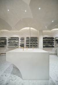
Given the financial success of the company and its consistent global expansion, I was keen to quiz Michael O’Keeffe, CEO of Aesop, on what Aesop had been doing to get where it is. There is no doubt that the company’s success has been achieved during a time of enormous upheaval in the retail world, not the least of which is the explosion of so-called “threatening” online retail over the past ten or so years.
Our discussion was wideranging and in some ways this reflects the curious nature of the Aesop story. We rambled both locally and globally. We stayed both “on topic” and strayed edifyingly “off topic.” We discussed design, poetry, culture and the role of retail in the community. All these things are on offer at the Aesop website, and in its monthly subscriber newsletter. Most significantly, we discussed a retail strategy that has a surprisingly simple and direct foundation, executed with none of what O’Keeffe calls “drift,” which he names as the curse of many an Australian and global retailer.
“Drift,” as he defines it, is the tendency for a product vision, aesthetic or in-store experience to slide away from an initially strong or consistent realization. This is not a mysterious or shrouded process – while some retailers start small and strong, with a clear product, service and aesthetic vision, as they grow there can be a tendency to homogenize. Sharp lines blur, and volume and price drive the decision-making. There may also be a desire to appeal to a wider consumer base, and to not alienate potential purchasers. In O’Keeffe’s opinion, this is a mistake, and it leads to the weakening of a brand, not to its strengthening through wider appeal.
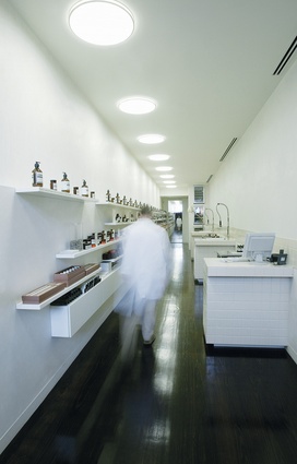
Since its inception, Aesop has been guided by founder Dennis Paphitis, and with his personal vision firmly in place, it has been able to stay true to its initial realization and the core principles of its marketing strategy. As such, there has been very little – perhaps even no – “drift” away from the founding conditions of the brand, established in its first store, which opened in 2004 in a carpark ramp in Melbourne’s gritty St Kilda.
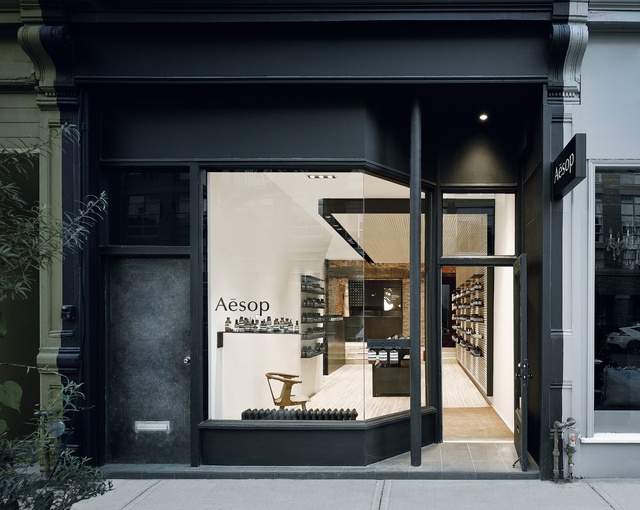
Many of the characteristics of the brand’s original appearance and strategy, from all the way back in 1987, are still evident now. These include the brown glass apothecary bottles (now imitated by more than two dozen brands worldwide); the sans-serif typography and design of the graphics; the eschewing of celebrity endorsement or advertising; and the tactile, scientific packaging and aesthetic.
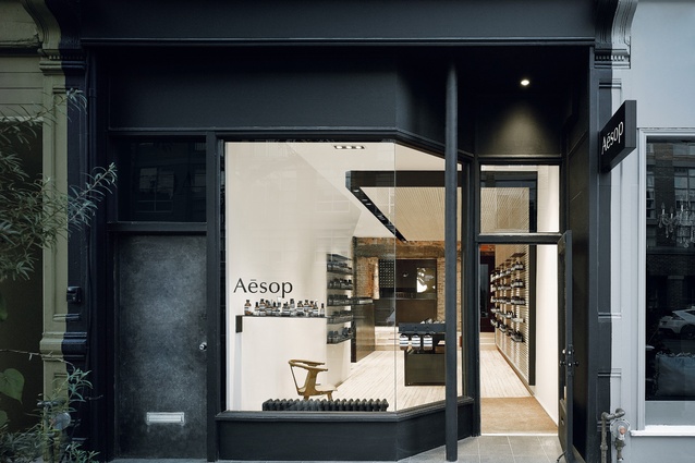
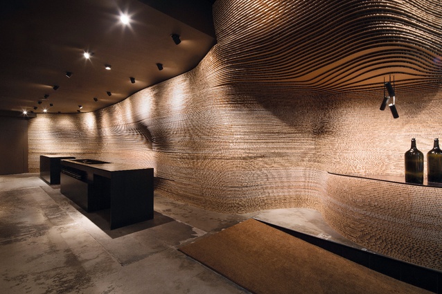
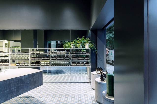
What is also consistent is the personal experience of the in-store consultation, albeit with subtle, culturally driven, localized variation. This is the basis of the bricks-and-mortar retail strategy, and forms a process-driven “backbone” for the in-store experience globally. As O’Keeffe explains, there are some aspects of the store brief that are common across the world, for example, the point of sale procedure. This and other important aspects of the in-store experience are not “reinvented” each time a new store is to be designed. Nevertheless, no two stores are alike, as the brief allows for a new, localized design interpretation in every case.
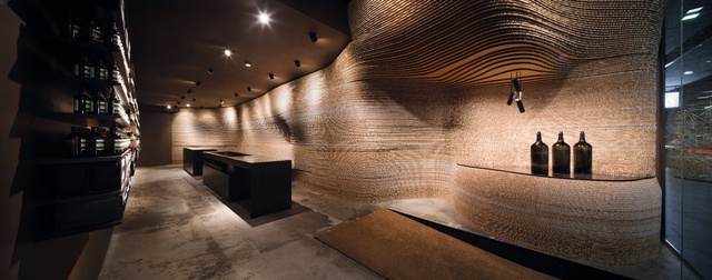
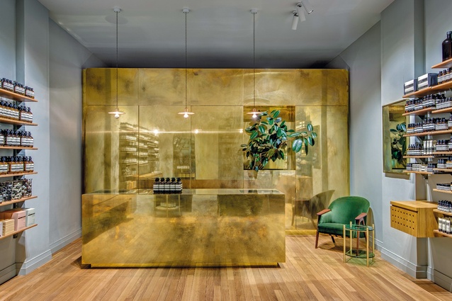
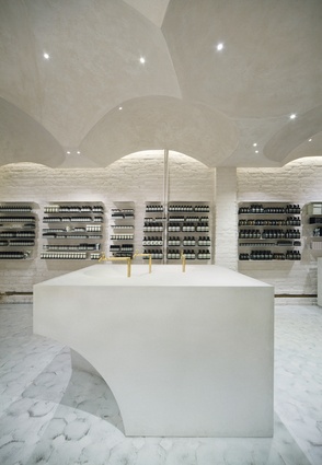
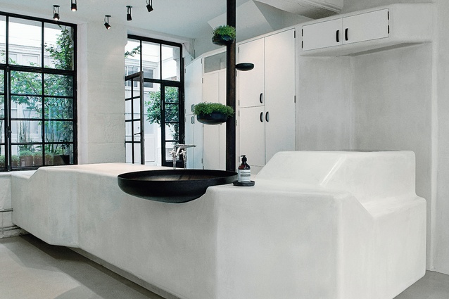
To create these interpretations, Aesop has made a name for itself in the retail architecture world by partnering with emerging up-and-coming architects, designers and studios. In Australia that has included Rodney Eggleston of March Studio and Russell & George. The brand actively seeks relationships with individuals and teams that have a strong connection to the location of each new site, and in particular with those who are hands-on.
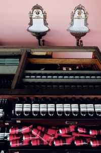
This balancing act is apparent in any number of the Aesop stores worldwide. For example, at Aesop Le Marais in Paris, the interior features 427 small polished-steel discs, originally used for closing off plumbing pipes across the city. These have been re-purposed to display product and to impart a unique aesthetic. While the product itself strives for universality and global appeal, the brief for each new store is a careful balance of local knowledge, materials, aesthetics and physical features – and a “common ground” that speaks to the product’s universality and consistency.
O’Keeffe nominates this as the area where Aesop could still see some improvement: in the calibration of the experience of the store visit. There is a fine balance to be struck between accommodating local cultural difference, and upholding the values and elements of the experience that are unique to Aesop the world over.
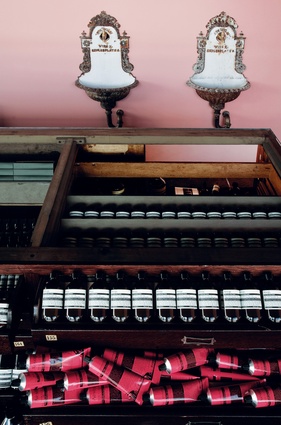
Aesop North Melbourne, a so-called “signature” store, features an antique plan drawer that once belonged to the Art Gallery of New South Wales. It was found in a nearby antique shop and repurposed by a skilled local craftsperson, and is used to display product and support the point of sale. Thus the local and the universal are fused in the store experience.
While the company has produced some outstanding interiors and other collateral in partnership with emerging designers, it has also been slowly building up its in-house team of creative professionals. There are now five architects in-house (spread globally), as well as a team of copywriters, illustrators, videographers, photographers, graphic designers and others. O’Keeffe explains that the decision to work with local architects or the in-house design team is usually a pragmatic one, based on the best fit of skills to the available challenge. Despite the vibrancy of the in-house team, it would appear that Aesop is not going to stop working with external creatives any time soon.
And what of the sense of online retailing as a threat, as it is so often portrayed? O’Keeffe is clear on this point: the two (online retail and physical retail) go together. Online, Aesop is able to provide rich content, including film, poetry, art and other cultural material. Customers familiar with the brand and its products can “stock up” by purchasing online. However, the converse of this – the Aesop consultation experience – is uniquely in-store, experienced in the flesh. In this equation, online is not a threat: it is an adjunct, a useful counterpoint to the bricks-and-mortar retail experience.
Aesop is an Australian and global retail success story, and since its inception it has fused the physical retail experience with a reliance on design thinking and the work of skilled designers across the globe. By both partnering with locals all over the world and building up its in-house design teams, Aesop has discovered a formula for an engaging, community-focused experience. Design sits at the core of the brand. Let’s see what comes after store number one hundred.

