Architect profile: AJ Sutton
From residential to quirky and deceivingly under-designed hospitality spaces such as Brothers Brewery, the award-winning architect behind Metropolitan Architecture Studio talks to Interior about influences and process.
Federico Monsalve: Have you had any overseas design experience?
AJ Sutton: No, but I travelled and worked in the Middle East, Europe and Australia prior to commencing my studies. I became excited about all the different architecture I saw and the way I saw it, unfiltered and through my own eyes. This experience ultimately informed my career path.
FM: What are the benefits and challenges of having your own practice rather than joining a big firm?
AS: Benefits – meeting and working with a range of people; I really enjoy this and gaining their trust as you work through a project with them. All our clients are investing a lot and we have a huge obligation to them. I like the responsibility and pressure that comes with that. Challenges – the admin side of running a small business can be time consuming on occasions and it takes me away from what the business is there for.

FM: Award programmes… are they important to your type of practice?
AS: Winning the recent [NZIA] award was great and it recognises the hard work that went into the project and the jury really ‘got’ what we did. I also regularly receive good feedback from members of the public who have been to Brothers Brewery. I love seeing people, especially families, enjoying themselves and when the place is filled I know our client is happy too. All this is ultimately why we do it and any award is recognition of this.
FM: What were the key design drivers of the Brothers Brewery at the City Works Depot?
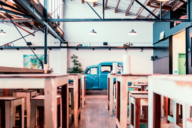
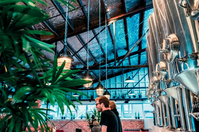
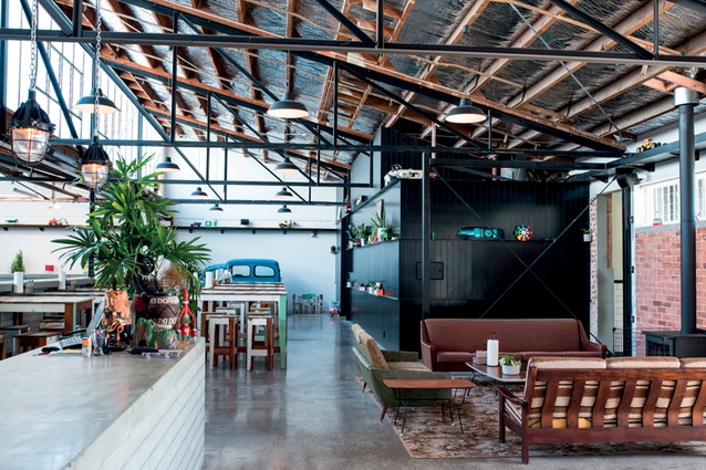
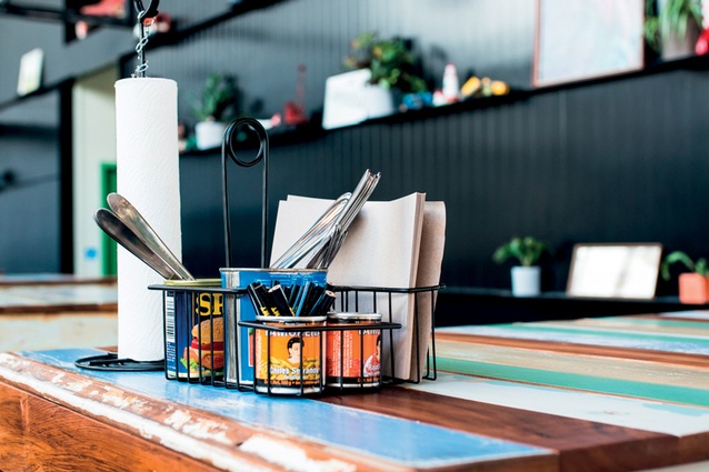
AS: It was driven mainly by function, budget, context and… with a little retro lounge thrown in. It was a new business in an unproven location and our clients did not want a financial noose around their necks from day one, so the budget was spent wisely. With this said, Brothers Beer has always set out to be unpretentious and relaxed; the City Works space achieves this, as does the Mt Eden venue. They are not ‘pretty’ fit-outs – and were never intended to be – but they are bang on brand.
FM: You have collaborated on three projects with the crew from Brothers Brewery… what have you learned from that repeat business and how closely did you work with them?
AS: Very closely. I always work closely with Andy the brewer to make sure the brewery works well technically. And I work closely with Ant, who looks after the front-of-house part of the business; he comes up with the business concept and the design brief and we work together on developing this. As with all my clients, I am always open to their ideas and I enjoy working collaboratively. I find with repeat clients, such as Brothers Beer, more trust and an understanding of how each other works develops over time.
FM: The Mt Eden iteration of that bar: how do you replicate the essence of the original without it becoming a slightly soulless replica, or like a kitset bar?

AS: We basically took the best bits from the first one, worked with many site-specific ideas and brought some new ideas on board. The Juke Joint is also a new idea from Brothers Beer – smoked meat sits very nicely alongside craft beer so the guys became very serious about this and invested a lot in the kitchen. A new brand and identity was developed around it, including the interior with the Juke Joint having its own space on site.
FM: Is it fair to say that the space seems deceptively under-designed?
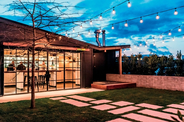
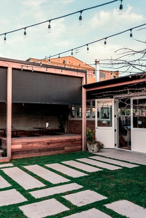
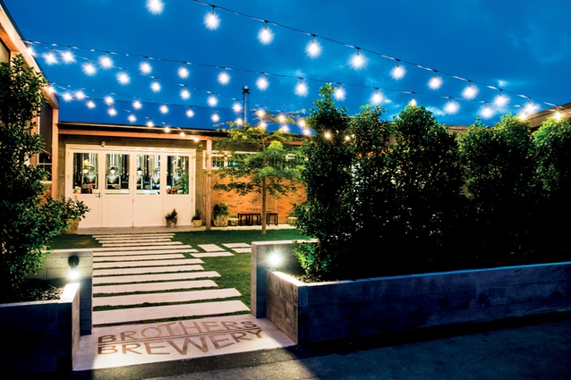
AS: Absolutely. We started with a great space – it was a bit rough but the spatial qualities were there and it really suited the business going into it. It just needed a lot of work to really bring out those qualities and we added a few extra. We had a few other things in our favour too, such as the only location for the courtyard was on the sheltered north side of the building. It was also the new main entrance. We contained the courtyard on all sides to create an external space and we used it to frame the entrance to the main space. Working with a larger building, we were able to create a few more moments and sequences through spaces – not a lot but a little something extra to enrich the customer’s experience of the building.
FM: How much does the furniture choice affect your architectural choices?
AS: It generally follows the architecture or it is in the mix during the design process. At the Botanist we used American oak floor-boards as a wall linings and for the furniture, one material and idea carried through to contrast against the concrete. At the Mount Eden Brewery the outdoor furniture is made from black steel and Australia hardwood, the steel to match the EQ strengthening in the main space and the hardwood to match the structural framing and decking in the courtyard. I like to use the furniture to reinforce the architectural idea.
FM: Any favourite furniture piece in those spaces?
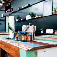
AS: It’s not really furniture but the built-in American oak shelves with recessed lighting are my favourite piece in the Botanist. They are framed at the end of the space in the florists area – dressed timber contrasting against a rough concrete wall, both are enhanced thanks to the other. Plants are arranged on the shelves to give the setting an additional dynamic. There is also a leaner table inside the Juke Joint deli area with tiled sides at each end and a beautiful wooden top crafted by the builders. We also threw in some EQ cross braces to toughen it up a little.
FM: You also double in the residential sector… how does that influence your commercial work – are there any similarities?
AS: I come at all my projects with a similar process: I look closely at what is important to the client, what they want to achieve and at the site and its context, both built and environmental. Be it a dilapidated old villa, a retail store or a city-fringe brewery in an old warehouse, it is an architectural interrogation of these things and more. So I think both types of work influence each other as we are always learning and honing the way we answer the questions we are given.
FM: Whose work do you admire (be it industrial design or architecture)?
AS: I admire John Lautner’s work, especially the Arango and Goldstein houses. The way he uses concrete to frame space is beautiful. I admire Carlo Scarpa’s work a lot too, partucularly his detailing and use of material and light. I like the work of Techne in Australia; I think they are doing some of the best hospitality work around at the moment.

