Designer interview: Daniel Lewis
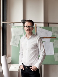
Nelson-born architect Daniel Lewis formed part of the British architectural firm Allford Hall Monaghan Morris which was responsible for the 2015 RIBA Stirling Prize-winning Burntwood School. Federico Monsalve chatted with Lewis about the his role in the project and the school's design.

Federico Monsalve: First of all, congratulations on your win. Where were you when you found out Burntwood had been selected for the Stirling Prize?
Daniel Lewis: I was lucky enough to be in London at the ceremony – after I heard the first sound of ‘B’ for Burntwood, everything was a-buzz for at least a few minutes – certainly lots of whooping and hugs!
FM: What was your role in the project?
DL: I was the project architect, working with director Paul Monaghan and associate director Ben Gibson, leading the Allford Hall Monaghan Morris (AHMM) team. This included coordinating with the consultant team, being involved in stakeholder design presentations, and liaising with the design-and-build contractor and its subcontractors. My involvement was from the early stages of the concept design competition through planning consent, detailed design documentation, subcontractor coordination, shop drawing review and site observation.
FM: What do you think makes the design so successful?
DL: The original school was designed in the 1950s by then-London County Council architect Sir Leslie Martin, at a similar period to the time the Royal Festival Hall was designed. This set a precedent for excellence – the master plan had a simple elegance, although the buildings were tired and lots of facilities were no longer fit for purpose.
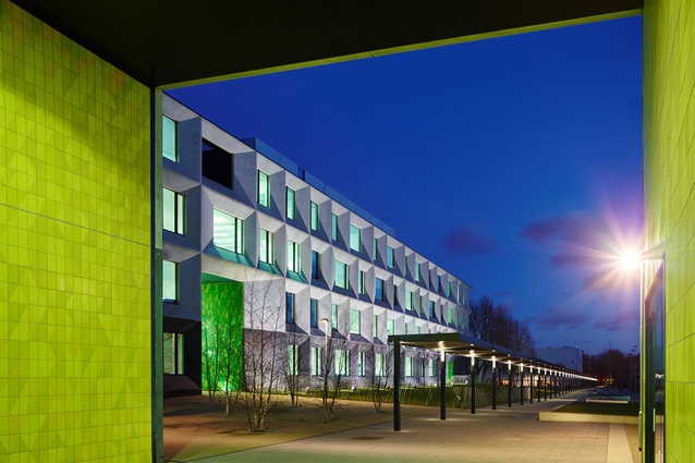
Two large teaching blocks were demolished as well as some smaller pavilion buildings. The existing hall and pool building were retained, with the new scheme adding six new buildings. The site master plan has an orthogonal layout: buildings sliding past each other and aligned corner-to-corner create varied and individual spaces between.
This simple layout, combined with the pedestrian spine that runs the length of the site, has naturally good way-finding. We also needed to allow phased construction stages without any temporary accommodation whilst the school continued to function on site. The pre-cast concrete cladding panels on the teaching blocks are solid and beautifully crafted, imbuing a sense of quality and permanence.
The school staff had quite sophisticated architectural knowledge, referring to Mies van der Rohe and other modernist icons. No doubt living in the old modernist buildings had a positive effect. The new buildings took some cues from the old, which seemed to have a logic of heavier cellular buildings and lighter open public buildings. So the teaching blocks had the heavier pre-cast concrete cladding and the performing arts and dining blocks were lighter with steel frames, curtain walling and expansive glazing.
FM: What about interiors; what do you feel was particularly inspired?
DL: The common spaces of the teaching buildings are particularly evocative: the double-height entrances; the stairs; the double- and triple-height break-out spaces; and the central corridors that mostly run the length of the buildings, terminating in windows. The spaciousness and connection to the landscape of these corridors through the end windows, and the adjacent break-out spaces, make what could have been quite dreary central corridors into light-filled spaces.
FM: Colour is minimal but is used to direct and inform students. How was this achieved?
DL: On a school project, the budgets are not great, so when we did use colour and draw attention, we wanted it to be effective. We focused a lot of attention on entrances, stairs and corridors, which is where way-finding is required. This is a key theme of AHMM projects and, often is developed in partnership with Morag Myerscough – a regular AHMM collaborator. Schools are busy, constantly changing, messy places; we didn’t want the buildings to be competing for attention.

FM: The differently sized windows add to the sculptural, whimsical look of the façade. Were the window sizes deliberately chosen for the use of the rooms?
DL: Along the long elevation, there are two window sizes to allow daylight in. On the short elevations, we chose to be more playful, as the functional requirements were not so prescriptive. These required smaller openings to avoid overheating as they are largely east and west facing. The very small windows were also a functional response to the intermediate stair landings at mid-floor height.
FM: “Burntwood sets a standard in school design that every child in Britain deserves…,” said the judges. What are the essential parts of ‘good design’ in an academic setting?
DL: There are loads of basics you must get right before you move into the more subtle elements of spatial quality, outlook and psychological considerations. Vitruvius talked about “firmness, commodity, and delight’. With the basics sorted, if you add some ‘delight’, you have the whole package. Private homes can be purely functional spaces but it’s important public spaces go beyond function to bring delight. In New Zealand we often get this from our natural settings but, as our cities become more built up and intense, we need to consider and implement delight consciously.
FM: The judges also mentioned “a covered walkway formed from off-the-peg shelters”… how did that come about?
DL: We always knew the canopy down the middle of the site was an important design element, yet it had almost no budget. One of our other school projects used these small cycle shelter canopies. Because they had a cantilevered design, they looked good and, with two columns instead of four, they were economical. As we suspected and hoped, it turned out to be a successful element within the landscape.
FM: How did you end up working for AHMM?
DL: I was acutely aware that, being in London, I was amongst some of the best architecture firms in the world and that I wouldn’t be living there forever. I wanted to gain experience at a scale, budget and typology applicable in New Zealand. AHMM has a reputation for making architecture that is thoughtful, considered and innovative, but not overbearing. They often work on project types and budgets that normally allow only for mundane outcomes, like schools, health-care centres and low-cost housing.
FM: What insights have you taken home from working with a large team?

DL: I experienced the value of simple things like setting deadlines, having good design team meetings, writing good minutes, sending emails summarising discussions with actions and keeping people accountable. Seems quite boring but, if you can be good at this and communicate well, the result is good architecture. I learnt how to navigate the complexities and politics of the building industry, and worked with clients who are organisations with multiple players.
FM: What has drawn you back to New Zealand and what are you hoping to achieve in this next phase of your career?
DL: I love London and Europe – but New Zealand/Aotearoa is my home, my whenua. I had a strong sense of that personally and professionally. New Zealand (and, in particular, Auckland) is at an exciting point. A lot can be learned from Europe in regard to our need for medium-density housing, improved public transport and quality public places. I’m excited about developing models that take the best from around the world and make local solutions acknowledging our culture and climate.
At TOA Architects, we talk about ‘kaitiaki’: being guardians of our clients’ and communities’ projects, and also ‘cutting new ground’. I like to work by looking back and understanding the context, whilst also moving forward. I believe we can achieve world-class outcomes from working with clients and communities on projects with this depth of thought.
Read the earlier ArchitectureNow article about Burntwood School here.


