Design people: Masquespacio
Who’s afraid of the big, bold colours? Certainly not this Spanish design duo. Leanne Amodeo chats with Masquespacio and discovers a refreshing vitality and eye-catching combinations.
Masquespacio’s Ana Milena Hernández Palacios and Christophe Penasse are not as preoccupied with colour as most people think. “The way we use it is very much dependent on the project,” says creative director Palacios, who originally hails from Colombia. “We do love colour, but we’re not obsessed.”

This seems surprising, especially considering the Valencia-based multidisciplinary design studio – of which Palacios is co-founder along with marketing director Penasse – is best known for its strong graphic configurations and stunningly explosive colour palettes.
There is, however, more to Masquespacio than meets the eye. While the practice’s interiors, art direction and communications portfolios are bright, cheerful and easy to digest, these lively, fun outcomes belie a customised approach and strict methodology that values research and strategy as much as creativity and aesthetics.
Palacios graduated from Valencia’s Barreira Arte + Diseño and, as Masquespacio’s interior designer, is responsible for designing all interiors projects. The practice specialises in commercial, hospitality and retail fit-outs, with projects in Spain, Germany, Italy and Norway to date. Palacios may arrive at each concept independently, but her creative process involves early collaboration with Penasse.
As she explains, “The most important step before I actually begin designing any fit-out is to research the brief so Chris and I can define what needs to be achieved in regard to outcome and aesthetic; it’s what helps us create a suitable design.”
It’s also the most rigorous part of the process as it gives rise to a design strategy – the core blueprint that drives each of Palacios’ resulting concepts. Of course, consultation always takes place with the client so the brief remains front-of-mind, and Penasse brings his marketing background to the table, overseeing the concept’s development to ensure focus isn’t lost during the creative process.
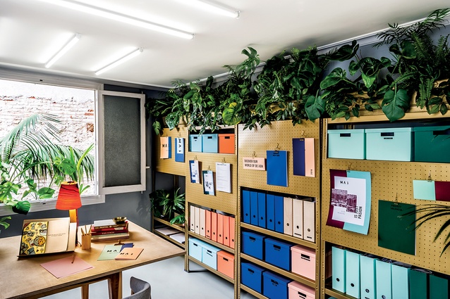
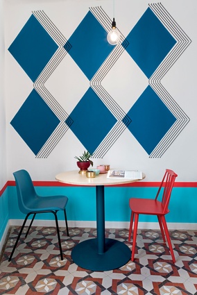
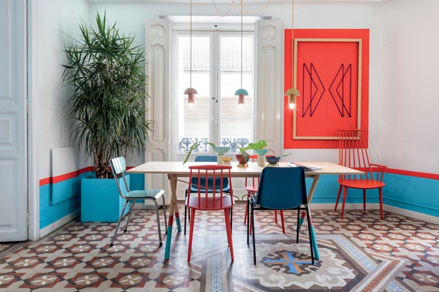
The formality of the couple’s approach reveals they leave nothing to chance, regardless of how playful the outcomes may appear. Recent projects like Valencia Lounge Hostel and Acadèmia Altimira are dynamic combinations of colour, pattern and graphic motifs, yet each scheme is far from random. The same can be said for Masquespacio’s own workspace in Valencia, which Palacios designed to accommodate the practice’s small team comfortably.
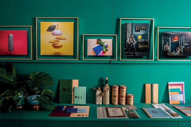
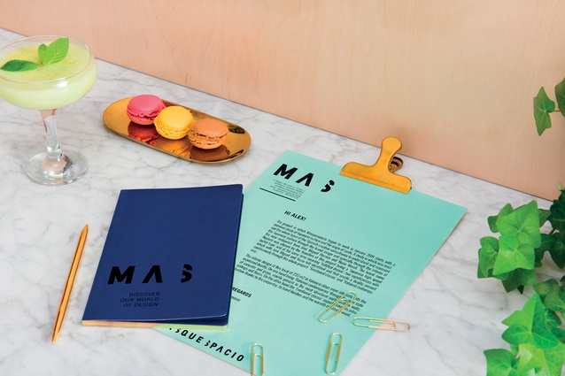
Her colour palette takes its cue from Masquespacio’s new branding, a refreshed identity recently completed by the practice’s in-house graphic designers. Interestingly, this cohesion not only reinforces Masquespacio’s strong market presence but also highlights Palacios and Penasse’s belief that a holistic design approach benefits business. To this end, they usually undertake both the branding and interior design for their brick-and-mortar-type clients.

“For us, everything is part of the overall experience,” says Palacios. “The service, the product, the interior design and the graphic design. That’s why we introduced a graphic design department a few years ago, because we feel it can’t be separated from what we do.”
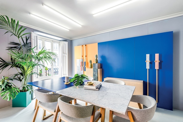
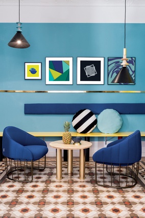
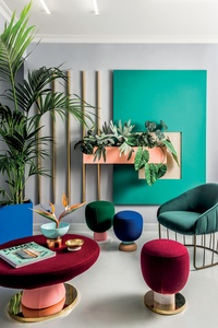
Blocks of teal, apricot, blue and yellow define Masquespacio’s otherwise neutral 120m2 workspace and visually zone the interior’s different areas and functions. Furniture is kept to a minimum and Palacios has carefully curated decorative items and furnishings to evoke a sense of home.
While these objects are curious enough to inject the warmth of Palacios and Penasse’s individual personalities into the design, the luxe finishes and forms also lend an ambience of efficiency and professionalism. It’s a fine balance best exemplified in the reception area’s furniture, comprising key pieces from the practice’s Toadstool Missana collection.

The range’s eclectic mix of materials and bold juxtaposition of shapes and colour is a nod to Memphis Design. And although the movement’s distinct style also offered Palacios inspiration for the interior design of Valencia Lounge Hostel, her influences in general are many and varied. “My creative process is mainly driven by the projects themselves and our clients; people who are passionate about what they do. I’m also inspired by everything that surrounds me – the work of other designers, fashion, art and popular culture,” she reflects.
Palacios certainly captures a spirit of fresh modernity in each of her interior designs (without being a slave to passing trends), which is befitting of the end-user’s needs. The pastel colour palette and clustered lightbox-style pendant lights of Valencia’s 2Day Languages school for foreign students, for example, lends the interior a much-needed welcoming atmosphere, whereas the ‘hand-drawn’ graphics of children’s clothing store Piccino instantly engages youngsters, as well as appeals to adults.
The couple is currently working on a new furniture collection and the bulk of Masquespacio’s new interior projects are based in Valencia, including a dental clinic and yakitori bar, although plans to design a supermarket in Germany are also under way.
Regardless of location, Palacios’ design concepts are consistent in delivering fit-outs that are thoughtfully detailed, experientially rich and memorable. Each contains that distinct Masquespacio DNA, yet there’s never any hint one is a mere carbon copy of the last; it’s custom design at its most energetic.

Valencia Lounge Hostel
Valencia, Spain
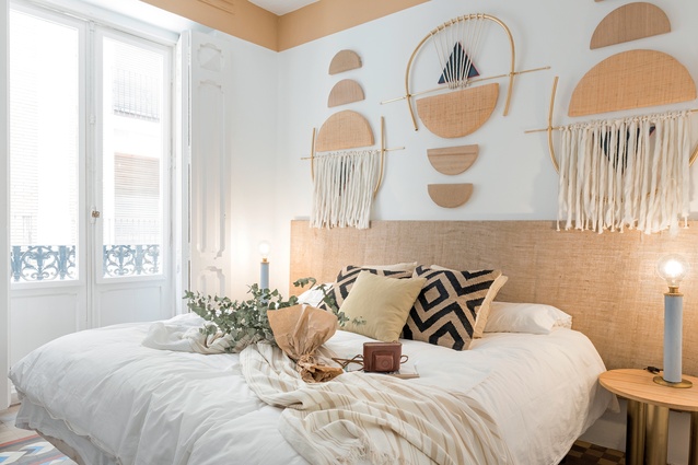
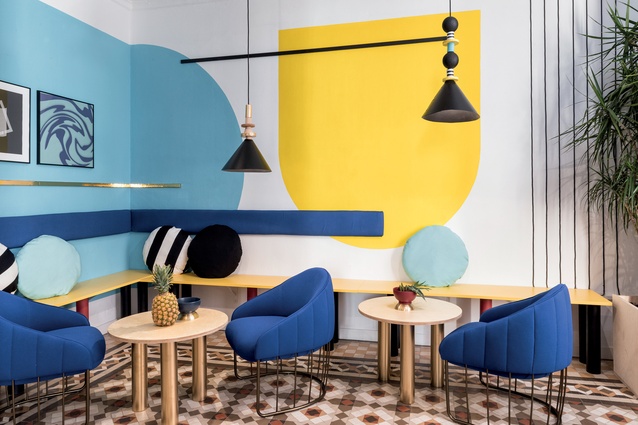
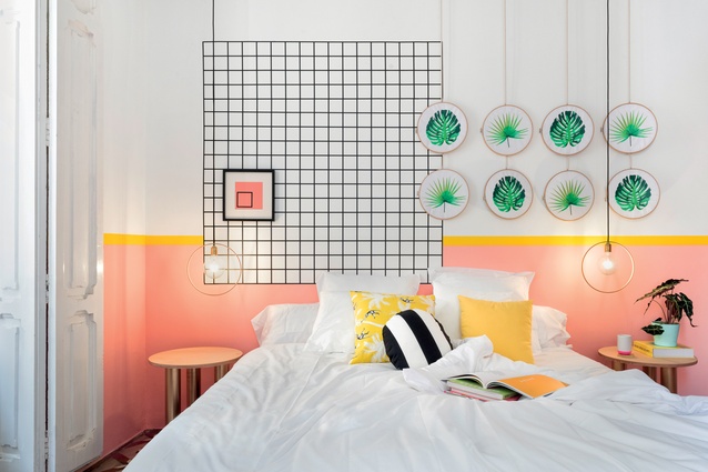
This newly-renovated 11-room hostel occupies a historic building in the heart of Valencia’s Barrio del Carmen. The original patterned floor tiles and plaster-moulded ceilings have respectfully been restored and serve as a striking canvas upon which Palacios’ new modern additions are inserted.
Each room in the 236m2 property is loosely themed and has a feature wall adorned with various prints, objects, graphics and decorative detailing. The combination of colours, grid motifs and patterns references Memphis Design (without being derivative), and the overall effect is bright, energetic and welcoming. Palacious’ concept was to create a ‘home-away-from-home’ ambience that also conveys the breezy appeal of a holiday getaway.
Acadèmia Altimira
Cerdanyola del Vallès, Barcelona

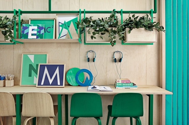
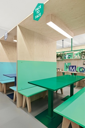
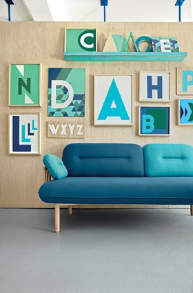
Barcelona’s Acadèmia Altimira, which offers classes in English and other languages to people of all ages, was redesigned by Palacios to better engage with its broad demographic of end-users. The scheme instantly appeals for its bright green and blue colour palette and clusters of framed graphic artworks.
But the fit-out’s most dynamic expression is a series of suspended plywood walls elegantly inserted into the 123m2 space. These walls still allow light to filter evenly through the interior and also provide zoning for the different study areas. The design’s domestic scale lends an appropriate sense of intimacy to the space, which is conducive to supporting one-to-one tutorials and small-sized classes.

