Denmark’s 3daysofdesign inspires
Tomi Williams and Alex McLeod from interior design studio at.space headed to Europe to attend Denmark’s 3daysofdesign as the annual festival celebrated its 10th year. Here, they report on their key takeouts.
Over 10 years ago, we attended a Scandinavian symposium in Auckland where the main message was about ‘working together’ to create best design, to create efficiencies and build our businesses. This ethos sang close to our hearts about how we feel about design and business. That this was still relevant 10 years later provided us with a great source of inspiration and thought-provoking realities and led us to be hugely motivated to book tickets to this year’s 3daysofdesign event in Copenhagen, to delve into these concepts on a first-hand basis.
The 10th anniversary edition of 3daysofdesign was the largest and most inspiring in a decade. This event intends to bring together and exhibit Denmark’s design heritage. This year’s theme, “Where would we be without you”, was derived from an understanding that we need to work together and create a world that can be enjoyed 100 years from now. 3daysofdesign managing director Signe Byrdal Terenziani said “the sentence is the symbol that, for example, the designer and the manufacturer cannot exist without each other”.
The format of 3daysofdesign takes you through the streets of Copenhagen – through heritage buildings, residential spaces and flagship stores. The architecture and the city itself are as much a part of the design festival as the 290 exhibitors, which are clustered into 13 districts to make navigation easier. We still felt we could have used a few extra days to soak up all that was on offer. Perhaps it should be renamed 4daysofdesign?
As designers, we’re constantly searching for new sources of inspiration. Copenhagen felt like a long way to go to get this inspiration but our love for colour and Scandinavian design aesthetics made this trip feel like a small step across the world. The event definitely delivered, within the setting of beautiful Copenhagen where the old and the new blend so seamlessly to create intimate spaces both outside and in. A few of our highlights:
Furniture inspiration
Carl Hansen & Son
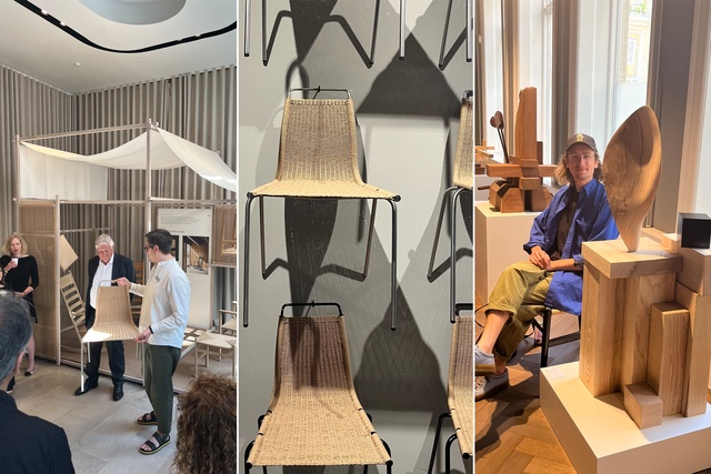
Your archetypal Danish company, which represents over 100 years of furniture history. For 3daysofdesign, it transformed its flagship store into the ‘House of Craft’, where key furniture pieces such as the CH45 chair and PK1 were displayed amidst a series of wood sculptures to celebrate craftsmanship, materials and timeless design. A display that showed the concept of chair design, stating “I see a chair as a metaphor for beauty” summed it up perfectly.
Within the ‘House of Craft’ another key highlight were the sculptures by Nicholas Schurey, who used different types of recycled wood to create works of art coined ‘Wonders of Wood’. In part these sculptures represented a love of wood but also its role in a sustainable future of design and architecture.
House of Finn Juhl
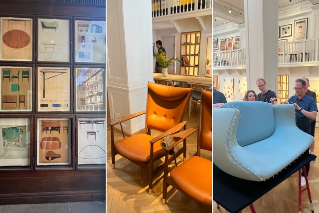
With the exclusive rights to revive and produce Finn Juhl’s iconic furniture, the collection now features more than 50 classic masterpieces. These were displayed within an architectural premise – drawings of the design process were framed and displayed to illustrate the extensive evolution of a furniture piece, such as The Whisky Chair, with handmade brass tray complimented by a mouth blown whisky glass unique to the chair. The skilled craftsmanship required was further displayed with an upholsterer working within the store on a Poet Sofa in a soft blue wool fabric.
Normann Copenhagen
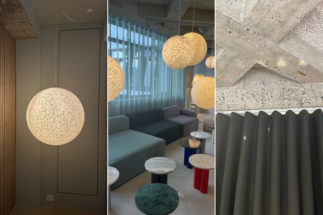
Another iconic Danish brand, Normann Copenhagen aims to challenge conventional thinking and make the ordinary extraordinary through great design. Over seven levels, its flagship store and offices have been designed to recreate living and bedroom spaces, to create intimacy and illustrate the relevance of its furniture and lighting. Soft, sheer linen curtains with wave formation (a style that was prevalent throughout all exhibitors) divide up spaces and provide softening texture to an industrial floor and ceiling surfaces.
A key pendant light connecting many of these spaces and illustrating its versatility is the Pix Lamp, which has a captivating, pixelated surface made from 100% recycled plastic waste. When illuminated, it comes to life.

Vipp
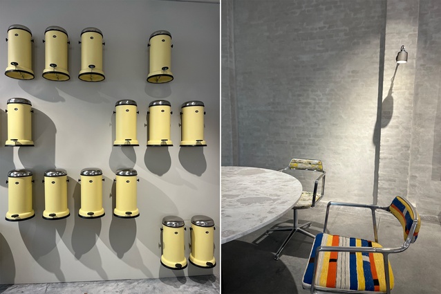
Vipp began as a pedal-controlled bin manufacturer and this leading product took centre-stage in its showroom in ‘Marie’s Yellow’, a colour and design that is a tribute to the woman behind Vipp’s founder. In recent years, the brand has grown to include the full range of interior furnishing items and, similar to Normann Copenhagen, its mantra is to be extraordinary. What we found extraordinary was the Vipp Swivel chair in vibrant fabrics – a limited edition creation. The versatility of this chair is its ability to look relevant in an office or residential space.

Colour inspiration
Hay House
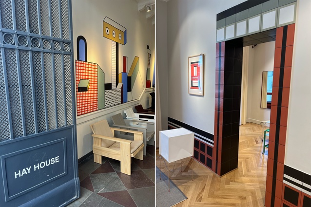
Founded in Copenhagen in 2002, Hay’s vision is to create high quality and well-designed products with the world’s most talented and courageous designers. Its showroom was abundant with colour displayed through fabrics on its sofas, its iconic chairs in more muted tones and lighting. Perhaps of more standout appeal was the showroom itself ,with doorways marked out in deep, rich red tiles, bay windows painted dark pioneer red to tonally talk to the doors and the balustrade of an old wooden circular stairway connecting the floors splashed in the same dark pioneer red. All proof that colour-blocking is a real thing and a great way to create defined, connected and inspirational spaces.

Montana
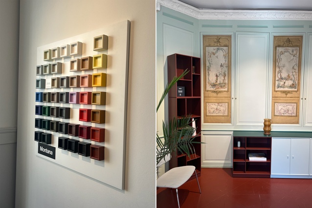
The premise of this showroom was ‘colours of comfort’, with three new colours being introduced with its colour palette – Ruby, Acacia and Clay – designed in collaboration with Margrethe Odgaard and fashioned to blend seamlessly with the rest of its range. Montana provides a range of storage and furniture all designed, developed and made in Denmark.

File Under Pop
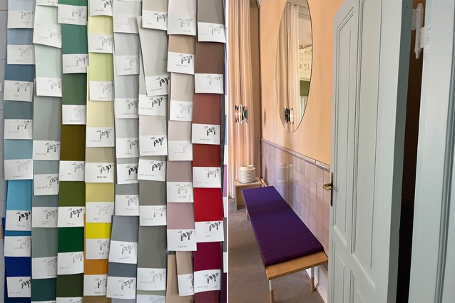
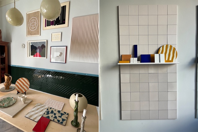
This unique company is driven by a passion for creative surface design. It has developed a range of handmade tiles crafted from clay and lava stone and finished with its own paint colours. The two display spaces showcased a collection of 16 new paint colours, as well as a range of new tile formats and a limited edition series of lava stone boards created in collaboration with artist Mathias Malling Mortensen. These tiles evoked the sense of softness and illuminated colour that have inspired us to use them everywhere and anywhere possible. We could have stayed in the showroom for hours, as it evoked a feeling of an artistic, homely interior, tying subtle colour together with incredibly interesting texture and surfaces. An absolute favourite of the fair for us.

Stillark
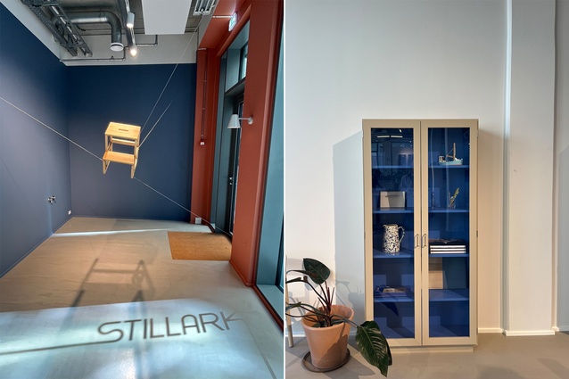
Simple design, functionality, craftsmanship and splendid colour range made this a standout for us. Stillark has developed a palette of seven colours, including a few neutrals but also two vivid blues and a rusty red, which can be used and combined within their cabinetry framework. This allows for a touch of colour on the inside or a full hit of colour on your frontal lobe. We would love to bring this into New Zealand.

String shelving
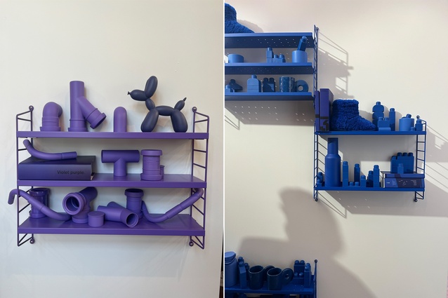
A classic and timeless beauty, String shelving provides a functional and versatile display and storage solution. We loved the addition of a selection of vibrant new colours, including vivid blue and deep purple.

Lighting inspiration
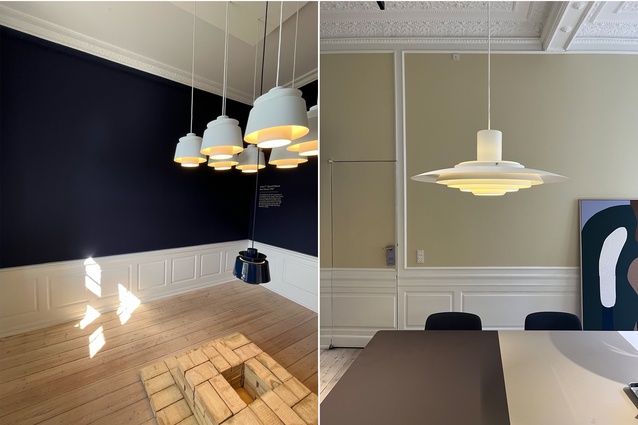
The lighting displays were vast, intimate, illuminating and offered inspiration on how lighting can bring joy to any and every space.
Flos
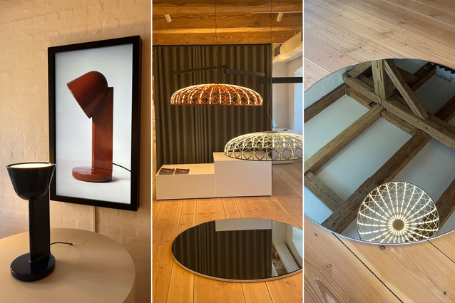
This large international and renowned brand had a significant showroom featuring their lighting creations in a simplistic and minimal manner, ensuring the lights spoke for themselves. Two new products that we could easily see filling our spaces were, firstly, the Céramique collection for Flos, designed by Ronan Bouroullec. This table lamp blended product design craftsmanship and colour. Not available until the end of the year, it was a real treat to get a sneak preview and it goes straight on our wish list. The other, the Skynest by Marcel Wanders, utilises traditional handweaving techniques with lighting technology to create an elegant nest of light suspended in the air. Its ethereal form a thing of beauty.

Made by Hand
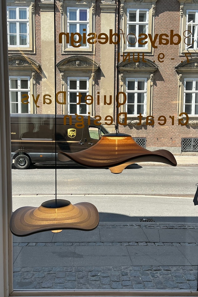
Guided by a passion for natural materials and permanence, Made by Hand offers lighting solutions with beautiful details and timeless personality for all spaces. The Flying Lamp, designed by Boris Berlin, was launched at 3daysofdesign and its form and shape appealed. “Flying is a family of sculptural pendant lamps with soft organic shape. When suspended, they appear to float beautifully in the air. The distinctive shape of the Flying lamps is created by stretching the 3D knit material between the aluminium, wavy frame and centrepiece that keeps the top and the bottom apart”. They coin the creation of this light as “a modern take on craftmanship in design”.
&Tradition
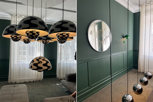
The four-floor apartment that is &Tradition’s home was a feast of colour and chaos. We weaved our way through tightly packed rooms to sneak glimpses of spaces that represented the Danish designer Verner Panton’s interior landscapes. Linear design combined with pendant installations of the 1968 Flowerpot lamp in colourful and patterned creations. No fear of colour here.
Nuura
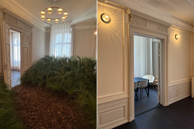
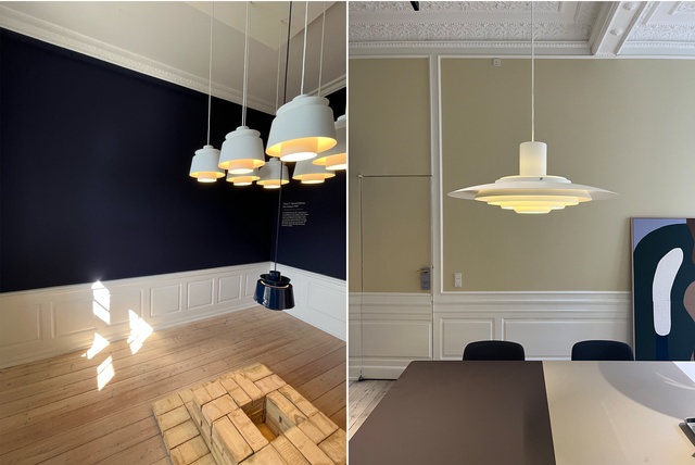
In an historic building in the centre of Copenhagen, Nuura presented its lighting designs. Nuura means light and honour and this was apparent with their lighting products and displays. Their focus is on quality light and how it affects health and well-being. Within the historic rooms, they recreated an outdoor garden as well as intimate dining and living spaces, with the ultimate aim of portraying how to balance natural and artificial lighting. Their wall lights and chandeliers are simple in design but refined and effective in aesthetic.

Sustainability
A part of the 3daysofdesign theme ‘Where would we be without you’ relates to the ever-real notion that we need to ensure that we are leaving our world in good shape for the generations to come. In essence, sustainability and what are we as designers, manufacturers and producers doing to play our part. For many of the exhibitors, it comes down to good design and materials – use the right materials and employ good design to create durable products and, therefore, less waste. But there were others where recycling and sustainability is at the very core of the design process. Here are just a few:
Mater
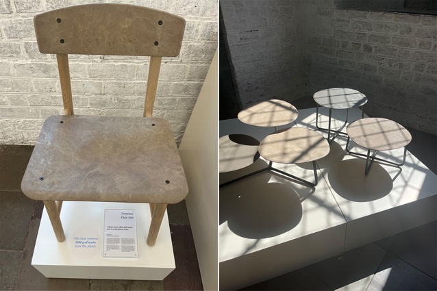
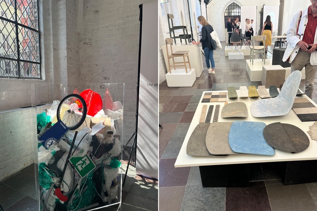
Mater is a green-tech design brand with sustainability and circularity at its core. It uses cutting-edge technology to allow it to transform waste materials into furniture. The Conscious Chair 3162 is one example of this process, where coffee shell waste and recycled plastic waste have been used and each chair removes 2500g of waste from the planet. Not only is this process functional but the form itself is beautiful, showing that good design can be achieved with sustainable aims.

ferm Living
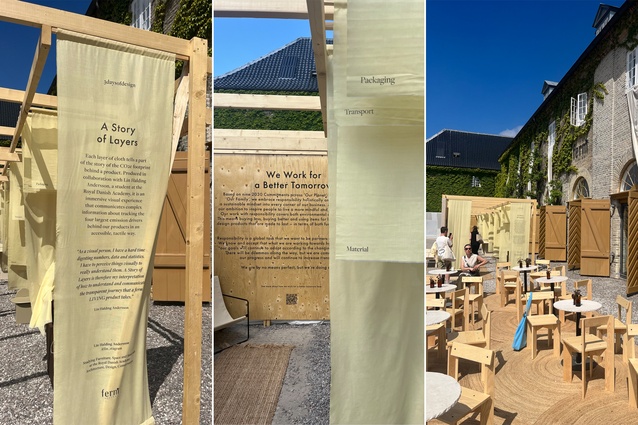
This international brand prides itself on authentic design, with responsibility at the forefront. ferm Living has started a Material Climate Screening Project to measure the CO2 footprint of materials. To explain this process, a display called ‘A Story of Layers’ broke down some of the mysteries and complexities around the CO2 footprint behind a product (produced in collaboration with Lin Holding Andersson, a student at the Royal Danish Academy). In this exhibition, you can find out how much 1kg of raw material corresponds to in CO2.

To sum up, there was an incredible number of installations, products, colour combinations and Danish design makers to take in across the three days and we have featured just a portion of what we saw and revelled in. The festival itself offers so much in terms of new products, access to great design and designers, all within the format of collaboration and working together to create designs that are timeless, durable, extraordinary and sustainable within the context of a city that combines old and new architecture perfectly. Put it on your calendar for next year!

