Creative collisions: GridAKL
Opened during 2017 in Wynyard Quarter, GridAKL is New Zealand’s first and largest co-working campus and a crucial element of the city’s innovation precinct. Camille Khouri looks into what makes this building special, how it works and why it was created.
Co-working spaces are not new – most modern cities worth their salt contain a number of lively spaces for small-to-medium enterprises (SMEs), entrepreneurs and freelancers, with meeting rooms, shared facilities and scatterings of beanbags – but developing such a building from scratch with multiple floors and to a corporate standard is new to our shores.
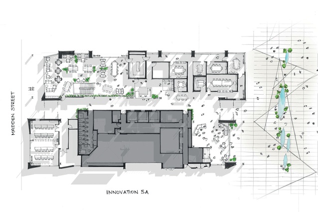
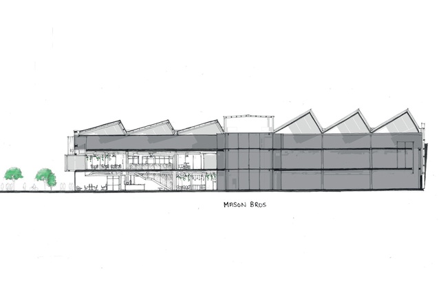
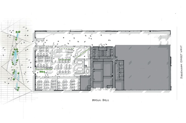
Owned by Precinct Properties and operated by Generator, GridAKL is contained in two neighbouring buildings at Wynyard Quarter: 12 Madden Street and the award-winning Mason Bros. building, which also contains the offices of the architects responsible for the Madden Street building’s design, Warren and Mahoney (WAM).
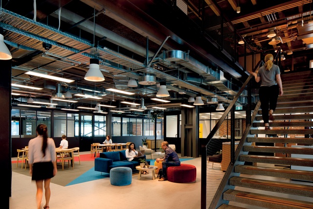
GridAKL forms the hub of Auckland Tourism, Events and Economic Development’s (ATEED’s) Innovation Precinct, which was created as part of Auckland Council’s master plan to boost the city’s economic growth through innovation and entrepreneurship. Over the next 10 years, Auckland Council plans to invest more than $10 million in the development of the campus. “GridAKL is projected to add $375 million to Auckland’s economy over the next 30 years,” says Rachael Child, GridAKL Strategist at ATEED. “Co-working is an important part of the GridAKL campus. It provides a highly collaborative environment, which encourages connections and collaboration between businesses; this is essential for innovation to take place.”
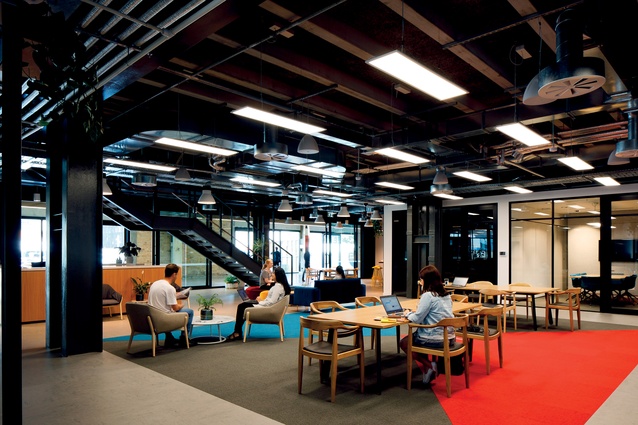
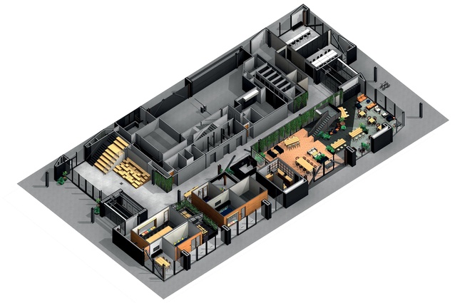
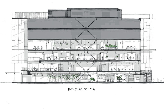
Following WAM’s design of the 12 Madden Street building, Jasmax took over the internal design and fit-out, in close collaboration with the team behind GridAKL. Jasmax interior designer Melanie Kassian says the inspiration for the interiors was taken from successfully activated laneway areas in places like Wynyard Quarter and Melbourne. “We looked at how the laneways are populated with things people need. We laid out the spaces so that print bays, circulation and bathrooms are all accessed centrally. This naturally draws people together and creates collisions.”
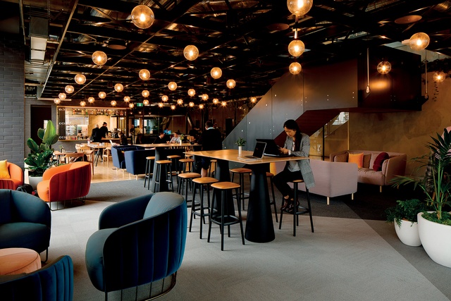
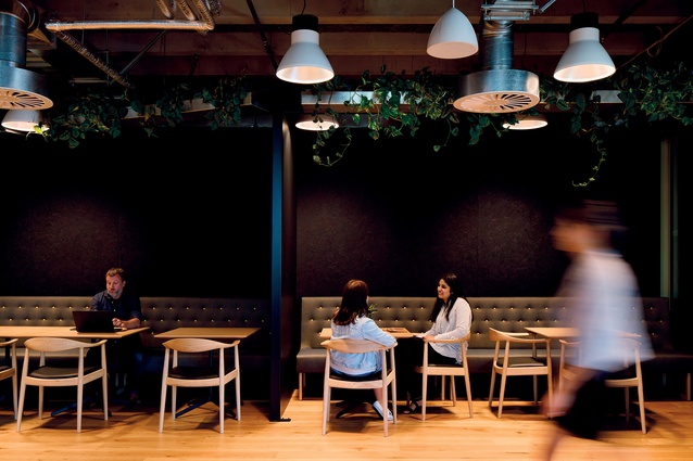
The laneway theme was also applied to the look and feel of the space. “Co-working spaces are notorious for having atmosphere and, usually, they have a more hospitality-like feel as opposed to a corporate look,” says Kassian. “Most corporate designs use colours to differentiate between floors. For 12 Madden, we used the different datum lines of laneways to give identity to each level and help with wayfinding.”
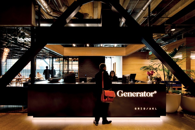
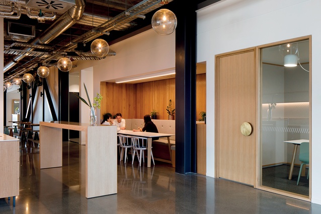
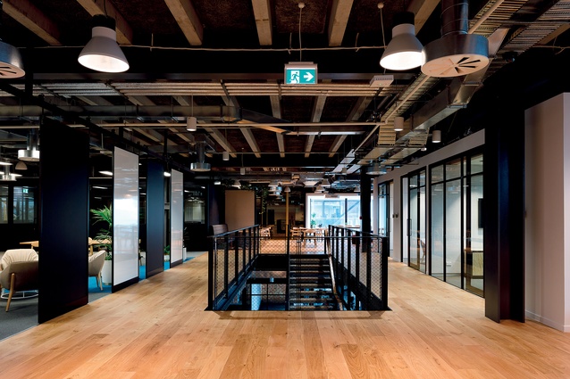
Laneways typically have market places and hospitality on the ground floors then, going up, workshop spaces, home loft apartments and gardens on the rooftops. Similarly, the ground floor of 12 Madden Street has a café offering and timber-clad, stand-alone meeting pods with black framing and open booths, which appear like market stalls.
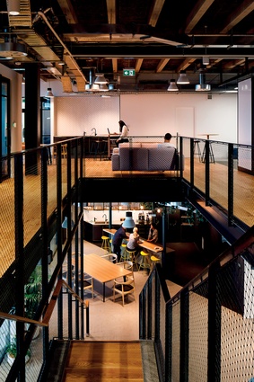
On this level, lighting in the social areas is reminiscent of street lights and globes strung between buildings. On level one, black powder-coated steel features heavily and the furniture is in tones that reflect a workshop setting, like orange and mustard. A large space for presentations and events is housed on this level, with a full lighting and media set-up.
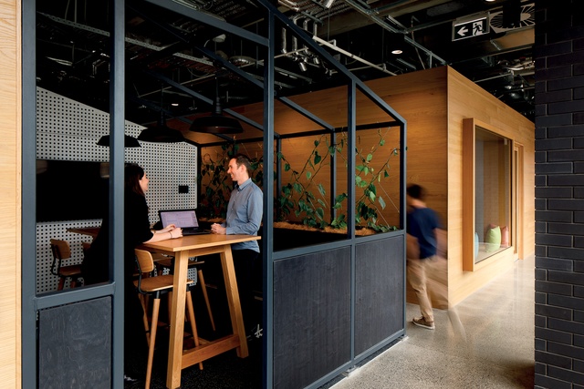
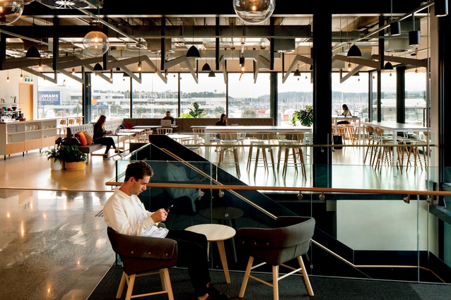
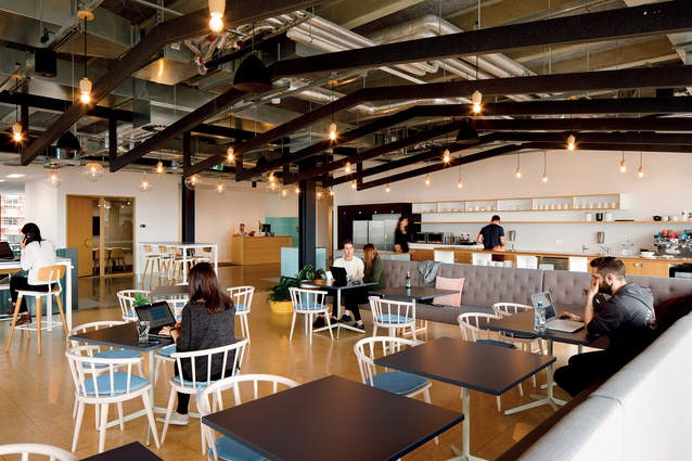
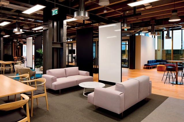
Level two has a homely feel, with carpet tiles that are laid in a plaid pattern, reminiscent of Grandpa’s slippers or a checked dressing gown. Pastels and understated neutrals feature heavily here in the soft furnishings. There is also a large cafeteria space, which has a full kitchen and tables overlooking the harbour view.
On level three, there are hard furnishings that appear like outdoor furniture. The carpet tiles are like paver stones and large-format windows create a glasshouse look. Levels four and five are designated for larger corporates, who can design and brand their own spaces accordingly. “This was part of a strategic brief devised by ATEED and Colliers in order to meet the financial needs of the project. It also helps with networking opportunities for start-ups and SMEs,” explains Kassian.
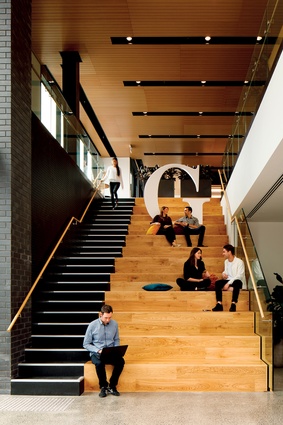
Despite the differentiation between floors, a sense of continuity is created through the use of wood and planting. “We wanted to use natural materials and have a neutral palette because there are going to be a lot of different businesses with their own displays and colours using the spaces,” says Kassian. “This allows the tenants to bring the colour to the space.”
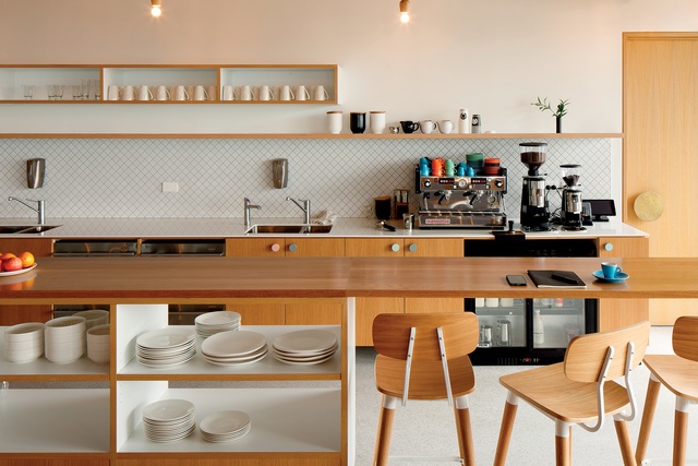
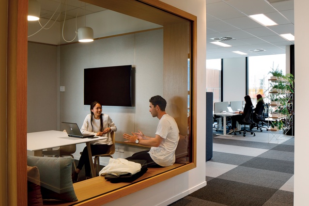
Planter boxes on the lower floors double as moveable screens, providing for the expansion of tenant groups. Generally, co-working spaces for individuals are located centrally on the lower floors, while offices for SMEs are included around the perimeter. The larger spaces can expand through the use of glazed sections in the walls, which can pop out to connect two offices together. On the upper floors, completely secure private offices are provided for larger groups. These have partitions between them with trunking along the bottom so they can be moved easily if needed.
The space is predictably high-tech. “It was important for the furniture in the GridAKL buildings to have integrated power,” says Kassian. “There is an integrated system provided for tenants through a site app, which means they can log in and access their locker space, for example. When it came to planning for the fire and sprinkler systems in the building, we had to take into account that most innovative companies are cloud or technology based. Special attention was paid to ensure these weren’t compromised by the building’s systems.”
A virtual-reality fly-through of the offices was created by Jasmax in the planning and final stages. “We were able to learn from all the companies involved in the project about these technologies,” says Kassian. “It was an amazing process for us to work with a client that is really passionate about innovation and learning.”

