Cool, calm, collected
Step into this Portuguese apartment and you’re instantly struck by the grand scale of the iron sculpture that takes pride of place in the light-filled entrance. Its unique proportions, typical of local sculptor Pedro Figueiredo’s work, set the scene for the rest of the rooms in this elegant, expressive home that spreads over two storeys in a modern, spacious block comprising six apartments.
The design for the renovation was created for a recently separated professional mother-of-two by Lisbon interior designer Cristina Jorge de Carvalho, and the brief was clear from the outset. “The client wanted an elegant and timeless apartment that incorporated a traditional feel with a very contemporary ambience,” explains de Carvalho. “She wanted a space that was comfortable and functional: a space where she could receive friends, where she could enjoy the outdoors on the terrace and where the children could play while she worked.
“By placing the Figueiredo sculpture in the entrance area, which is a clean and light space, it conveys an immediate contrast,” says de Carvalho. “I love the contrast of a huge iron sculpture amidst the very white ambience. I found it while working on another project, which was near an art gallery, and the minute I saw it I knew it would be perfect for this apartment.”
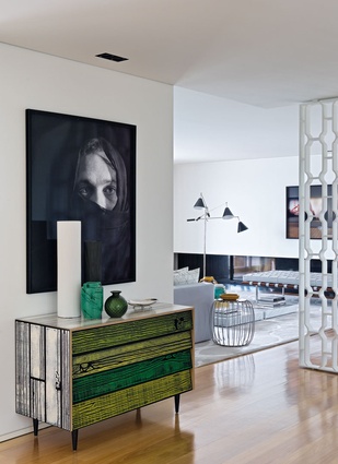
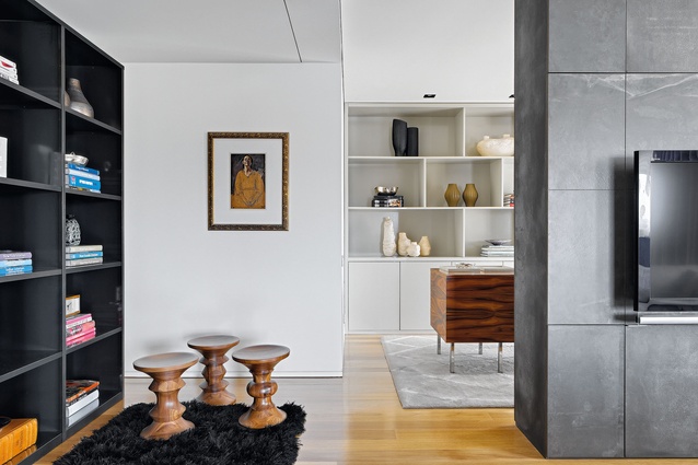
The designer, who renovated the entire 350m² apartment for her client, focused on buying work by contemporary artists for the space, to counter the owner’s existing collection of traditional art: “My aesthetic is very much based on contrasts; I like to play with contrasting materials and textures. The same applies to furniture and decorative objects. I always try to find harmony in the mix of classic and contemporary pieces.”
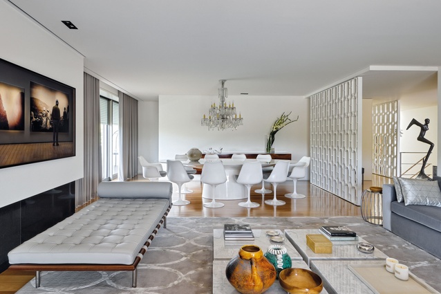
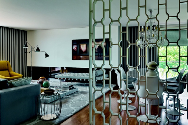
Beyond the entrance hall, where a white lacquered screen designed by de Carvalho (who routinely creates bespoke furniture for her projects) physically separates the entrance hall from the living area, the open-plan space is clearly divided into two areas. In the dining area, the modern and clean lines of a contemporary table and sideboard and their bright, clean surfaces contrast with an intricate antique crystal chandelier from the beginning of the 20th century.
“The ambience is much more interesting visually here, because of the harmony that is created by pairing these contrasting elements,” says the designer.
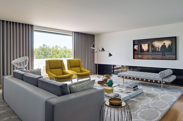
In the adjoining living area, as throughout most of the apartment, a neutral colour palette abounds, “but I use strong colours that work as highlights in the space,” says de Carvalho. Chairs covered in burnt ochre and vivid green vintage ceramic pots create intriguing contrasts in this space. A day-bed sits beneath an interesting triptych of contemporary photography by João Paulo Serafim.
From the terrace onto which this area opens, the views over a park and the village and ocean beyond are unencumbered.
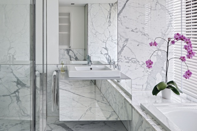
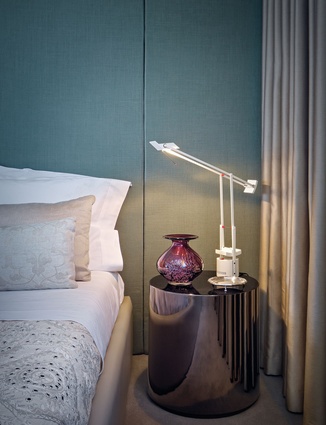
Downstairs, the two bedrooms and a second bathroom are housed. The master bedroom is a step away from the otherwise predominantly neutral colour palette in the rest of the apartment, thanks to walls lined in green silk; a 1950s’ red glass vase on the bedside table provides a counterpoint. The downstairs bathroom retains a neutral palette and features a lacquered screen and a mirror with edges upholstered in grey velvet. Brazilian tauari wood floors throughout are decorated with a selection of rugs designed by de Carvalho, while the bedrooms feature 100 per cent wool carpet, separating them visually from the rest of the rooms, and providing a feeling of intimacy and warmth.
“I think the mixing of art and furniture in this apartment is what makes the difference. But it is about the way you mix pieces; that is the secret of well-designed interiors.” Perhaps inadvertently, the spaces de Carvalho has created in many ways mirror the streetscapes of the northern Portuguese city of Porto where the apartment is located. Just as the city tumbles down the hills towards the Atlantic Ocean, broken up with pockets of colour, so too do bright bursts of colour highlight the interior spaces.
And as Porto, one of the oldest centres in Europe, elegantly combines contemporary architecture with baroque steeples and medieval ruins, blurring the line between historic hub and modern mecca, de Carvalho’s rooms cleverly fuse traditional pieces of art with those of modern artists and designers.

