Contact
Let’s face it, there’s a lot the world needs: a cure for cancer, an Israel-Palestine peace accord, another series of Breaking Bad. What it doesn’t need are dark, drab corporate buildings with poor flow and even less personality.
So when Wellington’s Studio Pacific Architecture was tasked with converting the HQ of power company Contact Energy from a silo-based, non-cohesive, three-storeyed space that allowed little interaction between floors, into a light, open and socially convergent structure, they lept at the challenge.
Marcellus Lilley, Studio Pacific Architecture senior associate, says Contact’s brief for the space on the corner of Panama Street and Lambton Quay was simple.
“Contact was in the process of consolidating its staff from various offices around Wellington into this central space, which involved housing 200 more people. They also wanted to get away from a situation where there was no connection between floors so that, when staff needed to go from one floor to another, they had to take the building’s common stairs. We wanted to connect Contact as one business for the first time.”
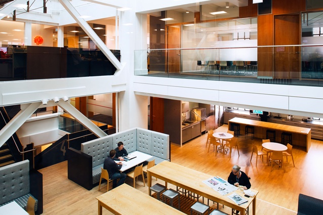
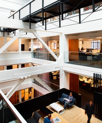
Lilley says the design for the 1927 Historic Places-listed building, originally built as the DIC department store, hinged upon the concept of converting an external light well into an 18m high atrium, from which floors radiate.
“The 7.5m x 22m light well was dead space right in the centre of the building. By raising the roof of the light well three stories, we were able to create a central atrium that lets in natural light and provides greater visibility across floors.”
The build, which started in December 2012, was completed in two tandem phases. The first involved a base build with the building’s owners, Kirkcaldie & Stains, which included upgrading the common areas such as entrances, lobbies and lifts, stripping out the light-well and upgrading building services.
Studio Pacific Architecture associate director Michael Davis says a key part of the base build was to engage with the New Zealand Historic Places Trust.
“We wanted to ensure they were happy with what we were doing, particularly with respect to the building’s common areas.”
The second phase involved a staged fit-out, conducted with staff in situ. Once the light well was opened up, it allowed the team to cast its creative wand over the building. Although Contact originally occupied floors one to three, the renovation allowed them to expand to floors four and five.
According to Lilley, the concept focused on creating three distinct ‘zones’ within the newly opened space, each delineated by three distinct circular skylights which flood the building with light.
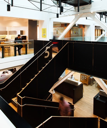
“The three structural bays of the light well were treated as three interconnected volumes, with one containing the new stair element, another the main communal space that links across the atrium at mid-height, and the third left as a full-height volume to maximise the cross-views through the fit-out from the edge of the atrium. The differing scale of spaces that results makes for a far more engaging experience of the atrium than otherwise would have happened had we left it as a single volume.”
By opening up into the atrium space, they were able to create the wharenui, or main meeting place, on Level four. This features an expansive kitchen and a range of seating options, such as banquettes and café-style tables, where staff can hold informal meetings and attend events such as employee meetings. High-spec acoustic absorption materials limit the noise to other building tenants on the top floor.
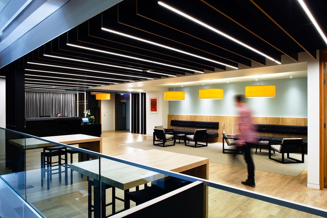
Studio Pacific also relocated and expanded the reception function from Level one to two and created a quiet library space in the centre of Level three, bookended by the light well’s original textured glass windows.
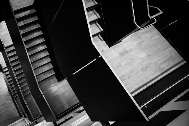
Linking each floor is a bold, seismically-designed black staircase, distinctive for its plywood balustrade.
“We wanted the space to have a less corporate, more homely feel,” says architectural designer Dorian Minty, also from Studio Pacific Architecture.
“That meant using a muted palette of materials and colours, which reveals itself as you move through the building.”
The team also opted for New Zealand-designed furniture with “a softer edge”. The distinctive LED artwork is from Massey University’s Squidsoup collective and runs from the roof-line to the third floor featuring programmable lights, while the Māori pou, which had to be lifted in by crane, began life at Contact’s New Plymouth power station.
The fit-out, which was completed in November last year and expanded the existing 4,130m2 tenancy by a further 2,600m2, has earned the client’s seal of approval. As Contact’s general counsel and company secretary Paul Ridley-Smith puts it, the renovation has “helped improved collaboration and encouraged random connections among staff”.
“Unscheduled meetings are really important in helping to keep information flowing and improving social relationships. The renovation optimised the existing attributes of the building, turning an unused light well into an atrium where people can move easily between floors and with spaces that encourage social collaboration…”

