Conceptual clarity: Christopher Orsega
American architect Christopher Orsega is a senior associate at the San Francisco office of Bohlin Cywinski Jackson and has extensive experience and expertise in office and retail space, having worked on many Silicon Valley projects. Amelia Melbourne-Hayward chatted with him prior to his keynote seminar at this year's Facilities Integrate trade exhibition.

Amelia Melbourne-Hayward: You initially studied as a structural engineer at Princeton. What led you to change fields and pursue architecture?
Christopher Orsega: From a very young age, my creative pursuits resided at the intersection of art and science. As a child growing up in Pittsburgh, Pennsylvania, I was inspired by marvels of engineering infrastructure; as well the city’s rich architectural tradition, including beautiful landmarks by H.H. Richardson and Frank Lloyd Wright.
Through my engineering degree I discovered was that there were certain aspects of the field of structural engineering that resonated with me – it is precise, analytical, disciplined and systematic. However, I was ultimately drawn to the field of architecture because it addressed my keen fascination in the emotional, experiential aspects of the built environment.
As an ideal, architecture exists at the nexus of these two fields of study. I like to think that my foundation in engineering has expanded my “tool kit” as I approach design problems.
AMH: You worked for Renzo Piano in Paris. What did you take away from this experience?
CO: The Renzo Piano Building Workshop is an incredible environment for creative thinking; not only did I have the opportunity to be mentored by such an esteemed figure in the field of architecture, but I was immersed in an incredibly collaborative design studio composed of great designers from around the world.

I am without doubt influenced by Renzo’s way of thinking, which is focused in equal measure on the analytical (exceptionally resolved details) and on the emotional (a brilliant mastery of the power of light and importance of circulation).
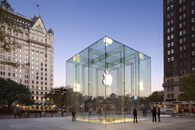
AMH: You worked on the iconic glass cube for the 5th Avenue Apple store in New York. What are some future possibilities in the realm of glass architecture?
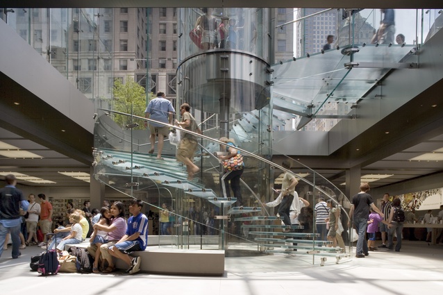
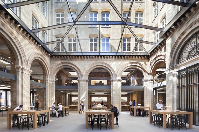
CO: The glass cube was an incredibly exciting project for us, which at the time of its construction was really pushing the limits of structural glass in a building application.
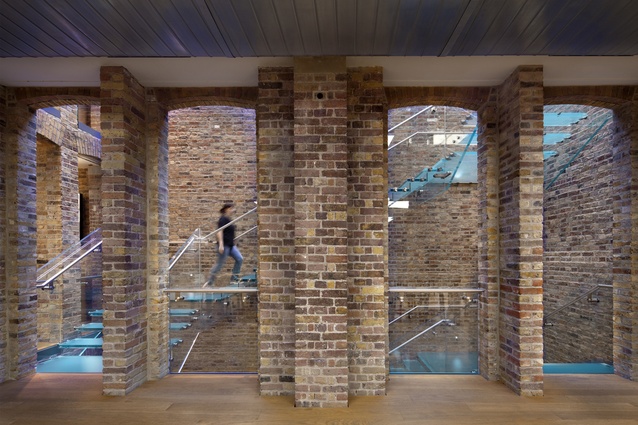
As structural glass technology has improved over the last decade or two, what we’re finding is that the possibilities are constantly expanding: glass panels are being manufactured in larger and larger sheet sizes and the customisation of glass assemblies is becoming more financially viable to a wider range of clients. This is inspiring architects to start thinking of glass as more than simply a visually transparent surface.

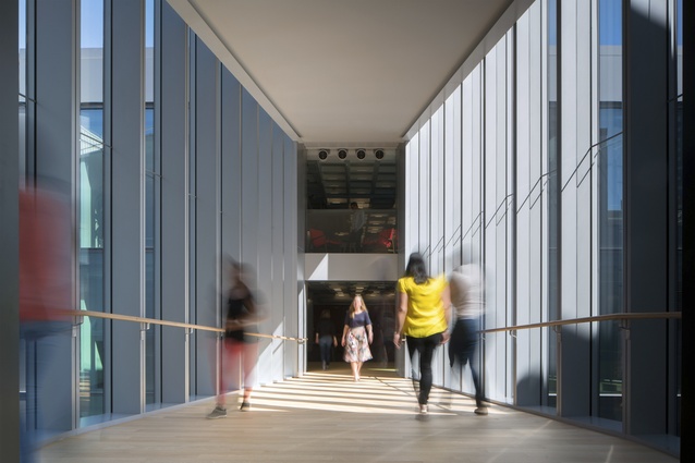
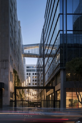
In a recent skybridge we designed, these technological advancements allowed us to play with layered glass to explore the effects of both reflectivity and transparency, and to study the way in which light glints off exposed glass edges.
AMH: With Square, Inc you were involved in the design of a large, innovative tech company. What were the challenges and how did you create a successful space for a company of this size?
CO: Square’s headquarters was an interesting design problem for us. The project was designed while the company was rapidly growing and expanding, and therefore it needed to address evolving programmatic needs and anticipate the nature of its own (somewhat unpredictable) future expansion.
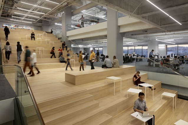
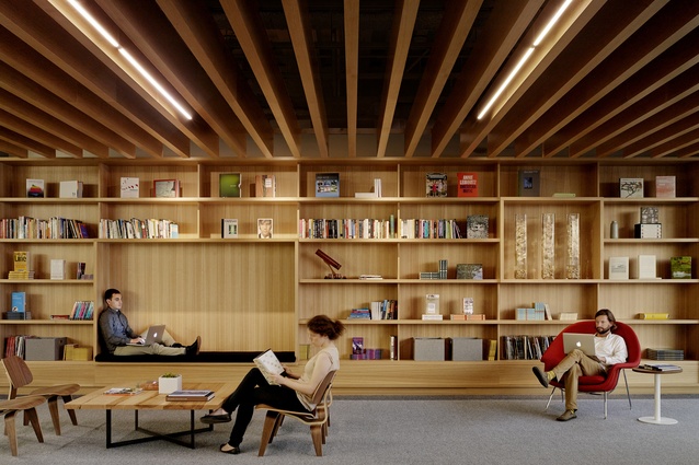
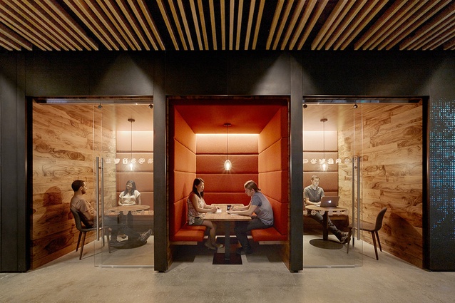
Built in two phases, the project provides more than 300,000 square feet of office space for the growing mobile payments company in San Francisco. The large 100,000-square-foot floor plates allow for a significant number of employees to be located in close proximity to one another, but posed a challenge for organising the space in a comprehensible way.
To foster a sense of community in a workplace as big as Square’s, we wanted to create a spatial framework that would entice employees to engage with another. We dubbed it the “boulevard”, and this central circulation axis serves as the organisational spine and functions as a primary hub for team collaboration and social interaction. The design encourages chance encounters and generates vitality comparable to the urban marketplace the company serves.
AMH: How do we plan for future workspaces, given the rapidly evolving nature of technology?

CO: Many architects and designers talk about building “flexibility” into their designs to accommodate future technology, but that flexibility can take on many forms.
What we like to do is to establish a strong spatial framework to our workspace designs, in the same way that an urban master plan serves as a tool as cities evolve and change over time. The design framework manifests itself both through the physical spaces it begets: visual hierarchies, clear paths of circulation and a constellation of work environments that are arrayed from this framework.
Since technology evolves more rapidly than the physical spaces we build, we try to develop an organisational logic that anticipates change. Rather than responding only to current trends and technologies, we try to take a longer view on the future of the workplace, and we believe that longer view is best served by creating great spaces for people into which current (and future) technology can be inserted.
AMH: How would you describe your design style?

CO: I like to think in terms of “design approach” as opposed to “style.” Conceptual clarity is incredibly important to me. When I begin a project, I tend to develop a conceptual framework to serves as a roadmap as the design develops and evolves over time. The concept could be driven by a contextual response, a client’s identity or a set of programmatic hierarchies.
As I work though the design process and layer more detail into our projects, the decision-making process is generally informed by whether it is in support of the project’s underlying conceptual framework.
AMH: What topics will we hear you talk about in your Facilities Integrate keynote?
CO: There are three strands of inquiry that will be explored in my presentation:
1. ”New Snails in Old Shells” (Adaptive reuse). Many Bay Area tech companies are moving into existing buildings, rather than building new ones. This is driven by a number of factors, including an increasing desire to be located in urban centers where new real estate is limited, economy/thrift, and the sustainable merits of adaptive reuse.

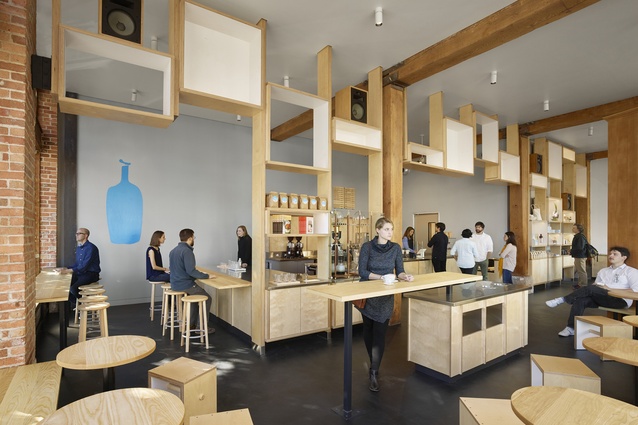
2. “Hacking High Design” (Creative customisation on a budget). Many of our clients, particularly in the tech industry, have great design ambitions but limited “start-up” budgets. As designers, we take this as an opportunity to creatively work with standard building materials and systems, applied in new and interesting ways.
3. “Predicting the Unpredictable” (Strategies for anticipating growth and change). A discussion of the over-arching design principles that inform how we design for fast-growing and evolving tech companies.
Facilities Integrate runs 27–28 September at ASB Showgrounds, Auckland.

