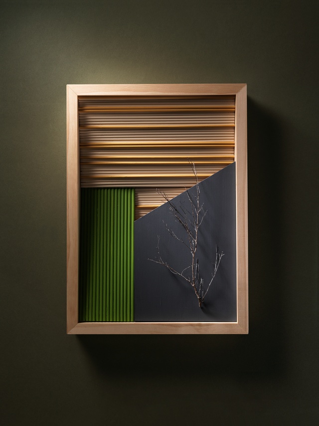
Colour Collab: Victoria Read
Wairarapa-based architect and director of Aspect Architecture Victoria Read is inspired by architecture that reflects the natural and cultural environment and adds to the built landscape in a positive way.


What led to you choosing a career in architecture?
Victoria Read (VR): I came to architecture as a second career after working in advertising. I worked in an office next to an architecture firm and I would look into its windows every day on my way to work and wish I was turning to go through its door. I loved the creative nature of advertising but the idea of contributing in a positive way to the built environment appealed to me. I decided to leave the advertising industry and retrain – naïvely not realising what a long and arduous path training to be an architect would be.
Your Palliser Estate Cellar Door won a Resene Total Colour Award in 2019. What role does colour play in your work?
VR: I love it when we have the opportunity to use colour in our projects. Colour helps to communicate and enhance your design ideas, lending personality, depth and connections. With the Palliser Cellar Door, we used Resene Half Baltic Sea to create a mood – the dark and moody cellar door space is somewhere to linger and enjoy the nuances of the fine wines on offer. We contrasted this with Resene Half Wan White to create lighter, brighter, more-open spaces for eating and socialising. The light quality and the colour created this pause in the building – a special moment where wine is the hero and the outside world is forgotten.

Tell us about the Kastrup Sea Bath in Copenhagen by White Arkitekter AB. Why do you consider it to be your favourite building?
VR: I have loved this construction since I was at university. I love the fact that it is in that inter-space between land and sea, providing shelter, safety and access for sea-lovers in an otherwise inhospitable environment. Its construction is also in an inter-space: halfway between building and jetty. I love the form, reminiscent of the sea tides, and the way it circles about the swimmer like a protective arm. The form is fashioned from slatted timber; occasionally solid, occasionally perforated, the whole edifice looks as if it has risen naturally from the seabed.
Your collaboration references your rural surroundings but it also has a Scandinavian-meets-Japanese aesthetic. What was the inspiration behind it?
VR: I wanted my collaboration to reflect the deep connection I have to the land of the Wairarapa and to architectural ideas that inspire me. I have long been an admirer of timber architecture, especially the work that has arisen in Japan and Scandinavia as the offspring of the ancient handcrafted construction methods used in those areas. The thing that attracts me to these buildings is the layering and repetition of thematic elements but at different scales. It reminds me of the layering and knitting together of all the pieces of landscape that occur in the Wairarapa, where the land is divided up into segments, whether they be paddocks, vineyards or residential lots, and knitted together. All these segments sit together under the strong line of the mountain ranges and are bisected by the Ruamahanga River.
How did you arrive at your colour choices?
VR: The colours I have chosen are the colours of the Wairarapa summer – the browns of the land are seen in Resene Sand and Resene Twine, the green of the vineyards is depicted by Resene Green Leaf and the deep, smoky blue of the bush on the hills is referenced by Resene Tuna.
See more from the Resene Colour Collab series here.
ArchitectureNow works with a range of partners in the A&D supply sector to source appropriate content for the site. This article has been supported by Resene.


