Colour Collab: Raphaela Rose
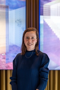
On a mission to radically reform the impact of our built environments, Raphaela Rose and her team at ahha are daring to imagine a future that’s better for everyone.


How did you choose a career in architecture?
Raphaela Rose (RR): I was raised in a creative family and my mother is an academic in urban planning. Dinner time often involved conversations about what constitutes a city, and family holidays were usually treated as research trips, to understand a city in relation to its broader context. It took me a while, however, to arrive at a career in architecture. I knew I wanted a career that enabled me to make a difference and, initially, I thought the best route to achieve this was through law. After a false start, I found my way to architecture, which fulfilled my creative needs and allowed me to explore design as a force for good.
Who or what influences your thinking?
RR: I’ve always been interested in the social implications of space and the ways in which design in the built environment can be employed as a catalyst for political and social action. My practice involves exploring architecture through a multidisciplinary lens, looking for the value of other disciplines and determining how they can be applied to architectural practice. As such, I have been influenced by practices and practitioners who also have a desire to deliver for social and environmental impact whilst working across architecture, design, education, experimentation and art, such as Assemble, muf, The Decorators and We Made That in the UK, or SO - IL and MOS in New York.
Does colour play a large part in your designs?

RR: Colour plays a significant role in my practice and in the work we do as ahha; you need look no further than our website to see our love for it! For us, the use of colour is the way we tell stories, whether as a tool to communicate the holistic nature of our framework or to create a specific emotion within a space. As we often work on constrained budgets, we employ colour to elevate simple elements strategically to create spaces that evoke feeling and change, depending on time, light and the seasons. Before forming ahha, I was part of a Brick Bay Folly winning team with Daughter of the Swamp, where our use of bright colour saw us awarded the Resene Total Colour Maestro Nightingale Award and the Resene Total Colour Installation - Experiential - Product Award.
What was the thinking behind your collab?
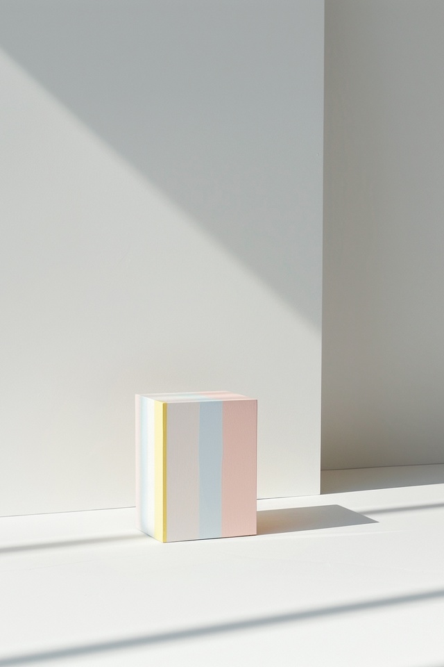
RR: My practice often draws upon artists’ work, their approach to form, colour and the ways in which these can influence the experiential nature of space. For this collab, I looked to the work of Agnes Martin, a crucial figure in the male-dominated field of abstract art during the last century. Her work was quite different from that of her male contemporaries of the time. It was characterised by meticulous grids and geometries, and she employed muted shifts of colour to explore and test the confines of structure, space, draftsmanship and the metaphysical elegantly.
How did you land on these five Resene colours?
RR: The colour choices are inspired by Martin’s paintings in the latter stages of her career; in them, she looked to the colours of the New Mexican landscape where she had once lived. The palette employs a series of translucent, shifting tones, exerting a certain radiance of light that is both powerful and subtle, peaceful and serene but, at times, almost garish. I’m interested in the ways colours can be viewed as a series of contradictions, to evoke a strong emotional response, and how this can be applied spatially through architectural practice.
See more from the Resene Colour Collab series here.
ArchitectureNow works with a range of partners in the A&D supply sector to source appropriate content for the site. This article has been supported by Resene.


