Colour Collab: Moshin Mussa
In this colour collaboration with Resene, we caught up with RTA Studio associate Moshin Mussa to discuss colour and how it has influenced his design choices.


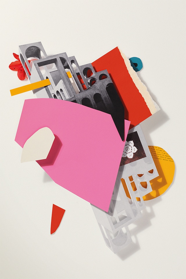
This colour selection was inspired by a Bally poster that hangs in your dining room. How did you come across it?
Moshin Mussa (MM): My wife and I stumbled across it whilst visiting friends and family in Melbourne last year. We had been searching for a large art piece for some time to fit within our dining space. When we saw it hanging in the Vintage Poster shop in Armadale, we both had that feeling of when you know, you know! It is an original Bally poster from the 1970s and, most likely, from a train station in France (this is what the lady in the shop told us). We love everything about it, from the composition of the different graphic elements to the contrasting colours, playful quirkiness and, of course, the fashion reference, which we are both fans of. It is certainly one of my favourite pieces from our art collection.
What do you think works so well about the colour combination of red and black?
MM: They are both very bold and work well as a combination when integrated with other colours. Black and white will generally contrast well with most colours and really make them pop. When black is used with different tones of red and pink, you end up with something that is quite romantic yet harsh and edgy. Perhaps they work well together because they may be associated with the same things, such as power, elegance, aggression and evil. We often see these colours being used together to represent something quite sinister. This is not the case with this poster – floral elements in shades of red and pink, against a black (shoe) and white background, are complemented by greens and blues, with bold, black text. It all comes across with pure elegance.

In what ways has the poster inspired you? Has it influenced colour choices you’ve made in your line of work?
MM: It has inspired me to buy my first pair of pink shoes and even my first pink sweater, now that I think of it!
Not intentionally but perhaps subconsciously, the poster has inspired me in different ways, although I have always been attracted to these colours. I am constantly trying to adopt these principles in the work that I do. The idea of bold, contrasting colours is apparent in projects that I have been involved with and had a leading role in at RTA Studio. I have been fortunate enough to be involved in projects that allow the design team to be creative with colour. Most recently was Freemans Bay School (winner of the Nightingale Award at the 2018 Resene Total Colour Awards), which has a very bold colour scheme consisting of striking yellows, reds, pinks, blues and greens, to name a few colours that we used. Different shades of these colours were used to represent the large number of nationalities present at the school. The colours were offset by black and white to achieve contrast and that ‘pop’ that I talked about earlier. The project has won numerous colour awards so it is great to see that we are more accepting of the choice of bold colour in New Zealand. I think New Zealand architecture, compared with other leading cities around the world, needs to be more experimental with the use of colour.
How do you approach integrating colour into a project? Where do you start and what kind of considerations do you typically make?
MM: I think the choice of colour for a building or space needs to be considered as part of the conceptual process and integrated into the design. It is important that the colour scheme has meaning and substance behind it. The colour scheme for a primary school is likely to be quite different from that of a large-scale commercial project. This is not to say that the latter type of building cannot have a bold and contrasting colour scheme but the approach might be different. Buildings with larger budgets allow us to use a wider range of materials. Colour may be introduced through the natural material selection, such as terracotta tiles or Corten steel, as demonstrated by the recent completion of a new RTA Studio mixed-use development in Havelock North, which I have been involved with. Because of various limitations in New Zealand, material selection is challenging. The use of colour may be a cost-effective method of injecting life into a building. This is particularly useful for projects with limited budgets, such as schools. Paint colour selections can have a major impact on the design, which can be used to our advantage to make buildings and spaces more appealing, add interest and express conceptual ideas.
See more from the Resene Colour Collab series here.
ArchitectureNow works with a range of partners in the A&D supply sector to source appropriate content for the site. This article has been supported by Resene.


