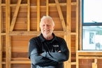
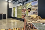
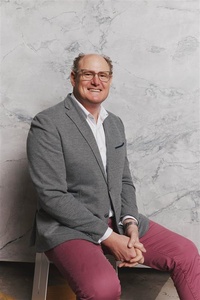
Colour Collab: Mike Hartley
Lloyd Hartley co-founder and director Mike Hartley is flamboyant, engaging and full of energy. It’s not surprising that his architecture, interiors and project management practice celebrates positive human interactions.
How did you end up in the world of architecture?
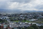
Mike Hartley (MH): It’s terribly boring! It’s a story of a pretty stable and natural progression from things I was interested in, to having the great fortune to be allowed to pursue a tertiary education programme that seemed to be a great fit. My parents were very supportive of the diverse range of subjects I was interested in at school, sculpture being an absolute favourite. And, while tertiary education was pushed pretty hard in our family, the architecture programme at the University of Auckland seemed like a snug fit with my interests. However, I don’t recall ever being impressed or particularly engaged with architecture or buildings until I visited Rome with my parents as an 18-year-old. Seeing my mum converse in what sounded like fluent Italian with a taxi driver as the sun broke through and warmed up the dome of Saint Peter’s Basilica, and then, later, walking through the forest of towering columns of Bernini’s Colonnade, had me hooked!
Is there anyone or anything that influences your work?
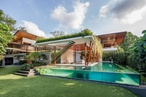
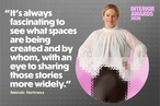
MH: Life and connection. I’m interested in how we can make spaces and places for people to come together and reinforce positive connections. I also love the way we can design and arrange spaces that allow the mundane, repetitive nature of life not to get the better of you. A little bit of the extraordinary within our everyday environment certainly lightens the load. Collaborating, engaging and coordinating with others to ramp up energy is also a big influence.You will always be influenced by the people you have worked for and the people you work with, and there is no doubt I am a better architect in collaboration with others. Ego is forgone; the best idea wins and is built on to make something specific, tailored and captivating.
How do you typically use colour in your projects?
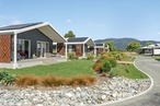
MH: Colour is something that is imbued in what we do — a way to bring some considered depth or warmth into a project and to be less confrontational with our environment. It’s also a way to imbed gently the influence of the characters for whom we’re designing through a collaborative process. Colour enables us to explore resonance and work with someone’s affinity for certain accents and hues. In our own home, ‘Lancaster, the Luxury of Enough’, we painted our children’s doors and ceilings in Resene Lip Service, Resene Buttercup and Resene Resolution Blue, almost as markers for what are otherwise identical spaces. They provide delightfully unexpected moments within a relatively small interior and allow for our kids’ identities to resonate with their own spaces — places to sleep in, sulk in and dream in…
What was the thinking behind your collab?
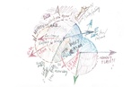
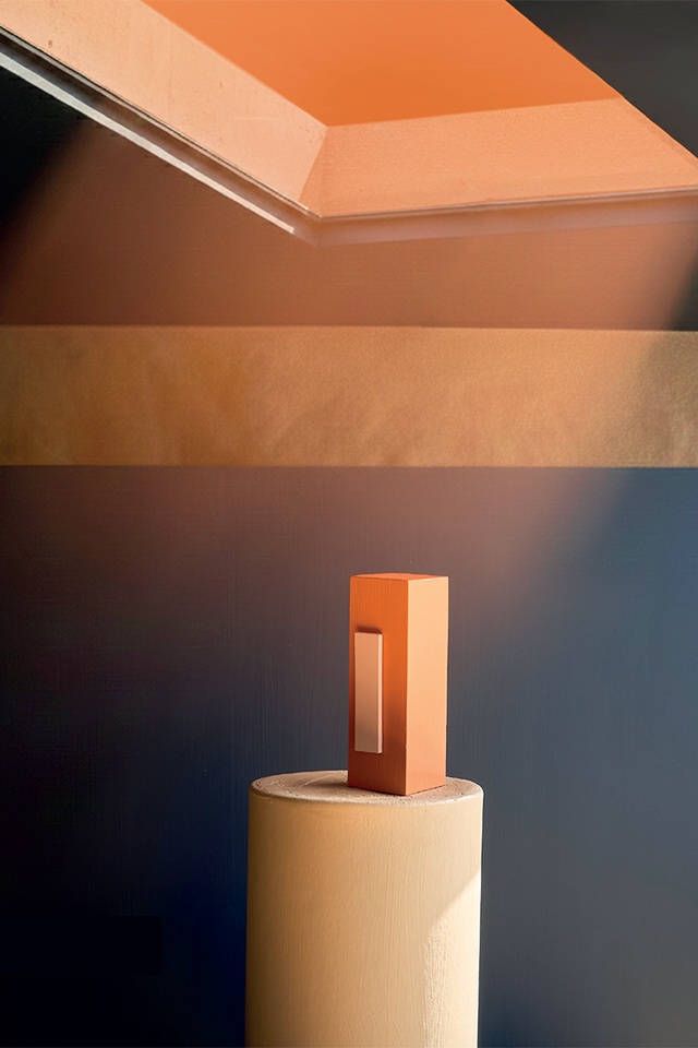
MH: I’ve always loved the experience of descending through the clouds as you come in to land at dusk. I’ve experienced it a couple of times where a layer of clouds above you is illuminated in such a way that it turns into a ceiling and you’re contained within a horizon of possibility. Dreamlands. I love it: Aotearoa, the land of the long white cloud as a spatial experience. I was interested in exploring this idea with Thomas — creating what is essentially an abstracted plane, depicting compression and release, reflection and refraction, and a horizon of possibility, as if a dream was made with your head in the clouds.
Tell us how you came about choosing these colours.
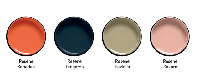
MH: We love Resene Sakura and it features heavily in the concept stages of our projects. Coupled with Resene Sebedee, it reminds me of soft pink clouds and the lived experience of colour overhead. Resene Pavlova and Resene Tangaroa are the grounding elements, providing both depth and protection around the horizon of possibility.